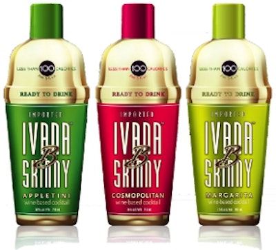
Glass shaker bottle serves up low-calorie cocktails
International Spirits, LLC has launched Ivana B Skinny low-calorie, wine-based cocktails to compete in the fast-growing segment of low-calorie, premixed cocktails. Ivana B Skinny Cocktails are available in Margarita, Cosmopolitan, and Appletini flavors with more flavors on the way, with 10% alcohol, and all less than 100 calories per 5-oz serving. The product comes in a 750-mL glass shaker bottle, packaged in an attractive outer shipper, 12 bottles to a case, with a suggested retail of $13.99.
Packaging, brand name make sake product approachable
Thick, black, swooshing brush strokes, like the precise movements of a samurai sword, the iconic outline of a samurai warrior’s helmet, and a bold, contemporary Japanese style are all design elements of the packaging for a new imported sake brand developed to bring approachability to a spirits category not well understood in the U.S. Hiro brand sake was introduced in spring 2011 by three spirits industry veterans who were inspired by their love of sake and saw an opportunity to create an authentic, premium brand that consumers could ask for by name.
Spirits cooler gets a new label
First launched in 2002, Brutal Fruit’s image has changed over the years in an innovative category. In 2011, SAB moved away from Applied Ceramic Labeling and opted for pressure-sensitive body labels. The elegant labels not only help to stylize the package, they’re also cost-effective thanks to manufacturing and throughput efficiencies. Converting from the costly ACL decoration to p-s labeling has allowed Brutal Fruit’s new-look pack to deliver on premium cues, while bringing substantial cost savings. The labels are printed on a flexo press. The elegant look was achieved by combining a high-luster UV silver ink with a stylish frost finish, created using a transparent white ink.
Bourbon brand makes comeback in historically inspired bottle
Cyrus Noble Small Batch Bourbon Whiskey, a Kentucky spirit bottled by Haas Brothers of San Francisco, has a long and prestigious history that dates back to the California Gold Rush. That history ended, though, around the middle of the twentieth century. A recent resurgence in bourbon drinking, however, has inspired Haas to demothball the brand. For the package design, the goal was to create a bottle that had the feel of the original packaging, but with an updated look. Bottle decoration includes the logo of a crossed pick and shovel topped by a crown, embossed into the shoulder of the bottle and centered above the label, along with the same ghosted image in green on the label itself. The color scheme harkens back to the colors used on the original label. An illustration of a miner panning for gold is used in a medallion design on the neck label, touting the brand’s heritage with the words, “Cyrus Noble Bourbon San Francisco,” and “Est 1871.”
Royalty evoked for cream liqueur packaging
Diageo’s QREAM WITH A Q™, or “Qream,” is an ultra-premium cream liqueur that was conceived and developed in collaboration with musician and style visionary Pharrell Williams. The brand focuses on an ethos that encourages woman to “live deliciously,” inviting them to treat themselves royally. With Qream, says Diageo, every detail was crafted to celebrate women—from the elegant design of the bottle, inspired by royalty, to the delicious flavor and silky lightness of the liquid, to how the brand is marketed. The beverage comes in two varieties: Strawberry Crème and Peach Crème.
Bomb Lager launches in cans
Bomb Lager is committed to building a brand that embodies artistic expression and creativity, as well as easy drinking. Every production of Bomb Lager will feature a new can design developed by a local street artist. East Village artist Billy Miller came up with the unique graphics for the inaugural can. Says Mike Raymond, managing director, Bomb Beer Co., “Along with creating a quality product, Bomb Lager is about artistic expression, so we wanted a package that people would want to see and be seen drinking. In fact we placed our recently updated recipe in Billy’s ‘Black Can’ design, which is as refined and exciting as the beer within it.”
Danish simplicity celebrated with limited-edition vodka bottle
A limited-edition bottle has been designed for DANZKA brand vodka, from Bélvèdere Scandinavia A/S, to reinforce the brand’s Danish roots. In acknowledgement of the brand’s strong local heritage, the design concentrates on the image of the Danish flag, and expresses the brand’s iconic Danish style through design values such as simplicity, minimalism, and functionality. Well-known for its aluminum packaging and minimalistic design approach, DANZKA has become an easily recognizable style icon among the Bélvèdere portfolio of brands. According to the company, the aluminum bottle was designed specifically for drinking vodka cold.
Design puts new wind in Cutty Sark’s sails
For a refresh of the packaging for Cutty Sark Blended Scotch Whiskey, designers worked closely with the Cutty Sark Global Brand Team assessing all aspects of the old branding, focusing on the key points of difference: the clipper, the yellow, and the Cutty Sark typestyle. The original clipper ship, drawn in 1923 and updated only once in the last 88 years has now been revised. The team took the opportunity to enhance the icon, putting more momentum and dynamism into the Clipper. It was vital, however, to maintain the brand’s identity, which evokes thoughts of adventure and excitement within the global consumer audience. The bold yellow color has been brought back onto the larger front label creating a higher degree of visibility. The green glass has been retained but has been premiumized with key brand messages embossed onto the bottle.
Color and shape define organic superfruit wine label design
Neon-like splashes of color in an organic design bring a celebratory air to packaging for a new wine brand from The Eppa Wine Company. New Eppa SuperFruit Sangria in Red and White varieties is a mix of high-quality ingredients, including Mendocino County Cabernet Sauvignon and Syrah wines made from organically grown grapes and a juice blend of organic pomegranate, acai, blueberry, and blood orange. Packaging is a stock, green, 750-mL glass wine bottle, decorated with a pressure-sensitive label six color-printed with brilliant splashes of color. Says Eppa managing partner John Gomez, “Consumers are consistently impressed with the packaging and the taste. They see the packaging as captivating and communicative of a contemporary and high-quality product that suggests fun and style. The colors and graphics also signal fruit, freshness, and vibrancy. It really pops off the shelf relative to the competitive wine set.”
Iconic bowtie design is focus of new Budweiser pack graphics
Budweiser has unveiled a new design, seen in its can and secondary packaging—the 12th since Anheuser-Busch began offering its flagship brand in cans in 1936. The focal point of the design is Budweiser's iconic bowtie, complemented by the time-honored Budweiser creed and Anheuser-Busch medallion. Says Rob McCarthy, vp, Budweiser, "Our refreshed packaging design gives Budweiser an updated look, which dramatizes the iconic Budweiser bowtie and incorporates the brand hallmarks that loyal Budweiser drinkers will recognize and appreciate." Budweiser's new "bowtie" can and secondary packaging designs will be the global standard as the brand continues to expand internationally.
Cuboid bottle contains all-natural energy drink
Ceethree’s iO Natural Energy Drink has recently been introduced to the Swedish market in a highly unusual cuboid bottle. It is the first commercial use in Europe of this bottle design, an extrusion blow-molded 250-mL HDPE cube-shaped bottle with a triangular flip-top closure set across one corner and minimalist graphics applied in the form of a shrink sleeve. From a retail and logistics viewpoint, the bottles are easily stackable and optimize space. Ceethree’s iO is an energy drink made from only natural ingredients, without artificial additives or colorings.
Shaped PET bottle helps tout UK milkshakes
Shaken Udder Ltd., a U.K.-based maker of “a new breed of milkshakes,” now offers its products in 330-mL PET bottles shaped to resemble a traditional milk churn. Earlier this year, Shaken Udder created a branding and labeling redesign to lend its “funky cow” icon increased prominence. So the bottle shape was crucial, as it allowed space for the logo to be displayed more visibly. Shaken Udder milkshakes are now available in Chocolush, Top Banana, Vanillalicious, and Strawberry Stash flavors, and sold at retailers including Tesco, Selfridges, Harrods, Waitrose, and Sainsbury's.
Iconic Coca-Cola red cans turn Arctic white
In November, Coca-Cola and the World Wildlife Fund joined forces in a new campaign to help protect the polar bear's Arctic home. For the first time ever, Coca-Cola turned its iconic red cans white in celebration of the polar bear and committed up to $3 million to WWF's polar bear conservation efforts. The familiar red can background was replaced with an all-white panorama, highlighted by the Coca-Cola script printed in red. The cans featured the image of a mother bear and her two cubs making their way across the Arctic. While the white packaging was originally scheduled to stay on store shelves through February 2012, Coca-Cola pulled the cans two months early, replacing them with a similar design with a red background, after consumers complained they had mistaken the Coca-Cola white polar bear can for the Diet Coke brand.
Norwegian spring water in a box
Glacia Icebox water in a box contains water pumped directly from the Rustad Spring in Norway. After pumping, the water is micro-filtered and cleansed with UV light before being packaged in paperboard cartons and in a bag-in-box configuration. The company says that its goal is to use the most sustainable and nontoxic packaging available. Therefore, its water cartons—in 5-L, 1-L, 500-mL, and 250-mL sizes—are made primarily from biodegradable, recyclable cardboard and are printed with a water-based ink and an aqueous coating. The polyethylene spout, handle, and bag-in-box for the 5-L version package are fully recyclable and nonleaching. The 5-L Icebox package is said to take up less space than occupied by the five 1-L bottles it replaces, resulting in reduced storage and shipping, and a corresponding reduction in energy consumption. According to the company, the carbon footprint of the box is only 24% of that of a comparable-size plastic bottle, even when transport from Norway is included.
Functional iced coffee line looks good in glass
RealBeanz is a new line of iced coffees that combines premium-brewed beans and fresh, artificial growth hormone-free milk, with functional ingredients such as vitamins and potent herbs. Each of the five varieties offers a functional benefit. Flavors include Energize/Cappuccino, Focus/Caramel, Trim & Fit/Cappuccino, Resist/Mocha, and Relax/Vanilla Nut varieties. Resealable 9.5-oz glass packaging is inspired by old-fashioned milk bottles and uses matte-finish full-body labels with simple graphics.
Nitro-fueled soft drink targeted at teens
Britvic has shaken up the soft drinks industry by giving its iconic Tango brand a new twist with the launch of Turbo Tango, a soft drinks innovation targeted at teens. The innovation features “nitro-fueled” aerosol technology, which delivers a foamy blast of orange and a totally new drinking experience. Britvic led a team of more than 40 international development partners to create the world’s first plastic aerosol drink—a technology that some say has the potential to create a whole new future segment in the soft drinks market. Turbo Tango is targeted at late teens, where early trials have been highly successful.
Yellow, smooth-finish fruit beverage bottle evokes the banana
The Chiquita Fruit Crushie crushed fruit beverage is available in four flavors—Strawberry Banana, Blueberry Banana, Pineapple Banana, and Mango Banana—and is made from 100% whole fruit. The product’s petite and curvy 8-oz bottle carries a bright-yellow shrink-sleeve label with a matte finish that feels as smooth as a banana. Front-panel graphics depict a banana peel being pulled back to reveal mouth-watering illustrations of the fruits from which the beverage is made. The bottle is constructed of 100% recycled PET and carries copy on the back panel that encourages consumers to recycle the package when the product is consumed.
Rainbow of can colors used for hemp iced tea line
Chronic Ice is offering five new flavors of its hemp iced tea—pineapple, blueberry-grape, black cherry, ginger ale, and unsweetened. A completely new packaging design that expresses the hemp beverage’s “refreshing-now-and-healthy-later benefits” accompanied the launch of the new flavors, says brand owner, Kush Boys. “The new label art communicates that Chronic Ice is a natural, refreshing drink,” says Jamal Weathers, a co-founder of Kush Boys and representative of Chronic Ice. The original lemon Chronic Ice hemp iced tea sports the new design in the original Chronic Ice green tones, while the new flavors debut in the same design but in a rainbow of colors. The new flavors and corresponding colors include black cherry with a red label, blueberry-grape with a blue label, pineapple with a yellow label, ginger ale with a brown label, and unsweetened with a pink label.
Slim can for functional tan-enhancing drink looks sun-touched
Sunlover of Portugal brought a skin- and tan-enhancing beauty drink to the Brazilian market in a 25-cL slim can. The new beauty drink has been designed to improve the quality and life of the consumer’s skin and tan, helping to give consumers a healthy looking complexion after consumption. Says Sunlover general manager Artur Tavares, “It has been a three-year process from concept to market launch, and it is great to see the final product. The cans look great and really represent the brand, showing how good the consumer will feel after enjoying the drink inside.”
Natural elements in design help express freshness of coconut water
Bebida Tropical enlisted the help of a design firm to develop a new coconut water brand for the Dubai market. Cocolino Natural Young Coconut Water Infused with Young Pulp was the result, designed in two formats: glass bottle and aluminum can. To represent Cocolino’s inherent freshness and purity, the designer incorporated elements from nature into the design. Fresh green coconuts, a blue tropical orchid, and a palm-leaf texture running through the logo, help communicate the source of the product as well as its refreshing and wholesome properties. To complement those blue/green shades, the designer used a crisp metallic silver as a background, overlaid with a tone-on-tone pattern. On the raw can substrate version of Cocolino, this pattern becomes more distinct the colder the can gets.