While there can be significant strengths to brand extension strategies, significant risks are also present in diluting or severely damaging the brand.
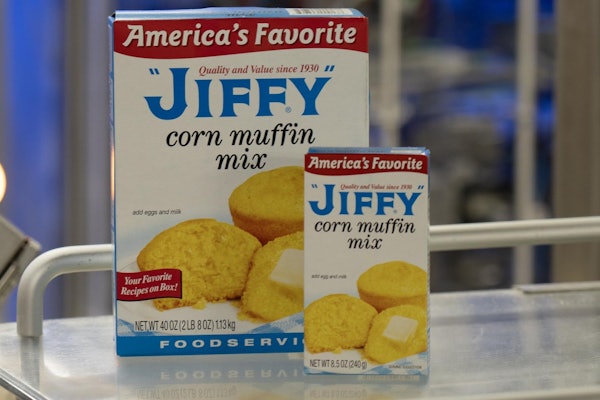
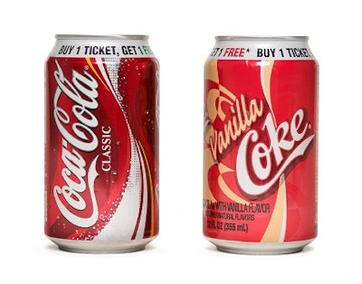
The most common brand extensions include basic line extensions within the same segment, from Coke to Vanilla Coke, for example. Another form of extension involves moving into a new category. A good example is Nike moving from footwear to golfing apparel.
Co-branding or licensing is another form of brand extension. Entertainment properties do this constantly. Before Disney/Pixar’s “The Incredibles” had even officially opened, in November 2004, nearly $300 million had been spent or committed in partnership and promotional deals. McDonald’s was part of that deal, incorporating “The Incredibles” into its Happy Meals and its Happy Meal consumer promotions.
Many brand managers believe it makes sense to “transfer” the promise and equity of their established brand to another product. But that isn’t always true. In fact, many companies go too far in trying to extend their brand to products or services that are not a good fit. They risk losing credibility in their flagship brands.
Does anyone remember Levi’s tailored suits? This was an utter failure since the Levi’s brand stands for casual clothing. Or, corporations go too far and dilute their brands. A great example of this is Pierre Cardin. This successful designer clothing line extended its brand, via licensing, into way too many product lines. Most of them had absolutely nothing to do with the cachet the brand had built in the couture business. The brand withered and died.
The key to successful brand extensions is determining that they are consistent with the brand’s values. Not from the marketing department’s point of view. From the consumer’s point of view. Consumer research should yield the following information about brand extensions:
* Their understanding of the brand’s core attributes
* Their ideas as to which kinds of products or services are logical and are consistent with those values
* Their view that the brand extension is credible and acceptable
* Their perception that the core brand can be transferred to the specific product or service extension(s) in question.
Once the marketing department has effectively carried out this research, design can begin on the brand extension. Traditionally, we visually extend a brand to maintain the core equities from product to product. This normally includes the brand, sub-brand, overall package design architecture, and color palette. However, when there is a need for market segmentation, this does not always apply.
The core equities of the brand and sub-brand must be retained, using a visual system of segmentation. This can be done through one or more of the following five methods:
1. Color. Variations in color from package to package help distinguish one segment from another.
2. Architectural device. This is a common element engineered into the package design architecture that allows for a color, pattern, or textural change to distinguish one segment from another. An example of an excellent use of this technique is Post’s high-volume Honey Bunches of Oats cereal line. Honey Bunches of Oats Honey Roasted, Honey Bunches of Oats with Almonds, and the new Honey Bunches of Oats with Strawberries share the same distinctive package design, while color differences clearly distinguish one flavor from the other. The center medallion with logo and front panel of the box in golden yellow connotes the original honey roasted cereal, blue symbolizes the almond variety, and red signals the strawberry flavor.
3. Typography. A strong typographic segmentation system can work if it’s prominent on the packaging and works in conjunction with the brand and sub-brand lock-up. Consider Pepsico’s line extension of Tropicana Pure Premium functional orange juices. While retaining the basic package design architecture of the original orange juice line, the functional products clearly target specific demographics.
Tropicana Pure Premium Healthy Kids features core package design architecture with softened lines, a changed font and adjusted bright color palette to appeal to kids. The packaging clearly shows moms that the addition of vitamins A, C, and E, as well as a highly absorbable form of calcium, are just what her growing children need.
Tropicana Pure Premium Healthy Heart targets an adult audience with its red “cardiovascular” cap on the gable-top package and its bold-red cartouche on the front. Six essential heart nutrients—potassium, vitamins B6, B12, C, E, and folate—are listed front and center. Tropicana Pure Premium Immunity Defense features a purple cap and cartouche on the package front and clearly targets a mature audience. The product is fortified with vitamins C and E, and selenium.
4. Iconography. This technique can be quite effective in segmenting a product line. It is particularly prevalent in global packaging.
5. Package design architecture stylization. Though less common, this is an excellent tool in differentiating segments that target specific demographic groups. Mattel uses it well in its classic Barbie line of dolls. Ever since her debut in 1959, Barbie has been in partially clear packaging with a window on the front of the carton.
Barbie’s ever-stylish persona and evolution over the years have kept pace with modern hairstyles and fashions. Thus, she has stayed relevant to several generations of young girls. Since the late 1980s, Barbie has had many incarnations, and the packaging architecture has reflected that.
There is the classic doll that is meant to be played with and adored by little girls in basic packaging. Then, there are the limited edition, collectors’ versions of the iconic Barbie. The packaging for these is specifically directed to an adult audience of women who grew up playing with, and loving, Barbie. The clear, elegant packaging looks expensive and is meant to permanently display the doll. These collectors’ items are not meant for play. As with most collectibles, they keep their value and accrue more over time if the package is kept in pristine condition along with the dolls.
When the brand extension is meaningful, and the brand extension initiatives are made clear to the package designer, the collaboration between marketing and design can bring successful new products to the marketplace.
The author, Ted Mininni, is the president and creative director of Design Force Inc., a package design firm in Marlton, NJ. Phone 856/810-2277.