While pop-tops and bags are still an efficient option for some cannabis product manufacturers, custom packaging is becoming more of a focus for companies looking to differentiate themselves. We sat down with Jesse Pixler, Creative Director at COHNNABIS in Denver, to talk about design challenges and choices in the medical marijuana space.
What was unique about designing for Verra Wellness’ nasal spray?
In terms of the label and carton, the client didn’t want the product to look “medical” though it is a medical product. They wanted a natural, organic feel with a consumer twist. We chose a vintage, illustration style that doesn’t overdo the cannabis plant imagery. 
The challenge was making this medical device look elegant. The bottle had to be child-resistant because it is a multiple-use product (vs. single-use) and the consumer throws out the secondary package, so we had to source a special top and lid to go on the base.
Verra was also very cautious compliance-wise and wanted to attach a label with marijuana infused product (MIP) facility and dispensary license numbers to the bottle, though it wasn’t required at the time. They opted for a foldover label that sticks onto the bottle. That eventually became a regulation, so they were already compliant.
The small seal at the top of the carton adds a higher-end feel while displaying the percentage of THC. This way, they can use the same carton for multiple product strengths by applying different seal labels.
With Seed & Smith, how did you arrive at the modern aesthetic without major leaf imagery?
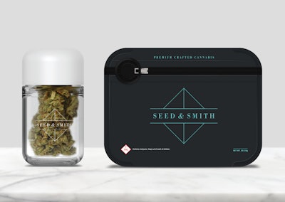
Seed & Smith produces small-batch, high-quality flower and wanted to give a premium impression to go with the premium product. We developed an icon to convey the seed-to-leaf concept. They have a grow operation, tours and a dispensary that all have this clean, geometric look—they did a great job translating their brand to retail.
Seed & Smith used a triangular carton which is unique in this space. There are extra considerations there: if the package inside is round, then the points are hollow inside the triangle, so not all of the space is used. Folding and gluing is performed by All Packaging in Colorado. 
They chose unique child-resistant bags and glass jars from Pollen Gear. We wanted the primary package to have a premium feel as well, to maintain consistency throughout the customer experience. We didn’t want the customer opening a high-end carton to reveal a simple plastic jar.
The SnapTech(TM) Bags are custom, they have a smooth-yet-matte finish and colored squeeze tabs. The white pouches are for medical products and the dark blue are for recreational. With the glass jars, the company logo is screen-printed directly on the glass. Again, this is a more expensive choice, but it gives the “top shelf” feel and maintains the branding when the consumer reuses the jar. 
Their pre-rolled joints are in a custom designed hanging package. Because they aren’t packaged in the same triangular carton, we applied more of the triangular design in the graphics of the package for consistency.
What about the rise of delivery and click-and-pickup services? Are there special considerations for standing out when customers are browsing sites?
Most consumers still have to go to the dispensary, but the visuals are key. Companies have to think about how their products look in photos online. If the photos are low-quality and badly lit, they aren’t going to do the products justice.
You design for medical and recreational products—what are the special considerations for medical?
From a regulatory standpoint, they face pretty similar challenges. Medical products tend to have a bit more copy with disclaimers and labels. But the lines are getting blurred. In Colorado, medical products no longer require the “M” on the warning label.
Designers tend to go a bit more clinical with the aesthetics. It’s also tough because the regulations can change at any time, meaning that labels may need to be reprinted to accommodate new rules.
What are the obstacles when it comes to label design?
Dispensaries in Colorado put their own labels on the products with information like batch numbers and initial grow location, so we have to leave space on the packages to accommodate. Not every dispensary has the same size label, so we try to base that space off the largest label possible.
Another design challenge is that with some topical or sublingual products, they’re oil-based (due to the essential oils used for scent and flavor).We’ve had to choose different packaging and more robust labels to mitigate issues with leaking.
