Touch is crucial to all of us as human beings. When we are visually engaged by something, we reach out and touch it. While we are visual by nature, we are bombarded by product imagery more than ever, suggesting that a richer, multi-dimensional experience with brands is required. The stakes in the brand packaging game are rising.
Marketers are looking at package design and coming to terms with a simple truth: People are multisensory, so why shouldn’t packaging be? While packaging has to be visually enticing to be noticed, it also has to appeal to the other senses as well if it is going to make the brand stand out from a sea of choices in category after category. Even with inventiveness and a disruptive mindset on the part of intrepid marketers, it’s getting increasingly challenging to find a unique manner in which to leverage visual and verbal brand communication alone to competitive advantage. Packaging has to evolve so that it can invite touch.
With advances in digital printing capabilities and the development of new substrates, more is possible than ever before. Consumers are attracted by and respond to packaging color, shape, scent, tactile feel, and sound—real or suggested—by the elements of package design. Based on his research, branding guru Martin Lindstrom observed in his best-selling book “BrandSense,” that branding has always been about establishing emotional ties between the brand and the consumer. “As in any relationship, emotions are based on information gathered from the senses,” he says. “In order to achieve emotional engagement, the sensory appeal of a brand has to have two essential ingredients: It must be unique to your brand, and it must become habitual.”
The more senses we can leverage through package design, the more compelling the brand will be to consumers. By understanding its role as a primary influencer as well as its power of persuasiveness in creating engagement directly leading to sales, elevated package design should become a greater focus for marketers. Packaging should be leveraged to enhance the consumer experience and differentiate and distance it from competing brands, and it should be tapped to play a key role in beginning relationships that bond consumers to brands.
The consumer response process
Creating inspiring, brand-centric stimuli for consumers is crucial in making initial contact. When they are attracted by specific packaging, consumers are experiencing a sensory interaction. More importantly, they have tuned out every other choice. Sensations are created via some or all of the consumer’s sensory receptors—eyes, ears, nose, mouth, or fingers. The more senses that are engaged, the more emotive the experience. Perception is the manner in which raw sensations are then interpreted and added to in the consumer’s mind to attach meaning. This must be understood: Consumers process a small amount of information from the stimuli with which they are bombarded and attach meaning to an even smaller amount, which is then stored in their brains.
So the right kind of stimuli makes the brand desirable and memorable. They elicit emotions and stir up personal associations and memories for consumers in the form of past, enjoyed experiences with the brand and even shared experiences with friends. We know that brand success hinges on how people feel rather than their rational thought processes and that these emotions are deep-seated and often subliminal. And we know that consumers are increasingly interested in seeking out satisfying experiences rather than in acquiring things.
Since the 1980s, researchers have increasingly studied what is referred to as hedonic consumption. This is defined as the multisensory, fantasy, and emotional aspects of consumers’ interactions with products. A branded product is used to fulfill fantasies and satisfy emotions. But brands aren’t purchased without consumers first interacting with—and being sold by—packaging.
When prompted to touch and then to pick up packaging, the “buy process” has actually begun. This has been confirmed by business school professors and researchers, Joann Peck and Suzanne Shu. In their research, “The Effect of Mere Touch on Perceived Ownership,” they say, “The research finds that merely touching an object results in an increase in perceived ownership of that object. For non-owners, or buyers, perceived ownership can be increased with either mere touch or with imagery encouraging touch.” Therefore we can conclude that tactile packaging adds more value—even if it increases cost—because it shapes perception and creates a deeper level of engagement, prompting touch that leads to sales.
Tactility personifying brands
Heineken recently used tactile ink to create “texture” on its refreshed beer can packaging.
As Mark van Iterson, Global Head of Design at Heineken, explained in a press release from Ball Europe, “With the design of our new ‘Groovy Embossed Can,’ we are combining cutting-edge technology with a bold design statement to surprise and excite consumers in a category that’s sometimes seen as heritage driven. The fresh, iconic design expresses the progressive personality of the brand and gives increased impact and stopping power at the point-of-sale.” Precisely. Stopping consumers in their tracks and compelling them to touch and hold the new Heineken package—one that makes a statement about the brand personality—is one step away from purchase. This is Heineken’s subtle way of making its heritage brand appealing to modern consumers who are clearly experience-driven.
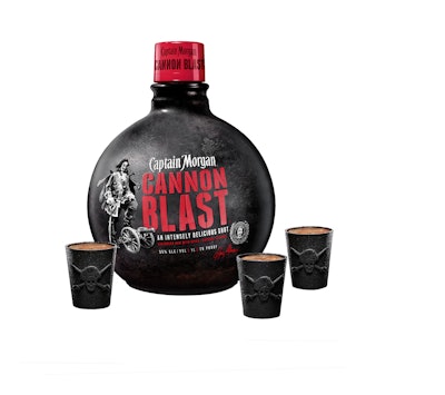
Even more distinctive in the alcohol category is the packaging for Captain Morgan Cannon Blast spiced rum in the shape of a cannon ball. A spherical bottle completely covered by matte, jet-black shrink film and textured like the surface of a cannon ball with a red cap represents a terrific package design accomplishment. Bold, shiny red lettering for the product name under the brand identity and a visual of Captain Morgan with his foot resting on a cannon and not on the usual barrel of rum is brilliant. The tagline, “an intensely delicious shot,” and the brand communication beneath that, “Caribbean rum with spices & natural flavors,” are all that are needed. This packaging prompts people to stop, touch, and buy; there’s nothing else remotely like it.
Gillette recently leveraged the power of tactility with its Venus brand of women’s razors. Venus Snap is a compact, portable razor aimed at women on the go. The packaging might have been designed as a typical thermoformed PET blister, but it wasn’t, and it’s obvious that it is unique. Printing and thermoforming have been combined in a unique manner to give Venus Snap packaging a tactile quality. The shaver itself seems to be suspended over the thermoform integrating product and packaging very well.
According to Gillette’s Mike Marcinkowski, Principal Engineer R&D, Global Pack Development, “The think4D technology [a process developed and patented by Canadian print technology firm think-4D] takes us to a four-dimensional quality by making the package so tactile. It’s all about looking for something we can do that fits an existing packaging platform yet still gets us some differentiation in the store. This was all about making the package an extension of the product itself, of extending product awareness into the packaging.”
Toying with new package design concepts
In dealing with package design for toy and entertainment properties, we’re bullish on tactility. We know that it makes brands stand out at retail. And we’re convinced that it prompts the touch-feel-buy process. Most importantly, like the new Heineken, Captain Morgan, and Gillette Venus packaging, it can be leveraged to personify the brand.
Sphero’s Star Wars BB-8 droid packaging presents another great example of tactility with its package within a package. The outer packaging features a matte soft-touch laminate that induces contact. Modern typography, simple visual and verbal brand communications, and sharp imagery of the endearing little droid make an impact. Every design element comes together to express the premium value of the Star Wars brand and its desirability to kids and collectors alike.
The side panel of the package depicts the droid’s technological features visually and verbally; it’s crisp and modern, making it easy to understand the product features at a glance. The outer packaging is shed to reveal a beautifully designed inner box that makes the unboxing of the BB-8 droid an event—one to be savored by Star Wars fans everywhere. All of this comes together to heighten the Star Wars experience and makes this packaging one that many consumers will keep.
Suggesting tactility
We often design packaging finishes and textures that attract the eye and beg to be touched, and, more importantly, refer back to the core attributes of the brand. If added cost is an issue to a client, we can incorporate these brand attributes in a highly suggestive manner through printed imagery rather than through actual tactile enhancements.
Our recent design refresh for FELD Entertainment’s Monster Jam packaging program has a dimensional quality conveyed through the use of a textural image of dirt inspired by the floor of an arena during a Monster Jam event. The iconic treads found only on Monster Jam vehicles make deep tracks that randomly traverse the dirt background, which is trimmed with a blue and grey angular metal design architecture. Although they’re printed and not truly dimensional, these design assets appear to be very tactile, while personifying the brand in a powerful manner.
Because today’s increasingly sophisticated consumers seek out and value experiences above everything else, retail packaging will need to become more sensory in nature to satisfy a growing desire for hedonic consumption. This is the new path to brand success.
Ted Mininni is President of Design Force, Inc. He can be reached at 856/810-2277.