There are two major reasons why businesses change their packaging: as a strategy to increase sales or to try and cut costs. However, there is much more behind it. Experts in the field of multisensory integration claim that the type of packaging and its color or heaviness is key in the perception of the taste of food. While food science and technology has mostly focused on changing the sensory attributes of the food itself, the characteristics of the packaging could be crucial in consumers liking a product or not, which means it could ultimately have an important influence on its sales.
Falsely sweeter and creamier yogurt
It is very difficult to find the exact formula as to why a product is purchased and repurchased. There are so many external reasons that could have an influence on the decision-making process, such as the brand reputation, price, label claims, fat content, or package size. However, it is not that well known that changing the color of a yogurt cup could change the perception of the product’s flavor or that changing the cup’s weight could influence how we perceive the thickness or creaminess of the yogurt or how filling the product is.
In fact, an experiment conducted by Betina Piqueras-Fiszma and colleagues—leading researchers in multisensory integration—showed that yogurt sampled from a heavier bowl was rated as being 13% more intense, 25% denser, and 25% more expensive, as well as being liked 13% more than the yogurt sampled from a lighter bowl. Another experiment showed that strawberry-flavored mousse served from a white plate was perceived as 15% more intense and 10% sweeter as well as being 10% more liked than exactly the same dessert when served on a black plate.
Link between sweetness and the color red
An experiment carried out by the University of Oxford entitled, “There’s more to taste in a coloured bowl,” revealed that sweet and salty popcorn could taste different depending on the color of the bowl in which they are served. In this case, for salty popcorn, which did not contain any sugar, a perception of sweetness appeared when served in a red bowl (3.7% sweeter in comparison to the same popcorn served in a white bowl). In the case of sweet popcorn, which did not contain any salt, 4% more saltiness was perceived when served in a blue bowl compared to when it was served in a white bowl. This has been explained by some experts via specific color/flavor associations, such as blue for ocean water/salty or red for ripe fruit/sweet.
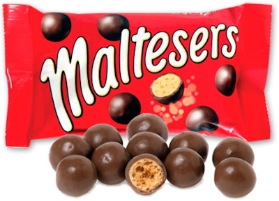
Major products in the chocolate confectionery field, such as Kit Kat or Lindor, with growth of 30% and 47% respectively during the 2010-2014 review period, or Maltesers with an even more impressive sales increase of 63% during the same period, are good examples of red packaging associated with sweet flavor.
Experiments
Experiments have repeatedly shown that red, the usual color of a can of Coke, is associated with sweetness, and this could explain Coke’s failed white can. It was designed as part of a fundraising effort for endangered polar bears but it was discontinued when people complained that Coke didn’t taste as good in it, which was just a perception, as the content was exactly the same as the regular product.
This is just one example of how important choosing the right color is and how it could explain why other brands’ sales are declining. Euromonitor International’s health and wellness data show that Diet Pepsi Twist, which also comes in a white can, has experienced a decrease in its sales from US$21 million in 2010 to US$3 million in 2015, and this may be one of the reasons.
Package design in the ‘snackification” era
Nowadays, the population is deriving a sizable proportion of its daily intake from food and drinks that are consumed directly from the package. Our packaged food data show 35% global growth in retail sales of snacks* during the review period (2010-2015), which is expected to continue to grow over 2015-2020 at a rate of 15% globally, even reaching 28% in Asia Pacific. The inclusion of all kinds of cognitive insights in the packaging design should be taken into account by companies, as these insights could help them increase sales in tandem with the “snackification” of the consumer diet. However, these findings could also be very useful for health and wellness products, as they could help to develop “sweeter” reduced-sugar products or “saltier” reduced-salt foods, which could increase acceptance of them.
*Snacks are defined as the sum of bread substitutes, packaged cakes, packaged pastries, biscuits, snack bars, confectionery, yogurt and milk products, ice cream, and sweet and savory snacks.
For further insight, contact Maria Mascaraque, Associate Health and Wellness, Euromonitor International.