The emerging shopping behaviors of millennial consumers—including product evaluation, selection, and channel preference—are having a significant impact on package design. Their interest in items that are natural, organic, and/or tied to a cause are not only driving package appearance, but also the messages conveyed. Therefore, there are a number of things you should consider when creating packages for the “green” products in demand by today’s shoppers. Following are some of these considerations:
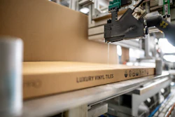
• The Principal Display Panel: Considered to be the at-shelf billboard, the front of the package—or the Principal Display Panel (PDP)—should command the most attention during the creative process. Here, graphics and text are critical for communicating the natural aspects of the product. Side panels have become the storytelling space of the green package. These panels are where you can explain your history, values, passion, and cause. And the back panel of the package, whether it includes the Drug Facts panel or a more creative ingredient listing, is the place to focus on what’s inside and how a product works. Don’t forget the top of the package, which for products placed lower on the shelf, can act as attention-grabbing ad space.
• Color: For “green” products, color is arguably the design element that gets the most discussion. Intuitively, designers lean toward natural color palettes that feature greens, golds, and browns. While these tones reflect the more organic nature of the products, traditional brand managers often struggle with their selection because they don’t pass the “five-foot test”—meaning that the more muted colors are less visible to the consumer standing at the shelf. Designers are encouraged to look at creative ways to reflect a product’s natural roots, while bringing in secondary colors to grab the consumer’s attention during product selection.
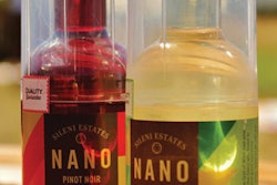
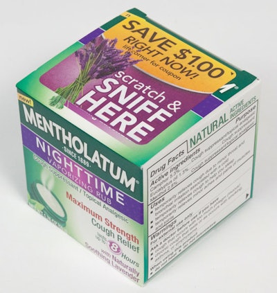
• Graphic elements: Graphic elements that convey a natural feel are being used more and more frequently. The Mentholatum Company kept this in mind during the design of its Nighttime Vaporizing Rub carton. With lavender being a key ingredient in the product, Mentholatum included images of the sprigs of the plant on the PDP as well as a scratch-and-sniff panel infused with lavender so that shoppers can experience the fragrance right in the aisle. New packaging for Zarbees Naturals, a line of dietary supplements, uses a unique design that leverages full-bleed photography of key ingredients such as honey, tea leaves, berries, and more.
• Icons: Icons also play an important role for green package design. Including the word “Natural” on a product package doesn’t guarantee that the product is natural—and the term is certainly not regulated. Consumers are actively petitioning the government to require more truth in food and product labeling. This includes phrases such as “non-GMO” and “Free Range.” Shoppers who are truly in tune with the natural and organic space know to look for icons on product packages as a quick way to determine if the contents within the package are the products for them. Most recognized—and important to feature, if applicable—is the USDA Organic logo. This, and others that can be verified, such as “Certified Vegan,” hold the most weight. Similarly, with an increasing number of people being diagnosed with sensitivity to gluten, more and more consumers are looking for the “Gluten Free” symbol on packaging. This indicates that the product is not just naturally gluten free, but that it hasn’t been subject to contamination during the manufacturing process. By monitoring its social media feeds and consumer comments, Softlips Lip Balm was able to identify that many of its customers were looking for confirmation that its products were both gluten free and cruelty free. As a result, Softlips added both of these icons during its package redesign process.
• Typography: Similar to color, typography is another style element that receives great debate in the green packaging space. The fonts and type treatments that feel most natural in their design are those that appear styled by hand or that have thinner lines. While physically attractive and authentic in their feel, these can lead to problems with readability at the shelf. If the terms “Organic” and “Natural” are critical to the brand, the type treatment should place heavy emphasis on those words in order to communicate that. It’s common for those terms to have even greater weight than a brand or even a product name. Again, designers are encouraged to take a few steps back from the shelf in order to evaluate the use of type in a manner similar to an average shopper.
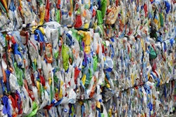
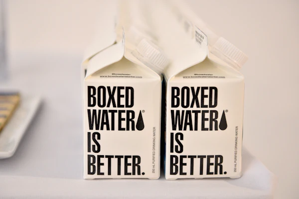
• Packaging materials: A company that manufactures green products should want to carry those values through to its packaging materials. Many believe that three factors should be considered with this type of manufacturing: Is the package recycled? Is it recyclable? or Is it reusable? While most cartons are made from paper that contains cellulose, a wood fiber, there’s a wide range of options out there. Others include bamboo, cotton, and even agricultural waste. Even with the most traditional production methods, consumers shopping for green products tend to put stock in those that use cartons containing at least some post-consumer recycled content. Manufacturers wanting to take it one step further can choose to use natural inks in the printing process. Packagers should also indicate how cartons and containers should be recycled. This should be indicated on the package for easy sorting and disposal.
Finally, there are many containers that can be reused for other purposes. While buckets, tins, and plastic containers can add to the initial price, consumers may be willing to pay a premium for a package that seems more durable and that can later be used for something else. This also holds true for containers that can be refilled with products that come in less-expensive packages. This has been the trend in skincare and infant care where cleansing wipes are now sold in soft-pack refills.
Green design for the omni-channel environment
In today’s omni-channel environment, designers need to be cognizant of where the product is going to be sold. If the answer is a health food store, an upscale grocery chain such as Trader Joe’s, or even a dedicated section in a supermarket such as the Nature’s Marketplace section created by Wegmans, there is danger of being one more product in a sea of sameness. And if that is the case, quirkiness isn’t always an answer, as you’ll find plenty of packages in this section that use bunnies, goats, and bumble bees as mascots, barns indicating “down on the farm,” and/or handwritten labels to add a homegrown feeling. In those cases, consider a bolder use of color or graphics to stand out at the shelf.
When selling green products within a traditional shelf set, it’s advisable to begin by looking at the category planogram. Get an understanding of what’s already happening in the store, particularly around shelf placement, color, and packaging claims. Know your product’s role. Is it the one natural or organic product in the mix, or will it be grouped in-kind? Is there a dominant color in the category that serves as a consumer cue, or does it present the opportunity to stand out? Consider brands such as Annie’s Homegrown that have crossed over from the natural space to the mainstream shelves at mass retailers. As Annie’s Homegrown expanded its line from cheddar snacks to frozen pizza bagels, it has retained some of its core identity elements while also picking up standard category practices, including photography, that enable the brand to compete with traditional product lines.
And as we all know, e-commerce and sites such as Amazon.com and others have been game changers in the sales environment for all products, but even more so for healthy products from smaller lines that don’t have the funding and/or infrastructure to gain national distribution. Here it becomes critical that a product’s package pass the “screen test,” meaning it can break through the clutter caused by online browsing behavior and be eye-catching, readable, and on point. Be sure to have an understanding as to whether an online shopper will only be able to view the PDP or whether other package panels will also be viewable. Realize that even with the ability to display all sides, without the ability to pick up and turn the package, only a small subset of consumers will go the extra step to investigate ingredient panels and stories.
Natural and organic ingredients, production methods, and sustainable packaging often lead to premium pricing. And while shoppers may be more price tolerant to some degree, there is a breaking point that can send a person back to the traditional solution. Therefore designers of green packaging should remain true to the mission, yet be reasonable when evaluating paper stock, unique shapes, and other design elements that can add to the beauty and appeal, yet may have a negative impact on retail prices due to increased manufacturing costs.
Overall, as loyalties to traditional brands converge with consumers’ desire to eat, use, and support “green,” and live lives of health and sustainability, we can continue to expect packaging design preferences to evolve. Staying ahead of the curve by keeping a finger on the pulse of graphics in a category, exploring opportunities to be different, and crafting the stories necessary for brand managers to buy into the overall packaging vision will benefit the designer and the product line, and will ultimately lead to selection at the shelf.
Beth VanVliet is the Director of Client Services at full-service advertising agency Martino Flynn (www.martinoflynn.com).