Color is a crucial element of brand strategy; it is the visual component that consumers remember most about a brand. That’s why color consistency across a brand is so vital. But ensuring repeatable, consistent color across brand packaging can sometimes prove a major challenge—especially when dealing with a range of substrates, package formats, print providers, and printing methods.
In late 2011, that was exactly the challenge faced by Sun Branding Solutions—a U.K.-based global brand life-cycle management agency—when it was asked by Mondelez International to manage the rebranding of its European chewing gum brands Trident, Stimerol, and Hollywood. According to Sun Branding, the refresh was the biggest cross-country branding project embarked upon by Mondelez up until that time.
The master designs for the brands were refreshed by international design agency LPK and were adapted by Sun Branding for more than 700 SKUs across 11 European countries, and across multiple packaging formats and substrates. The Stimerol brand is found in the Nordic countries, while the Hollywood gum brand is sold in France, and Trident in southern European markets such as Greece and Spain.
Says Sun Branding Business Unit Director Sue Thompson, “The scale of this project made it one of the most challenging we have managed for Mondelez, but also the most satisfying.”
Revitalizing the brands
Consistency—in both color and design—was the goal of Mondelez’ refresh of its Trident, Stimerol, and Hollywood brands in Europe and part of its strategy to revitalize the brands. “It was a massive undertaking, but an essential evolution for the brands, to bring them under a common positioning,” says Penny Thomas, Design Technology Project Manager for Mondelez.
This consistency was implemented at different levels of the design, relates Sun Branding Account Director Anne Martinet:
• All three brand logos use the same red “smile” underneath the logotype, printed in P186 (Pantone 186) red.
• Regardless of the brand, the flavors as well as the designs needed to look the same in all regions.
• Color consistency was required across a total of 30 printing machines producing primary packaging, shelf displays, and single and multipack packaging units, using lithographic, flexographic, and rotogravure printing methods across three different substrates. For example, litho and gravure were used for the paperboard packaging, while flexo and gravure were used for various types of film for multipacks. “On top of that,” says Martinet, “the SRPs [shelf-ready packages] had a blue wave on the bottom, half of which were common to all of the ranges, flavors, and brands. This was to help with the identification of products on-shelf, but as not all SRPs were printed by the same printers, we had to ensure consistency.”
At the outset of the project, Martinet says Sun Branding had pre-artwork meetings with LPK to guide them on color and print process restrictions. Once the designs were finalized, Sun Branding created color standards using the PantoneLIVE digital brand color management solution from Pantone for the key colors used in the Mondelez brand logos, SRPs, and major flavors. “All printers were required to create color draw downs that matched our standards, and we validated each draw down before production,” Martinet explains.
She adds that in addition to color standards, Sun Branding made master files that were approved by Mondelez before the rest of the formats were rolled out. All formats were then matched and validated against the approved masters.
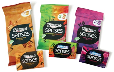
One of the most difficult designs to work with was the Senses range of fruit-flavored gums, Martinet shares. “The Senses range was the most challenging due to the complexity of the design vignettes—from green to orange, or purple to pink, and so on,” she says. “We worked closely with LPK to achieve the expected results while keeping the number of colors used to a minimum, to ensure reasonable costs.”
The skill of the print providers was key in achieving the final outcome for all the SKUs, Martinet explains: “We have good relationships with our printers, having worked with them on previous projects. For those that we were working with for the first time, we made sure that we had all their latest and up-to-date specs. Ken Birch, our Print Technologist, attended most of the first print runs in order to help the printers achieve the expected results and offer guidance. This upfront attitude toward the color standards also helped to build relationships with the printers and in turn gave us insight to their press and print results.”
Consistency achieved
The refreshed Mondelez gum brands rolled out over several months toward the end of 2012. Martinet says the scope of the project provided some significant insights for Sun Branding. “Our key learning has been to engage with the printers at an early stage and carry out the majority of color and masters work upfront before the roll out. Had we not done this, we would not have achieved such consistency. We also had a dedicated team of account managers at Sun Branding Solutions, and in particular one global account manager who managed the masters with the global marketing team and who oversaw the roll out for the brands and formats.
“This is the first pan-European project of this magnitude that we managed for Mondelez, and it is also the first project of this scale that Mondelez embarked on. It has been hugely exciting to be part of this adventure. The success of this project lies in the fact that we managed to create a great working relationship with all parties—LPK, the global Mondelez team in Zurich, Mondelez’ Penny Thomas, and the printers.
Confirms Thomas, “Sun Branding expertly managed expectations of consistency across the brand, packaging, and display units, and we are very pleased with the results.”