Aesthetically pleasing packaging is nice to look at, but it doesn’t always necessarily connect with its audience or sell product. If it did, many brands wouldn’t be losing traction in category after category at retail. In order to make effective brand-to-consumer connections—for packaging to work as an effective branding tool—the correct triggers have to be leveraged.
Package structure, imagery, color, and fonts work synergistically to appeal to consumers. But what we really need to do is to evoke positive emotions, memories, and personal context in a conscious and subconscious manner. The question is: What appeals to consumers on an emotional level, and where does that emotion come from? According to Buyology, Inc., a consultancy that helps businesses to identify, assess, and quantify consumers’ emotional triggers, “at least 85% of human decisions are governed by the non-conscious.”
In spite of this, many companies continue to use brand communication to appeal to reasoning by listing features and benefits on packaging. Since most decision-making is being made in the subconscious, marketers can’t know which triggers to develop until research has been done to dig more deeply into the complexity of the consumer psyche to unearth this information. This isn’t a matter of simply delivering the brand communication that the marketer and their design partners think are central to the brand in consumers’ eyes, but to research what, in fact, their associations truly are.
How do they feel about the brand? Which of its attributes matter most to them? What is unique or most satisfying that consumers can’t find in any other brand? What is most memorable, pleasant, and satisfying in their interactions with the brand? Getting to the heart of the brand by answering these questions helps to guide design teams to the most effective package design solutions. The revelations obtained can be surprising and not all expected.
Digging deeper into the subconscious
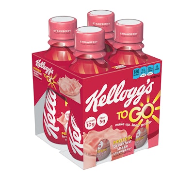
I’ve always said: To consumers, the package is the most tangible representation of the brand. Marketers should not make the mistake of using packaging to sell products. Packaging should sell the brand instead. There are too many products competing in the marketplace in every conceivable category. Packaging must, instead, make the brand the most desirable among its peers to sell products. For example, package structure should refer to product and brand in a simply understood, concrete manner. It’s no accident that lower-calorie food offerings are being presented in smaller, slimmer packaging. Kellogg’s Smart Start cereal and its To-Go Breakfast Shakes offer perfect examples. Listerine mouthwash packaging was revamped in the barbell shape to indicate its power to cleanse and freshen the mouth. Febreze Sleep Serenity bedroom refresher products are aimed at helping consumers relax, unwind, and sleep better. Packaging depicting lavender, jasmine, or milk and honey evoke age-old memories of comfort, tranquility, and peaceful sleep. Aren’t these subliminal brand messages aimed at the consumer the most effective brand communication?
Domino Sugar didn’t replace its ubiquitous 5-lb bag, a staple in American households for a century, but it did offer a 4-lb resealable tub for consumers who wished to avoid countertop spills. Additional consumer insights led the company to offer a new, easy-pour, easy-to-hold 12-oz carafe that is attractive enough to be used at the table without any mess at all. The sparkling sugar crystals can be seen inside thanks to a new shrink label that doesn’t cover the entire package. The shrink label itself appears as a swirl, since research divulged that consumers enjoy stirring sugar and have long-term memories associated with the pleasant aspects of using and enjoying sugar’s sweetness.
Since sugar is a commodity item that consumers can purchase at lower prices, Domino’s smart packaging concepts ensure that the brand will continue to be relevant to consumers and that the brand will be perceived as delivering emotional satisfaction, hence more value, than its competitors. Isn’t that what packaging can and should do when leveraged in an optimal manner?
Think of the massive display of bottles and labels in wine shops and liquor stores. How to stand apart? Beautiful labels that incorporate unique imagery and typography aren’t effective by themselves. Understanding the brand’s core constituency can reveal how to package most effectively; how to speak to the brand’s fans and hit all of the right emotional notes.
Knob Creek Kentucky Bourbon bottles are broad-shouldered and feature labels with a strong, masculine font since its audience chiefly comprises adult males. But that isn’t all. The packaging points to the brand’s heritage, best explained on the company website: “Our squat, apothecary-like bottle was fashioned after the turn-of-the century bourbon bottle sold throughout Kentucky. The label is inspired by the decades-old custom of wrapping finished bottles in newspaper at the distillery.”
The labels themselves tell the all-important brand story. For brand communication, short phrases serve the purpose best, and they are masterfully presented on the Knob Creek label: “Kentucky straight bourbon whiskey,” “small batch,” “patiently crafted,” and “aged nine years.” On the side of the label, copy reads: “Hand-crafted in limited quantity for superior taste and smoothness.” The company website reinforces the fact that Knob Creek has been made this way since before Prohibition (why mess with success?). The brand story and the family that famously started the company appear on the site. When every element of a brand works in a cohesive manner like this, and packaging carries the story forward, it’s deeply meaningful to its fans and more likely to attract many new ones.
Children’s packaging that engages the senses
Children respond to emotional cues more than adults do. Yet it’s more challenging to reach kids than adults when they’re easily distracted by limitless options. Engaging their senses and offering tactile sensations encourages kids’ interaction with packaging at a deeper level when they’re confronted by a plethora of busily packaged products in toy aisles.
Interestingly, toy brands that make their products highly interactive and package them in a unique manner resonate with kids so much that they make it to the top of kids’ holiday wish lists. Fisher Price Imaginext toys are packaged to surprise and delight—promising interactive play. The Batcave playset promises action-packed adventures, and what’s cooler than being able to see the gadget-filled, underground lair of Batman and Robin? Package structure is unique and shows the entire toy, which is designed with outlines of bat ears on its structure, reinforced by figures of Batman and Robin. The DC Super Friends brand identity is superimposed on a poised-for-action Batman, and the Fisher Price logo appears on the lower right of the package. Even better: A free Imaginext Batcave app used in conjunction with the Batcave brings play up a notch with interactive fun on an iPhone screen!
Playskool’s Sesame Street Big Hugs Elmo promises interaction of a different kind for toddlers and preschoolers. The package structure design features a large window with the photo of a child who appears to be hugging the Elmo toy inside of the package. Any child seeing this will have an immediate, emotional response. Brand communication is limited to three visuals depicting how Elmo hugs a child back, how he talks using numerous phrases, and how he sings a lullaby when lying beside a child for a nap or for the night. How wonderful is that?
The Sesame Street brand identity appears in the upper left-hand corner of the package; the Big Hugs Elmo descriptor along with the lovable red, fuzzy character’s face on the bottom left-hand corner. No other brand communication appears, because it isn’t needed. This packaging is guaranteed to make an instantaneous brand connection with children—and their parents.
Mattel brings the latest family member of the Disney Princess brand to life with the Sofia the First doll. Young girls will immediately identify Sofia in her soft purple dress and tiara, surrounded by her animal friends in the forest. The package structure allows Sofia and the animals to be fully visible; an invitation to “Try Me” will have numerous girls doing just that. An illustration depicting Sofia the First wearing her tiara, which appears next to the Sophia the First brand identity encircled by the tiara, reinforces and is consistent with the Disney Princess brand.
The Disney logo appears on the upper right-hand side of the package; a scroll exhorting kids to “Be Kind to Animals” is right below it. The Mattel brand identity appears on the bottom lower right next to simple brand communication: “Talking Sofia and Animal Friends.” Everything about this brand packaging is engaging for its target audience, because it enchants little girls’ hearts.
Children’s product packaging that invites them to see, touch, and interact stands head and shoulders above the expected and the usual. It surprises and delights; it appeals to children in an emotional manner. The same is true for adult brand packaging. Confronted by a myriad of products on the shelf, and only a few seconds to scan and decide whether to even interact with packaging, how important is it for brand owners to make a meaningful appeal to the subconscious minds of consumers?
Ted Mininni is President of Design Force, Inc. He can be reached at 856/810-2277.