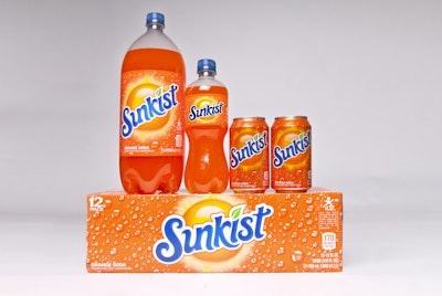
CBX, a brand agency based in New York City, recently collaborated with Dr Pepper Snapple Group to refresh the packaging graphics for Sunkist® Soda, the number-one orange soda brand. Introduced in 1978, Sunkist Soda was once known for its California style.
Prior to engaging CBX, Dr Pepper Snapple Group recognized an opportunity to reposition the Sunkist Soda brand, going back to its “fun in the sun” roots and targeting teens with a bull’s-eye age of 16 years, in order to better differentiate from competitors within the orange segment. There was then the opportunity to better align the packaging graphics with the revised brand positioning – “Sunkist Soda lets you shine.” CBX was engaged for this challenge.
“Since 2008, our packaging has been missing the original sun graphic, an equity that has been present for much of the brand’s history. Without it, we lost a connection to our California beach story and lacked differentiation within the orange segment,” said Eric Blackwood, Director of Brand Marketing, Core Flavored Soft Drinks at Dr Pepper Snapple Group.
With this in mind, the CBX team worked with Dr Pepper Snapple Group to determine the visual opportunity areas for Sunkist Soda. “The sun graphic provided us with a great platform for expressing the brand. Our opportunity was to visually express the idea of ’liquid sunshine’ – it was all about harnessing the positivity and vitality we associate with the sun and using that energy to gain relevancy with our target,” said Satoru Wakeshima, CBX General Manager.
The design solution – the playful script brandmark was refined to capture a California surf vibe, and fresh flavor colors were introduced to give the package a sun-like glow. The reintroduction of a vibrant sun and refreshing condensation convey summer beach energy. By reversing the blue and white brand colors, and staging the logo right on the sun, CBX helped Sunkist Soda embody "liquid sunshine" and stand out on the shelf.