For global healthcare products provider A.R. Medicom, Inc., of Montreal, Quebec Canada, 2013 was a banner year. Not only was it the 25th anniversary of the entrepreneurial-minded company, but it was also the year in which Medicom rolled out an enormously successful new global brand identity that united its myriad sub-brands and strengthened its leadership position in the category of infection control products.
The year-long project involved taking the brand from a collection of disparate package designs and brand presentations for thousands of SKUs across a global network and bringing it under a single, logical, and consistent design architecture—guided by Medicom and carried out by brand consultancy Spring Design Partners.
Says Medicom Marketing Director Gayle Padvaiskas, “The greatest brands in the world show up with consistency around the world, and they are instantly recognizable. The redesign presented us with an opportunity to have an impact on our global brand and for our organization to be recognized no matter where our customers are in the world.”
Other advantages of the redesign included product differentiation within the category, a streamlined process for creating package designs for new products, and a compelling story to tell customers about the values surrounding the brand.
An inconsistent strategy
Medicom’s origins date back to 1988, when the World Health Organization mandated certain precautions in the management of patients infected with HIV. Seeing an opportunity in the market, then 22-year-old Medicom founder Ronald Reuben introduced the SafeTouch glove, sourced from an outside supplier, to protect healthcare workers from the HIV virus. From there, Medicom expanded into other infection control products—including masks, nonwovens, and sterilization products, among others—many under the “Safe” sub-brand (e.g., SafeMask, SafeBasics, SafeGauze, etc.).
Over the years, Reuben partnered with other business owners and entrepreneurs, establishing a global network of more than 50 countries. In 1998, Medicom established its first manufacturing facility in the U.S., and now has manufacturing operations in Asia and Europe as well. Serving the medical, dental, industrial, veterinary, and laboratory markets, Medicom’s products are sold through distributors such as Henry Schein Dental, Patterson Dental, Sinclair Dental, and Medicom sister company AMD Ritmed.
According to Padvaiskas, because of the opportunistic way in which Medicom’s product portfolio grew and because of the varying strategies of the network partners, after 20-plus years, the brand lacked cohesiveness. “The partners all kind of worked together in a network, but part of the problem with working in a network is not having a certain natural brand ownership and even natural marketing,” she says. “The way the company evolved, it wasn’t like having a brand and then branching out into other opportunities. The opportunities basically became the brand. So part of the disconnect in terms of the way some of the brands grew up is there wasn’t a logical, cohesive approach.”
Padvaiskas says her mandate when she joined the company in 2010 was to bring cohesiveness and consistency to the brand. “If you look at how the packaging was before, there was no logical laddering or treatment of the mother brand,” she says. While the Medicom logo was the same on most packages, the size, placement, and color varied from sub-brand to sub-brand. In addition, each sub-brand had its own system of fonts, colors, and graphics.
Because of this, Padvaiskas adds, some sub-brands—for example, SafeMask in Canada—became stronger than the Medicom brand itself. “When we started to look at it more strategically and ask, ‘How does each of the sub-brands inform the mother brand, and what is the relationship in terms of the graphic approach?,’ we saw so much inconsistency. And over time, even the Medicom brand had changed, with different icons and different attempts at making it more ownable and consistent. But there wasn’t any attempt to standardize or set guidelines.”
Therefore, the goal of the design project—and the challenge given Spring Design Partners—was multifaceted:
• To halo the strength of the Medicom master brand to the sub-brands through an architecture that united the portfolio
• To bring logic to the portfolio to add efficiency and scale
• To reflect Medicom’s points of difference
• To position Medicom as a “best in class” global brand
While Padvaiskas says Medicom did not want to lose any equity from its existing visual identity, it kept the design brief very open. “We felt there was some brand equity that had been built up in terms of color and some fonts, but we knew it wasn’t consistent, it wasn’t ownable, and it wasn’t necessarily differentiating,” she says. “So we were very open to changing color and to the introduction of an icon. We said we wanted to keep some of the logic in the naming structures, but beyond that, we kept the design brief quite open.”
Translating values to visuals
Creating the visual identity for any brand is a complex process, involving a thorough understanding of the brand’s message, its target audience, the environment in which it will be viewed, the competitive landscape, and other considerations. For Medicom, that challenge was further complicated by the vast number of sub-brands and SKUs that had been developed independent of one another, the variety of package types and materials used for the brand—paperboard cartons, film pouches, and rigid plastic containers, for example—and the fact that the products are sold business-to-business, not on a retail shelf.
But Spring Design Partners was undaunted. “When we looked at the category, we saw an incredible opportunity,” says Vice President of Strategy for the company Meghan Labot. “It is not uncommon for B2B brands and even pharmaceutical brands to take a more organic approach to packaging. It is not something that’s traditionally invested in; it serves its function. And then 25 years later, you have a massive portfolio with a lot of inconsistencies. When you couple that with a category such as this one, where everyone has been taking a very similar approach, it presents a great opportunity.”
To get a sense of the competition and what they stood for, Spring Design Partners first mapped the brands on a spectrum “from being very personable to being very efficacious and clinical,” explains Labot. “Everyone was playing in the same wheelhouse, but no one was breaking through, and it had a lot to do with the fact that this is a B2B category.”
Padvaiskas says Medicom wanted to end up with its brand identity somewhere in the middle of that spectrum: “We wanted to be seen as innovative, but we’re still a healthcare company, so it’s about consistency, security, and trust.”
To learn how Medicom viewed itself and to translate that into a visual identity, Spring Design Partners employed its proprietary design methodology, Design Insight™. As Labot explains, Design Insight is a way to uncover the visual implications of an idea and then identify design elements and principles that align with that idea. “We wanted to use Design Insight to really understand what Medicom stood for, what made the relationship they had with their customers and consumers special, and what made it different from other brands within the category,” she says.
Through work sessions with Medicom team members, Spring Design Partners identified the defining attributes of the brand as quality, trust, pride, and relationships. From there, the team did some visualization around those words to understand what they meant and how they could be translated into design principles and elements to guide the visual strategy for Medicom. Three three key principles emerged: simplicity, scale, and movement.
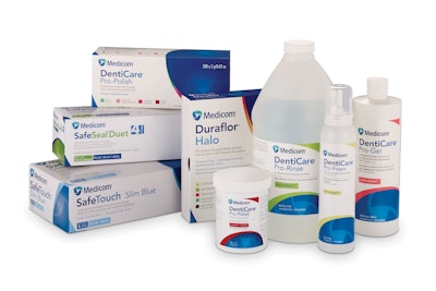
Beginning with the logo, Spring Design Partners moved from a slanted, blue typeface in all capital letters to an upper and lower case font coupled with a “shield” icon, or interlocking knot, in shades of blue and teal. As Erica Johnstone, Design Director for Spring Design Partners, explains, color played a key role in the design of the logo. “We know that the color blue is something that is familiar within the category, and familiar to the medical world in general, but we had to make it ownable for Medicom.” This was done, she says, by infusing teal colorations along with the Medicom blue to bring about “a sense of vitality and life and identity.”
The three-part knot provides balance and signifies the three core corporate values of trust, pride, and quality. The typeface for the Medicom name has been made more approachable through the use of upper and lower case letters, which Labot says symbolizes the strength of Medicom’s relationships with its partners and customers.
In the design hierarchy, the Medicom logo is the first design element, appearing at the top of a package. The sub-brand copy appears directly underneath the Medicom logo. Then, in a smaller, grey typeface, are product-specific details. All the information appears against a white background, designed almost as a “swoop,” with a small triangle in one corner, and approximately one-third of the opposite corner in a block of blue, overlaid with a transparent image of the Medicom icon.
“The white background, which holds all of the information, is very dynamic and smooth, and speaks to the gentle nature, or the relationship, between the consumer and the products themselves,” says Johnstone.
Each sub-brand uses a different tonality of the Medicom blue, sampled from the shield icon. For example, DentiCare uses a richer tone of blue, while SafeBasics is a lighter shade. This differentiating color is also used in the second half of the sub-brand name; so the “Basics” copy in SafeBasics is the same lighter shade of blue, while “Safe” is the Medicom blue. Different “flavor” varieties within a sub-brand use colors such as red, pink or green, which is used as a second arch next to the blue background.
“Even though it may not be automatically visible to the consumer,” says Johnstone, “we really took a look at every single element and were very decisive about what they meant to the Medicom brand.”
Simplicity allows scalability
One critical aspect of the new package design was that it needed to be simple enough and flexible enough to allow for sub-brand variations, such as the need for multiple languages or regional differences. For this, Spring Design Partners created the white space on the package, with an organized structure for presenting product specifics. “You will notice that all of the information, while it may be different, is held within that white space,” says Labot. “That’s something we have been able to keep consistent throughout the package design.”
The organized, logical design architecture serves another purpose as well: It allows Medicom’s in-house graphics department to easily create package graphics for brand extensions by eliminating subjectivity. According to Padvaiskas, this has resulted in an incredible number of efficiencies for Medicom as an organization.
The simplicity of the design was also tailored to accommodate the multiple package types and materials used by Medicom, and the printing processes required for each—a delicate balance, says Labot, as the design still needs to have the beauty and communicative value of a brand that uses only a single packaging material. “You want it to be able to scale across a lot of different structures and substrates, but you don’t want the design to look as though it’s been ‘dumbed down,’” she says.
To ensure brand consistency across multiple printing technologies, Medicom’s Graphics Supervisor, James Melo, created a color-match card for the company’s print providers.
Design as competitive advantage
Medicom revealed its new brand identity at the International Dental Show in spring 2013 in Cologne, Germany. The unveiling, says Padvaiskas, was positioned as part of a story as opposed to just a look. “We unveiled it in the context of the strategy behind it, what the logo stood for, what the icon represented, and our global values and network, and how it all comes together,” she says.
The response, Padvaiskas adds, has been “absolutely fantastic,” especially in cases where Medicom has been able to explain to its customers the rationale behind the new identity in terms of the company’s values and strategy.
The success of Medicom’s rebranding, Labot says, points to the tremendous opportunities that exist for B2B and healthcare brands to leverage design as a competitive advantage in categories where packaging typically doesn’t play a role. “Design isn’t exclusive to consumer brands,” she says. “Brands are the relationship between a product and a person. That applies to any category, including B2B, which really hasn’t looked at design that way in the past.
“If you think about healthcare products, this is a category that literally saves people’s lives. It has a very strong emotional role within their lives. Yet traditionally, these brands don’t necessarily think about the doctor or the patient as a consumer. But if you’re asking a patient to put their lives in the hands of these brands, you owe it to them to demonstrate that your products are about quality, which translates to safety. This isn’t usually the case, however, with package design for healthcare brands. That’s why we are so proud of Medicom for leading the way.”