How do you take an award-winning package and make it better? That was the dilemma facing Florham Park, NJ-based Ciao Bella Gelato in 2009, when it sought to redesign the graphics for its 16-oz ice-cream containers for greater consumer appeal. Artwork for the intensely flavored, all-natural line of gelatos and sorbets was originally created in 2000 by Wallace Church, a New York City branding firm that subsequently won design awards for its bold vision for the brand.
But as Ciao Bella discovered over the next nine years, beautiful, bold artwork does not always translate into product sales. Explains Deborah Holt, vice president of marketing and natural sales for Ciao Bella, “Our challenge was that while the package looked great on the shelf, it wasn’t necessarily selling the gelato and sorbet.”
To take its packaging to the next level, Ciao Bella and design firm Interact On Shelf employed a unique innovation technology from Affinnova, Inc. that allowed them to test a virtually limitless number of concept variations—6.7 million, to be exact—with current and potential consumers to identify the top concepts. The resulting design, which combines the bold, color-drenched brand equity of Ciao Bella with new elements that assist consumers in picking the product up off the shelf, has been shown to outperform the former design by 65%.
Bright, colorful brand is born
Ciao Bella began as a gelato shop in 1983 in the Little Italy neighborhood of New York City, serving gelato and sorbet in unique, intense flavors made from pure ingredients. As its frozen specialties gained in popularity, Ciao Bella expanded to provide its product in bulk to area restaurants and eventually in pint containers to small, local boutique and specialty food stores. Holt describes the packaging for Ciao Bella’s initial retail offering as “very artisanal-looking,” and “not flavor-specific.”
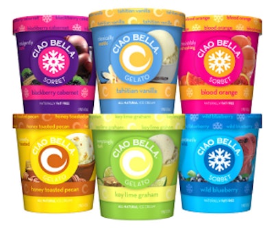
In 2000, Ciao Bella hired Wallace Church to develop a brand logo and packaging that could convey the flavorful essence of the product. The result was a design that used bold color blocking, with each flavor variety identified by two contrasting colors: for example, blue and gold for Tahitian Vanilla Gelato, pink and orange for Blood Orange Sorbet, and pink and purple for Blackberry Cabernet Sorbet. Swirl and snowflake icons were developed to indicate whether a product was gelato or sorbet, respectively. The icons were placed prominently on the front of the pack, “in a very sort of pop, Andy Warhol tradition,” says Holt.
“At the time, there was not a lot of color in the freezers,” Holt adds. “So it was something different from what anyone else had done on the freezer shelf. It was very bright, fun, and colorful. It became the Ciao Bella brand.”
Beautiful but not compelling
Visually arresting, Ciao Bella’s bold new brand identity helped propel the company’s growth in the 2000s, launching the product into grocery and specialty food stores nationwide. With national distribution, however, came the challenge of marketing the product against major ice-cream brands with greater promotional dollars, and with more support and distribution.
In 2009, Ciao Bella realized the need to enhance its package graphics to provide greater cues to the consumer about the product and to combat the challenge of having the product displayed behind a freezer door. “Your product is on a shelf behind a door,” says Holt. “People don’t necessarily just pick it up the way they would pick up shampoo or soup when they are walking down the aisle.”
One of the biggest drawbacks of the existing package design was that it did not clearly identify the product type and flavor. With gelato and sorbet indicated only by the graphic icon on the front of the pack, unless a consumer was familiar with the brand, they could not distinguish one from another. In addition, while the package colors were eye-catching, they did not necessarily have any meaning when it came to the flavor.
Therefore, the debate within Ciao Bella became how to redesign the packaging in such a way as to help consumers know what they were purchasing, while at the same time preserve the bright-colored packaging the company had built its brand on.
To resolve the debate, Ciao Bella worked with Interact On Shelf to develop new design elements, including ingredient and product imagery, that provided fodder for a collaborative innovation process driven by Affinnova’s IDDEA II and Discrete Choice methodologies. As Affinnova’s chief marketing officer Jeffrey Henning explains, Affinnova’s technology is inspired by the life sciences and uses genetic algorithms, or a “survival of the fittest” model, to poll consumers to identify the top concepts from virtually any size test field.
“We encourage our clients to think about all of the components of their ideas, and break them down,” says Henning. “So for example, you might have a new product where you have 10 ideas for a name, 10 ideas for a slogan, and 10 ideas for an illustration. That comes to a thousand ideas when you do the math—far more than you can test with traditional testing techniques.”
Through Affinnova’s online test methodology, elements are drawn from the innovation space and are combined into four possible designs, or choices. “We then have consumers basically do something very natural that they do whenever they go to the store, which is look at what is available, and pick one,” says Henning. When a consumer picks a design, the software remembers the attributes of that design. In the next set of four choices, it uses those preferred attributes, along with the attributes selected by other consumers taking the survey. In all, the consumer is asked to view 12 to 16 sets of choices. “So what happens over the course of 450 interviews is that we quickly find those ideas that have the greatest appeal,” explains Henning.
Holt says that Ciao Bella began the process with an open mind. “We were very open to see where it would take us,” she says. Among the variables tested were the size and placement of the swirl and snowflake icons, the location and size of the fonts for the product name, and the way in which the flavors were represented. The only element Ciao Bella was not willing to compromise on was color.
For the IDDEA II process, Interact On Shelf provided Affinnova with all of the elements to be tested—referred to as the content matrix. “They had five different graphics that they wanted to use, some that were symbols and some that were the actual product,” recalls Henning. “They had different fonts that they felt reflected their brand. They had a background color and a color palette. Then they had different slogans in terms of emphasizing that the product is all natural or ultra premium.”
The process polled 427 respondents, both existing and potential customers, and vetted 27,000 concepts from a total of 6.7 million possible combinations. According to Holt, the resulting concepts provided new ways of thinking about the design, but took some Ciao Bella shareholders too far outside their comfort zone, with one design eliminating the swirl and snowflake icons altogether in favor of a product shot.
Fine-tuning required
In order to rein the design back in, Ciao Bella next employed Affinnova’s Discrete Process methodology, which allowed them to evaluate a defined number of concepts through the same consumer testing method, but with the design elements remaining in a fixed position. “We took the findings from IDDEA II that consumers liked the ‘all natural’ wording, they liked the word ‘gelato’ bigger, they liked the flavor large and in a certain location,” says Holt. “Then we went back to our design agency and said we wanted to incorporate more product shots into the packaging, but it couldn’t be in the center of the packaging.”
During Discrete Process testing, Ciao Bella used the top concepts revealed by IDDEA II, and experimented with product imagery positioned in different locations in relation to the icon.
The last step in the Affinnova process was active benchmarking, where the two best design concepts were tested against the competition, as well as against Ciao Bella’s existing design. Says Holt, “Both of our top concepts performed equally well under this process, outperforming the current package by 65 percent.” Furthermore, both new concepts were also more preferred by consumers of rival sorbet and gelato companies.
The final design is one that preserves the Ciao Bella color and icon brand equities, while adding imagery of the product ingredients, as well as the gelato or sorbet behind a redesigned circular Ciao Bella logo in the center of the pack. The new logo now includes wording that identifies the product as sorbet or gelato. Also prominent is the flavor descriptor, which is indicated in a colored band near the bottom of the pack. Copy on the edge of the lid, interspersed with swirl or snowflake icons, also provides flavor information.
“The changes just make the package more consumer-friendly,” says Holt. “Some consumers may say the design is a little less artisanal, and a little more mainstream, but what we found was that we really needed the consumer to know what they were purchasing.”
A successful restaging
The new packaging was rolled out slowly through 2010, increasing Ciao Bella’s existing base business, as well as growing new business for the company. “Our goal in the design process was to get the consumer to say that they would be willing to try our product,” says Holt. “We knew based on other research we had done that once they tried Ciao Bella, they were more likely to buy it because of the high quality.”
Of the Affinnova design process, Holt praises both its inherent subjectivity, as well as its ability to stimulate new thinking about a brand. “With Affinnova, we successfully resolved the subjective debate around a package change by incorporating consumer feedback when testing each design.
“The process allows you to test things that you are not even thinking about testing. It becomes unexpected. It takes you a little outside of your comfort zone, but I think that’s where you end up with a great package. It challenges everybody to think a little differently.”