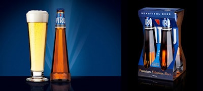
Viru: striking structure, minimal labeling, in and out of the four-pack.
For my role as a panelist in Beverage Roundtable Episode Two: Craft Beermania, I chose Viru beer, an ale brewed in Estonia and owned by U.K.-based Baltic Beer Co., Ltd. I chose this product not because the design originated with my firm (it didn't) but because its approach to structure and labeling present a compelling design that disrupts category cues. This package design did, however, inform our own execution of a New York-based microbrew, as you'll see.
In my analysis, the craft beer category seems to follow one of four very specific “visual codes,” or sets of category cues:
• Employing strong “hand crafted/hand created” graphics (i.e. Magic Hat, see attached),
• Highlighting a sense of place or origin (i.e. Sierra Nevada, see attached),
• Using a sense of whimsy, irreverence, fun (i.e. Big Hoppy Monster)
• Evoking a sense of heraldry, as many European and Asian craft beers do, when they rely on crests and shields to imply their heritage (i.e. Beck’s, London Pride, Kirin, etc. )
Many of these brands use traditional stock bottles with their heavy, rounded body, pronounced shoulders and short necks. The overall impression is generic; nondescript. These bottles provide no unique “hand feel” or engagement when used. Many of these brands also use highly ornate backgrounds, flourished typefaces and very busy graphics.
My guess is that they are all use these strategies as a meaningful differentiation from the strongly iconographic images of mass brands like Bud, Miller, etc. However, what results is a “sea of sameness” on the shelf or on premise. Few craft brands have successfully used structure and graphics to elevate the brand experience and drive a premium or super premium expression. Viru does this well. It disrupts category cues by creating a most relevant and compelling brand message justifying its premium price and targeting is sophisticated and discerning consumer.
Distinctive Structure
The most immediate visual cue that creates this brand’s unique appearance both on premise or at retail is its highly sculpted bottle shape. This elegant bottle takes cues from super premium liquors such as St-Germain liqueur as well as campaigns. By streamlining the bottle dimension and eliminating the traditional “shoulders,” the neck is dramatically stretched and the bottle is significantly taller, more slender, more elegant... more premium. In the case of Viru, the bottle height also encourages retailers to merchandise it on the top shelf. The strong base provides a sense of stability as it also allows for filling and operations efficiencies during bottling. The scalloped details and debossed icon are additional cues of premium and still highly crafted distinction.
Hyper Simplified Graphics
By eliminating the traditional label and moving all graphics to the elegant necker, this identity again breaks tradition and results in a distinctive impression. This strategy could only work for a brand that has such a short name, but again, Viru is leveraging all of its distinctive assets to result in a proprietary brand perception.
Leveraging its iconic shape in a four-pack
The secondary package configuration again echoes the brand’s distinction. Firstly being only a four pack (vs. the traditional 6 pack) creates a feeling of elite prestige. Allowing almost the entire bottle to be seen, this structure further differentiates and elevates this brand experience at retail.
Creating a custom glass
The on-premise brand experience is equally unique. The product is currently only available at select bars and restaurants. As with many European beers, this brand created a custom glass that only this product is to be served in. The glass mirrors the bottle’s proprietary shape and perfectly complements the brand experience.
The Brand message: 'Beautiful beer'
This brand’s marketing tagline, "Beautiful beer," is as distinctive and relevant as the package itself. In fact, my guess is that the brand strategy was to craft a package that so effectively evokes this brand experience that the brand could literally own this compelling message. Beautiful beer indeed!
Glas Beer: Putting the lessons to use
Wallace Church recently applied similarly disruptive design techniques in developing the graphic and structure of a new, ultra sophisticated Manhattan gastro-pub’s microbrew, Glas. Here, the clear glass substrate allows the product to be the hero with it’s warm amber color shining through. The slender body is accented with an inset impression that acts as the staging area for the beer segment name, and provides a unique hand feel. The debossed G insignia adds a touch of crafted detail. The shoulders slope to a slightly wider neck and a larger opening which allows for a perfect pour. The cap is shrouded with a paper label that suggests small batch customization. What results is a simple, clean departure from the expected and a distinctive voice for an elegant, premium product.
In addition to this EXTRA commentary, Wallace is also featured in a short video EXTRA.
For more insight, (re)view the Craft beermania! episode of Beverage Roundtable.