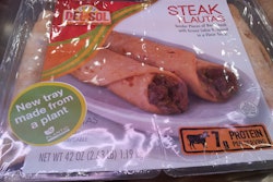
Tray packs promote tomatoes as nutritious ‘candy’ for kids
Mastronardi Produce Ltd., Kingsville, Ontario, Canada, is one of the largest greenhouse companies in North America. Under the SUNSET® brand, the company provides gourmet tomatoes, peppers, and cucumbers year-round. With an interest in promoting the nutritional value of fresh produce and making these products more appealing to kids, Mastronardi developed a novel, on-the-go snack and lunch-box packaging option for cherry tomatoes. The company’s SUNSET® Kidz™ MiMi™ “candy” tomatoes are packaged in clear-plastic, single-serving trays made of recyclable PETE and hold 3-oz volumes of cherry tomatoes. The contours of the small trays allow them to fit into a small hand for easy portability. The trays are sealed with breathable, tear-away, clear lidding film. Mastronardi Produce also markets the single-serve trays in eight-count club-pack paperboard cartons.
Campbell Soup to pack its soups in contemporary pouches
To heat up sales in a flagging category, Campbell Soup Co. will be launching a range of new products later this year in striking, contemporary packages whose development has been fueled by consumer insights and aligned with what Campbell describes as the New American Family—nontraditional, multigenerational, single-parent, and multicultural. Though by no means abandoning its iconic soup in cans, this year the company will be introducing new packages, including microwavable pouches for its Campbell’s Go! Soup line, which will launch with five to six varieties in a broad range of distinctive global flavors, such as Coconut Curry and Moroccan Chicken.
Clever combo kit extends Kraft cheese's reach
Convenience, taste, and freshness are the key qualities emphasized in packaging for Kraft Food’s new line of Fresh Take meal solutions in six varieties. Fresh Take is a line of two-ingredient meal kits containing a special blend of Kraft Natural cheeses and seasoned breadcrumbs, that when added to poultry, meat, or fish, create a six-serving entrée in just five minutes. The Fresh Take line was introduced at retail in early 2012 in the shredded cheese section. To catch consumers’ eye in this cluttered category, packaging consists of a two-compartment film pouch that transforms into a “mixing bowl,” held in a die-cut, peg-hooked paperboard sleeve with vibrant graphics and food photography. “Hero photography grabs attention, while the hand-tooled logo reinforces the ‘you make it fresh’ benefits,” says the design firm. Copy reinforces the ease of preparation with “Mix, Coat, Bake” emblazoned across the front panel.
ConAgra pops up snacking bowl for Redenbacher brand
Orville Redenbacher’s Popcorn Pop Up Bowl from ConAgra Foods is a significant improvement over the traditional paper microwave popcorn package format, allowing new usage occasions by providing improved utility for the user. The patent-pending design delivers to consumers a microwave popcorn package that transforms into a stable, wide-mouth bowl that can be shared and used on the go without spilling. According to the Flexible Packaging Association, the package is the most complex lamination ever produced for
high-volume microwave popcorn packages.
Moroccan colors, patterns inspire custom brand icon
A stylized red bell-pepper design influenced by Moroccan tile patterns and shapes serves as the brand icon for the debut product from Casablanca Foods of New York City. Launched in spring 2011, Mina Harissa is based on traditional Moroccan harissa red pepper sauce, but has been crafted to the unique taste and style of the founder’s mother, Mina. The condiment’s six key ingredients—red pepper, chili pepper, garlic, salt, oil, and vinegar—are cleverly represented in the icon, which serves as the main graphic element of the new product’s packaging. Explaining the origin of the bell-pepper icon, the designer says: “When a red bell pepper is cut in half width-ways, it forms a rounded, almost floral outer shape similar to that found in traditional Moroccan tile patterns. …Four chili peppers form the cross, and in between each is a clove of garlic. In the center of the icon, there are four dots representing salt, and the four droplet shapes inside each curve represent oil and vinegar.”
Mushroom Sauté in molded fiber tray
A new 7-oz heat-and-serve mushroom sauté product from To-Jo Mushrooms contains washed, pre-cleaned, fresh mushroom slices along with a Grade A butter pad with all-natural seasonings. “Consumers are looking for convenience as well as freshness,” says Paul Frederic, senior vice president of sales and marketing for To-Jo Mushrooms. “Preparation is quick and easy. Simply remove the film from the tray and microwave. The result is perfectly cooked fresh mushrooms in a delicious savory sauce in less than four minutes.” Packaging is made from a molded fiber with a PET lamination. The trays maintain their integrity throughout the cooking process and are easy to handle while hot. The material rigidity along with the PET lamination makes the tray impervious to moisture, allowing the use of washed or pre-cleaned mushrooms that have higher moisture content. The film barrier reduces the potential of pathogen growth as moisture migration into the package is prevented.
Resealable carton debuts for sugar
Plantation® brand natural “raw” sugar has become the first product to go to market in the new resealable carton format. Plantation says it chose the package because it alters the packaging landscape on the shelf, ensuring their product will stand out among traditional pouch packs in the “natural sugars” segment. The package is a poly-coated paperboard carton incorporating an attached flexible film header containing a zipper closure solution. The package eliminates the need to use clips or to transfer contents into a separate container, keeping marketing messages in front of the consumer through the last use.
Nutrition 'keys' are central to Meals to Live meal packaging
One look at the eight frozen Meals To Live entrees makes it clear that packaging graphics are instrumental in singing out to consumers interested in making healthy meal choices. Individual tabs on the outer carton are clearly printed with “nutrition keys” that list each meal’s amount of calories, saturated fat, sodium, sugars, fiber, and protein. Italicized graphics indicate other healthy choices, such as no preservatives, gluten free, 0g trans fat, etc. The single-portioned 9-oz entrees were launched in September 2010 to serve the growing number of diabetic consumers. Meals to Live worked with consumers and various health groups to develop packaging for the frozen meal line. Consumer feedback indicated that finding amounts of calories, sugars, etc., on printed packaging was often a time-consuming process. Support-group feedback suggested putting the vital nutritional information on the front of the carton so that aging eyes didn’t have to struggle to read such details. A nutritional facts box is printed on the back of the carton along with preparation instructions.
Bold colors, photorealistic imagery distinguish new baby yogurt packs
Hain Celestial’s 25-year-old Earth’s Best baby food brand is marketed as delivering the highest level of purity and freshness, “to ensure that babies can grow up healthy and strong.” In developing a package design approach for the company’s new line of Organic Baby Yogurt in four flavors, the design firm was challenged to create graphic imagery that could leverage the inherent equities of the Earth’s Best franchise, strongly communicate flavor, and differentiate the product from other baby and toddler yogurt brands. Elements carried over from the puree packs include the use of bold color cues to differentiate flavors, photorealistic imagery of fresh fruits, and a baby illustration that helps quickly define the appropriate age stage for the product. To ensure maximum shoppability and shelf-impact for the product, which is often stacked low in refrigerated cases at retail, the designer placed key information on the top panel, placing photographic flavor cues close to the center of the panel.
Agostini Chocolate Packaging Design by Ramp Creative
ICAM Cioccolato (subsequently rebranded to Agostini Chocolate) is the largest organic chocolate producer in the world. With the majority of its sales in Europe and Japan, ICAM was ready to expand its global reach to North America. After conducting a brand evaluation, competitive analysis, and positioning study, the design firm found the company faced challenges in communicating its rich history, premium quality, and cutting-edge chocolate processing technologies, as well as pronunciation difficulties with the name “ICAM.” The design firm helped rename the company to Agostini Chocolate to communicate “Italian Family” at first glance. While other chocolate makers were jumping on the “fair trade” messaging bandwagon, Ramp positioned Agostini with family passion, manufacturing knowledge, and artisan culture.
Fresh fruit parfaits combine three components in one pack
Introduced in fall 2011, new Fresh Fruit Parfaits from Ready Pac in four varieties combine creamy low-fat vanilla yogurt, crunchy sweet granola, and 100% seasonal fresh-cut fruit. The Fresh Fruit Parfaits are packaged in proprietary packaging that keeps each component in the parfait separate and fresher, longer. Bold, bright graphics and a broad profile help increase awareness of the products on-shelf.
Packaging for Pereg presents unified design vision
Pereg Gourmet Natural Foods has launched its Quinoa-Rice-Couscous line, comprising “superfood” mixes that combine major health benefits with international flavors. With this line, Pereg exceeded the normal bounds of wholesome, flavorful, food production and challenged the design firm to create packaging that has a savory, tasty appeal, visually communicates the natural, nourishing qualities of the products, and stimulates the consumer. The design firm unified the visions of graphic designers, the photographer, and stylist to create artful packages that stand out on the shelf. The designers opted for recycled, raw-type paper to express the natural feel of the product, and its technical team worked intimately with the printer, to resolve the issues of complicated printing techniques, in order to realize the desired design.
Heinz Dip & Squeeze addresses unmet consumer needs
The dual-function package allows for both dipping and squeezing
and addresses consumers’ unmet needs: a package that is easy to open, easy to use, less mess, right-sized, and simple. The final package is bottle-shaped and has a tear feature with a laser score at the top for opening and squeezing. The package contains 3x the amount of a 9-g packet and is more resilient to abuse in the shipping environment. It is designed to be flexible and still
be robust enough to sustain its package integrity, while reducing waste.
Cream cheese pack uses bakery-pack feature
Kraft’s packaging for its Philadelphia Cream Cheese introduces a new flexible packaging solution for the cheese market in the South American marketplace. Incorporating an easy-open/reclose feature that has proven very successful in the baked goods market, the package makes strides in improving convenience and freshness over the current flow-wrap package. The package also provides a superior value for product billboarding, with the metallized overwrap highlighting the bright-color graphics and text.
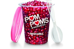
Pomegranate arils get packed for snacking
Available from pomegranate purveyor POM Wonderful from October through January, POM POMS Fresh Arils are a convenient, ready-to-eat helping of ruby-red pomegranate arils, or seed casings, packed in a 4.3-oz rigid plastic container. The clear PET cup is branded with the trademark POM logo and is capped with a custom ruby-red polypropylene plastic lid that holds a plastic spoon. The spoon, folded and held securely in place under the lid, sports a molded design on one end that mimics the pomegranate stem—a motif that is also used at the edge of the lid, offering easy removal. According to POM, fresh arils are loaded with vitamins and potassium and are known for their powerful antioxidants, known as polyphenols.