The 2011 fourth-quarter Shelf Impact!/Dragon Rouge survey of innovative packaging awarded products that holistically combined creative concept, design, and execution: a wellness water that uses an active cap to deliver vitamins, a twist on concentrated cleaner packaging, and an appetizing pack design for organic baby food.
With a composite score ranging from 3.5 to 3.7 on a five-point scale, the three packaging innovations that lead our report are Karma Wellness Water, Ella’s Kitchen’s new organic baby food packaging, and SC Johnson’s new Smart Twist all-in-one cleaning system. While all three scored high across the board, they were exceptionally strong with relation to concept idea, structure, and graphics.
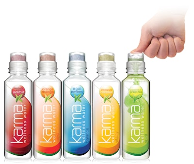
Taking the top spot this quarter is a new line of natural, nutrient-enhanced water. Unlike other nutrient-enhanced waters, where the vitamins are premixed with the water, Karma has developed KarmaCap, a proprietary technology that allows the vitamins to be contained in an airtight cap. When you’re ready to open the bottle and release the vitamins, simply peel off the top sticker, push the cap down, and shake! Since vitamins deteriorate in water, premixed drinks lose their strength over time. Karma allows you to enjoy all the vitamins’ benefits at their maximum potency.
With five different varieties, each focusing on a different health benefit, the line differentiates itself on-shelf through its square bottle shape, unique cap, and strong flavor cues. The uniqueness of the active cap technology caters to the idea of fresh convenience, clearly communicating the benefits and value of achieving the maximum vitamin potency when you need it most.
Fresh, on-the-go convenience is also exhibited in the new packaging for Ella’s Kitchen, an organic children and baby food brand in the U.K. The goal of the project was to harmonize and evolve the packaging to bring greater visibility and recognition of the brand mark across the line, provide a clear and simple communications hierarchy, and ensure that designs are appealing and differentiating. The new “at a glance” age-and-stage communication system cuts through the clutter, allowing moms to conveniently identify which product they need without having to invest time deconstructing the information on-pack. The vibrant colors and messaging such as “I’m Organic” further emphasize the freshness of the product.
Following the convenience theme, SC Johnson has introduced a new take on concentrated cleaning solutions with an all-in-one cleaning system. The system, called “Smart Twist,” was created to help consumers clean more efficiently and effectively by enabling them to choose three of their five favorite cleaners to dock at one time in a simple, lightweight sprayer that adds the water. Consumers simply fill the tank of the handheld sprayer with water and snap each of the concentrate containers into place. When they are ready to use the system, they simply twist the carousel to the desired cleaner. The new system is convenient for consumers and also takes up substantially less space than having to store each product individually.
‘True innovation’ requires a well-rounded approach
Regardless of average or above-average scores in one category over another, the three products that scored the lowest only further prove that true innovation requires a well-rounded approach—everything matters!
As part of its “Reduce, Reuse, Recycle” initiative, nut processor John B. Sanfilippo & Son, Elgin, IL, decided to transition the current packaging for its Fisher Nuts brand from a composite can to a lightweight, clear PET package. The new see-through PET container provides more sustainability as well as a greater perception of freshness and in turn inspired a complete brand makeover. While the materials and production of the new packaging ranked high, the design concept and graphics fell short, as the new logotype and graphics don’t match the new overall contemporary look and feel of the structure and the campaign, “Freshness You Can See.”
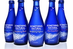
Something Natural is a new brand of all-natural flavored sparkling water that blends the healthful and refreshing qualities of sparkling water with delicious fruit flavors. While the Something Natural brand was created to prove that less is more, the liquid and the name may deliver on this promise, but the design does not. Quite simply, the flock of birds design on the front of the bottle clutters up the pack, detracting from the simplicity and elegance of the overall design.
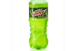
Similarly lacking in concept and graphics, Mountain Dew also falls short with its new bottle. The intent of the new structure and design was to reenergize the brand with a distinctive, new PET bottle design that more fittingly meets its promise of robust, spirited fun, exuberance, and refreshment. The new bottle features a distinctive silhouette that provides the package with a solid shelf presence. A label less than half the size of the brand’s previous label allows the bottle’s shape to be the point of differentiation for the brand. But respondents gave the new design unfavorable reviews, thus overshadowing the bold textural elements meant to add excitement.
Tips for 2012 design
As you wrap up 2011 and begin to think about how to create packaging innovation in 2012, try to keep these fundamental guidelines in mind:
• Begin with a solid foundation. If you don’t have an amazing concept, you won’t have anywhere to place a stake in the ground.
• Don’t overthink it! Simplicity and convenience are key… everything else will follow.
• Remember that the whole is greater than the sum of all parts—you can have really great design, a stand-out structure, sustainable materials, etc., but none of that matters if they don’t mesh well as a whole.
The author, Eric Zeitoun, is president of Dragon Rouge USA, an international brand and design consultancy. Contact him at [email protected] or at 212/367-8800.
