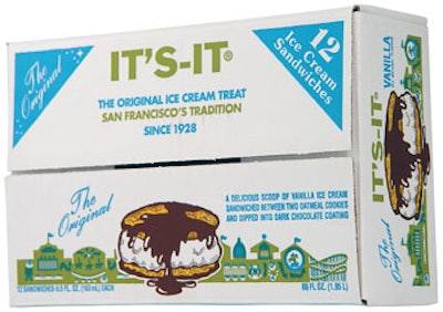
Since then, the chocolate-covered, oatmeal-cookie ice-cream sandwich has had a loyal following both in the San Francisco area and in nearby cities.
But when the Burlingame, CA-based ice-cream maker began selling its product farther afield, in Costco club stores throughout California, it found that its 1920’s era package graphics—easily recognizable to the initiated, but lackluster to newcomers—required a retooling. “Because the product was going outside of where it had a following, it needed to work much harder to communicate,” says David Gauger, agency principal for design firm Gauger + Assoc. (www.gauger- associates.com), which revitalized the product’s 12-pack club-store carton.
“The product needed packaging that was more dynamic, with more appetite appeal, that explained what the product was all about,” Gauger adds. The challenge, he says, was to “create compelling new packaging, yet keep the product recognizable for its long-time fans.”
The result is a bright-blue, eye-catching package with a nostalgic graphic quality. Explains Gauger + Assoc. art director Dana Klumb, “We decided that the It’s-It brand should be the focal point of the packaging. The old package used a cartoon line drawing. We commissioned a very realistic illustration to maximize appetite appeal. The result looks much like photography. The sandwich is the star in an uncluttered design, surrounded by classic and timeless graphics.”
In the top left corner of the four-color litho-printed paperboard pack, Klumb positioned the original It’s-It logo, preserving and celebrating the brand’s heritage. Gauger says the carton’s bright-blue background color was chosen to help the pack stand out in the freezer section and to give it a fun, kid-friendly feel.