See What’s Possible in Packaging & Processing @ PACK EXPO International
See packaging & processing solutions from 2,600 exhibitors and gain insights from 150+ free educational sessions at PACK EXPO International.
REGISTER NOW & SAVE

Create a free Packaging World account to continue reading

Not just a 'corny' redesign

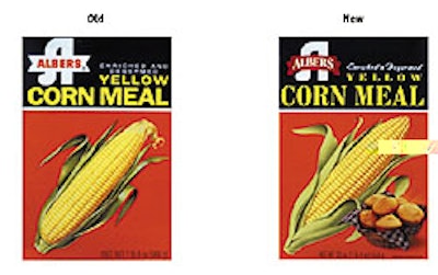
Since its redesign last year, sales for the Albers corn meal product line have increased considerably. The Nestlé USA company turned to Enterprise IG (San Francisco, CA) to revitalize the image Albers has cultivated since it introduced its product line in the 1920s.

Pw 17047 Albers

Designers revised the logo, incorporating a red banner for the corn meal and a blue banner for grits. The change was designed to continue to appeal to loyal customers, while also attracting new buyers. That was achieved in part through consumer research that proved that an illustration of a corn cob had become an icon for the corn meal brand. Designers retained the image, tweaking it a bit to make it appear as if it had just been harvested. A photo of corn muffins was added to the cartons to increase appetite appeal. Glendale, CA-based Albers-brand corn meal and grits are available primarily in the West.

Retail multipack suppliers, all in one place
25+ vetted systems for cups, tubs, and bottles — shrink, paperboard, banding, clip, and more. Free download.
Read More
Retail multipack suppliers, all in one place
Co-packers: the competitive gap is widening
Brands want more than low bids. See what automation, services, and sustainability mean for CM/CPs in 2026.
Read More
Co-packers: the competitive gap is widening