To successfully enter a new product category, there are a score of hurdles to overcome. For an existing brand, making the leap into a new category draws added scrutiny, particularly in living up to the promise being delivered by the brand’s current products, as well as creating serious competition for those already in the category. But before the product can deliver, its packaging has to compel the consumer at shelf to give it a try.
Sacramento, CA-based Blue Diamond Growers, the world’s largest tree-nut processing and marketing company, known for its snack and baking almonds, faced just this type of challenge when it expanded its offerings into the almond butter category with six new SKUs.
The company wanted to launch its Homestyle and ReadySpread Almond butters in Creamy, Crunchy, and Honey versions, first in natural food stores and then in traditional grocery outlets.
“As with many new products, during initial distribution, the first time a consumer sees a product, it might be on the shelf,” says Kristen Arakaki, assistant marketing manager for Blue Diamond. “The packaging and the price then do all the selling. This was the case in the launch of our new Blue Diamond Almond Butter and why this was one of the most important packaging projects we have had to date.
“Entering a new category was quite thrilling. We knew going in that we had excellent brand awareness and a brand name synonymous with quality. The final design of the labels for the new product line needed to capitalize on this existing brand equity. This would make it possible for new Blue Diamond Almond Butter consumers to know what to expect when it comes to any of our products—great taste and superior quality.”
Shelf presence is key to success
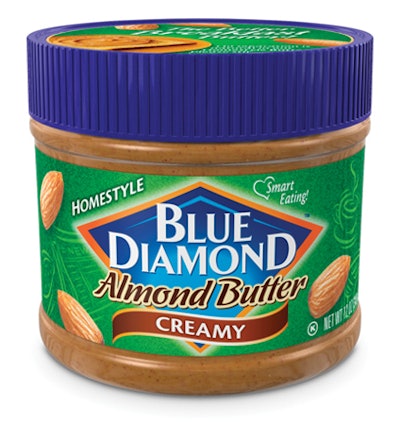
Getting noticed at shelf was critical. The facing label measures only 1.65 in. high x 10.35 in. wide, and therefore had to work exceptionally well from a graphics standpoint. The Almond Butter label, designed by Thompson Design Group, features an enhanced Blue Diamond logo and an intricate background design with appetizing almond images.
Says Dennis Thompson, principal with Thompson Design Group, “Working with Blue Diamond from the initial stages of concept through production allowed us to strategically develop a label that resonated with the consumer, while remaining true to our client’s desires. Even though we had a small display panel, the label leverages the key Blue Diamond brand equities and clearly communicates the new Almond Butter product form and flavor, with further appetite and usage cues on the lid sticker.”
The Blue Diamond Almond Butter labels are printed on white gloss paper facestock with permanent adhesive and a 40-lb Kraft liner. The company chose a custom 12-oz PET jar from Berry Plastics for the new Almond Butter and opted for a pressure-sensitive label to leverage its experience running pressure-sensitive labels for an existing product packaged in a 38-oz PET jar.
A departure from the usual glue-applied label and lithographic printing done for other Blue Diamond packaging, the switch to p-s labels presented a printing hurdle because the graphic design was more suited to litho production.
“The challenge was to get past the flexo limitations with a viable option,” says Linda Lennihan, a graphics consultant who oversees label production for Blue Diamond. “Selecting the right print technology is key to the success of any print job. Knowing at the outset how the package/label will be produced is very important to the final outcome.
“The original design needs to be appropriate for the chosen method of production. The old adage ‘The right tool for the right job’ is ever so true.”
But to really put this adage into action required that the right tool be placed into the right hands. For this project, the right hands belonged to WS Packaging Group and its Nilpeter M3000 rotary offset press.
The original artwork called for four-color process and five spot colors, as well as a varnish. The print run involved six sidewall labels and two 3-in. lid labels. The corresponding top and sidewall labels had to match color-for-color to reflect the high-end positioning of the new Almond Butter.
After reviewing the artwork, WS Packaging’s art department knew it was going to be extremely difficult to trap the colors the traditional way using flexo; Blue Diamond would have found the quality unacceptable. However, the art department felt it could accomplish the results the design agency wanted by running four-color process and only one spot color. But doing so meant it would have to hold registration on a reverse-out in process, which can be challenging.
“Due to the fine lines in the design, there would have been no way with flexo that we could have kept the four-color process in register enough where it wouldn’t have been blurry,” says Sal Caravello, senior account executive with WS Packaging. “That’s when we proposed printing the pressure-sensitive labels via litho on the Nilpeter.”
Printing process saves design
Sure of its recommendation, and at its own cost, the WS Packaging’s Algoma, WI, facility ran a sample for Lennihan, who agreed with the quality of the results and gave the approval to proceed—a move that saved more than $10,000 in prepress work.
“It was a relief to know we could go in another direction to achieve the results we were after,” Lennihan says. “A design can look great on paper and on the computer, but it all comes down to how it’s printed. The printing determines the final representation.”
Lennihan attended the press check and planned to pull samples every four hours for each SKU. After the first pull, she identified areas that needed special focus. The remaining SKUs ran without a change. Blue Diamond was delighted with the press capabilities, as well as the dedication of the entire staff at the Algoma facility.
“The integrity of the logo was extremely important,” says Caravello. “The Nilpeter hit it the very first time dead on.”
Says Arakaki, “The final results were better than anticipated. The package form itself allows for double-stacking. Multiply that by outstanding artwork design and printing, and our new Almond Butter really makes an impact on shelf.”
Shipments of new Blue Diamond Almond Butter began in Spring 2009. Currently gaining steady distribution, all six SKUs are doing very well to date. An additional line has already launched into Canada, and the company is looking at demand for a larger container format for foodservice.