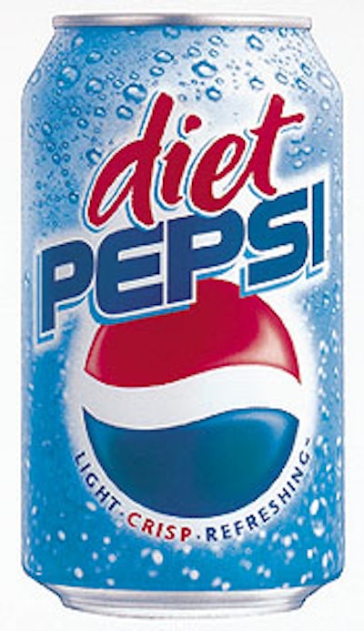
The redesigned labels and multipacks that feature the Diet Pepsi logo on a light blue background debuted on store shelves in late February. A “bubbly” background connotes a crisp, fresh taste while the blue color ties in with the beverage’s nondiet regular Pepsi. The addition of the three-dimensional red, white, and blue globe icon gives Diet Pepsi a strong identity, yet keeps it “grounded” within the Pepsi family of products. “We’re giving Diet Pepsi the marketing support it deserves,” says Dave Burwick, senior vp, marketing, Carbonated Soft Drinks, Pepsi-Cola North America, Purchase, NY. “There are more than 33 million Diet Pepsi consumers in the United States. They’re a fiercely loyal and outspoken group who say consistently what they like most about Diet Pepsi is the light, crisp, and refreshing taste. Diet Pepsi’s light blue graphics reinforce those qualities and create a tighter bond within the Pepsi trademark.”


