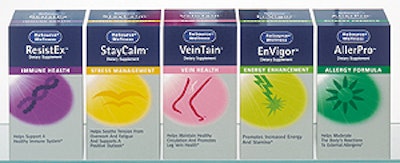
Package design makes healthy use of large, eye-catching icons printed on the folding cartons. NCH’s internal package design group worked with the Sterling Group (New York, NY) to develop the look. NCH associate director of package design Catherine Glynn says that visual clues quickly communicate each product’s formulation. For example, ResistEx, which addresses “immune health,” uses a stylized DNA strand, and “2ndWind,” for stamina and muscle recovery, uses the silhouette of a running figure. The design also creates a strong on-shelf presence in a busy segment, she says. With one exception, all products are bottled and sold inside 16-pt SBS paperboard cartons offset-printed in six colors, including silver metallic ink. The lone exception is CalciWise, for bone health, which is sold in a paper canister. (RL)