In the uber-competitive coffee category, one way brands are increasingly differentiating themselves is through unique and unexpected packaging designs that tell their brand story. Whether it’s a redesign for an existing product or branding for a new one, these companies are moving beyond just a focus on the functional aspects of their packaging to creating memorable graphics that tell a story.
 | Read how Absolut Vodka redesigned the packaging for its Flavors line. |
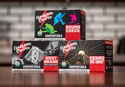
Oakland Coffee Works, founded by American rock band Green Day, is one such brand. The company was founded in 2015 “with the goal of creating a badass, premium coffee company that does things the right way,” says the company, adding, “Oakland Coffee not only pushes the boundary on sustainable packaging, but gives you the energy to seize the day.” Among its achievements, the brand was the first in the U.S. to exclusively sell certified, municipally compostable pods and bags of coffee.
 Oakland Coffee worked with independent artists, including concert photographers, graphic designers, and studio artists, with each packaging design showcasing a different designer or artist collaboration.
 Packaging for the Sound Check brand includes snapshots of the coffee company founder Green Day’s recent Hella Mega Tour.
 The West Grand blend uses iconic Oakland landmarks on its packaging.Oakland Coffee worked with independent artists, including concert photographers, graphic designers, and studio artists, with each packaging design showcasing a different designer or artist collaboration.
For the redesign, the team worked with independent artists, including concert photographers, graphic designers, and studio artists, with each packaging design showcasing a different designer or artist collaboration. The first three designs in the new series of 10-ct coffee pod cartons include West Grand Decaf, Soundcheck Blend, and Cerro De Oro, a single-origin coffee from the highlands of Guatemala. According Oakland Coffee, the launch is only the beginning of its newest roasts and packaging designs.
Shares Oakland Coffee co-founder Mike Dirnt, “Green Day and Oakland Coffee are so excited to continue our collaboration with inspiring artists and expand our line of sustainably packaged, damn good, organic coffee!”
New packaging captures Dilworth’s brand voice
For Charlotte, NC-based Dilworth Coffee, rebranding involved a complete overhaul of its coffee bag graphics from a color-blocked generic design to one that is whimsical and unforgettable.
Dilworth was launched in 1989 as a supplier of small-batch, ethically sourced coffee to independent shops and distributors. As business grew, the company added turnkey supplies, equipment, and training for independent coffee shops. “But greater distribution and retail presence didn’t translate to commensurate Dilworth Coffee brand awareness among consumers,” the company shares.
To create new branding that would help it develop a closer relationship with its ever-changing customer base, Dilworth enlisted the help of advertising and branding agency The Republik. Explains agency CEO Robert Shaw West, “With a 30-year anniversary as a reason for a change to take place, our job was to show the ‘newer is better’ coffee culture that Dilworth still had a lot of worthwhile coffee wisdom. So we channeled our inner ‘Dude’ to share the vibe.”
 Dilworth Coffee's packaging AFTER the redesign.
 Dilworth Coffee packaging BEFORE the redesign.
| | Read about Milk-Bone’s smile-inducing refresh of its dog treats packaging. |
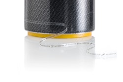
Displaying a complete 180 from Dilworth’s vintage vibe is a package design for a bagged coffee product from new San Francisco food-tech startup Compound Foods. Compound offers a sustainable, lab-grown beanless coffee that is said to have “the same taste, look, and smell of the coffee we know and love with a smaller footprint to ensure a bigger, brighter future for both coffee and the planet.”
Visual identity for lab-grown coffee tells story of process
For its visual identity, Compound Foods looked to creative design and branding agency Pearlfisher. Notes the agency, its challenge was to develop a strong and cohesive brand for Compound Foods that would invite coffee lovers around the world into their story, their pioneering product, and their mission. “We wanted to counter the notion that an innovative product like this has to have a scientific or futuristic feeling,” says Annie Seely, Associate Strategy Director at Pearlfisher New York. “Coffee is a fundamental part of many people’s day. It has strong emotional and personal ties, and so we really leaned into the question of what would we do without it? This led us to the idea that, when it comes to coffee, the sum of the parts is greater than the whole—our love of it is not just about the beverage itself; it’s about the ritual, the culture, the myriad feelings it evokes in us, and the multi-sensorial experience of drinking it, smelling it, holding it.”
 The challenger for Pearlfisher was to develop a strong and cohesive brand for Compound Foods that would invite coffee lovers around the world into their story, their pioneering product, and their mission.
Says Compound Foods’ founder, Maricel Saenz, “We are incredibly proud of our mission, and Pearlfisher’s colorful and striking visual identity now allows us to stand proud in the world and on shelves as we future-proof coffee without the negative environmental impact.”