Pure doggie joy—that’s the emotion that comes through on new packaging for The JM Smucker Company’s Milk-Bone dog biscuit brand. The smile that crosses the consumer’s face upon spotting the new branding on the store shelf is the result of a partnership between the JM Smucker team and brand strategy and design agency CBX that involved work on research and insights, brand architecture, design strategy, identity design, package design, and a photo shoot with 80 dogs.
Born in New York City 1908, Milk-Bone has been the category leader in dog treats for much of its 100-plus-year history, begging the question, why rebrand? “I think two reasons,” says Ryan Thomas, VP of Marketing, Pet Division, The JM Smucker Company. “One, Milk-Bone is a healthy brand. And a healthy business is one that is constantly looking back at itself and seeing what it can do better. As a brand team, as good brand stewards over the past two years, we had stared at the brand and said, we can do better on our packaging. Our brand deserves to be in the 21st century, to be blunt.
“The other driving force was that our country had changed. We knew that many millennial and Gen Z households were having their first fur babies to start their families. There was just a cultural shift in dog parents in general, and what those dog parents are expecting, and how they ‘treat’ that moment with their pet.”
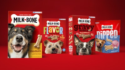
 The Milk-Bone packaging BEFORE (l.) and AFTER the redesign.
CBX began its work on the rebrand in January 2019, guided by research from JM Smucker. Shares Chris Cook, Creative Director for CBX, “We learned that the dog imagery [on the existing packaging] was key to delivering on the anticipation of the treat and helped to communicate joy and happiness. Even more so, we found that the classic wagging tongue of the dogs helped further communicate taste and anticipation. We also learned how willing current Milk-Bone consumers were to embrace change, which was crucial for our success. We needed to retain the essence of the Milk-Bone brand while enhancing consumers’ engagement with the package.”
CBX worked with Milk-Bone to establish the key pillars to better organize the brand’s portfolio of 25+ SKUs and conducted work sessions to strategically align to equities across the brand architecture pillars and bring them to life. “We created a visual and verbal toolkit designed around the concept of ‘Life’s More Fun with a Dog,’ and used that foundation to overhaul the packaging system with a fresh, updated feel,” explains CBX Client Director Katherine Spahr.
 | Watch: “Doting Pet Parents Drive Innovation in Packaging Design, Technology” |
Dog imagery, designed to mimic the exciting moment a dog looks up at you for a treat, was evolved to become a larger, even more important element of the packaging that engages the consumer at-shelf and helps them shop their dog size.
However, capturing that dog imagery was no walk in the park. The 80-dog photo shoot, overseen by Cook and CBX Design Manager Brendon Reilly, required them to have a few tricks up their sleeve, as well as lots of patience. “A lot more goes into selecting the dogs than one would think,” shares Reilly. “The first task was narrowing it down to match the breeds on the current packaging, creating a smooth transition for consumers. Next came the casting, where we went through countless casting sheets to look for dogs that were not only adorable, but looked like they photograph well. Dogs that have a naturally expressive face give the humans a much easier job.”
 Dog imagery, designed to mimic the exciting moment a dog looks up at you for a treat, was evolved to become a larger, even more important element of the packaging.
Reflecting on the rebrand, Thomas says, “We know consumers shop with emotion, and the pet category is driven by love and adoration for our pets. We brought that emotion of the dog to life front and center, in their eyes and in their smile, which is very compelling and memorable. It was not just the photography itself, but the placement, positioning, size, color—everything working together. We selected specific packaging formats and the matte overlay to really make the photography pop off the package. We made sure to showcase the actual size of the Milk-Bone treat, making it look very realistic on-pack. Those three things were an opportunity for us to amplify the strong brand assets and icons we had, and push into where the zeitgeist is today in terms of how consumers perceive brands, make purchases, and develop loyalty to a brand.”
The new package design for Milk-Bone’s biscuits, treats, chews, and supplements launched in summer/fall 2020, and is continuing to roll out on shelves nationwide.
 | Read how Walmart leaned in to the ‘humanization of pets’ with new packaging designs. |