If ever there were an organization qualified to create a report on packaging design trends, it would be Pentawards. Pentawards is a global platform and community for packaging design that holds a competition each year to recognize excellence in the field. Since it began the awards in 2007, it has received more than 20,000 entries from over 64 countries across the globe. In 2021, despite the ongoing challenges presented by COVID-19, it still received a whopping 2,000 entries from across five continents.
“Entries to this year’s Pentawards showed how design can not only help solve crucial issues both in business and for the planet as a whole, but how it also can transform categories, reach new audiences, and bring delight and fun to people’s lives at a time of global uncertainty,” says the Pentawards team. “The caliber of work has been groundbreaking, hitting a new level of creative excellence, even under such circumstances.”
 | Read this story to find out what color Pantone chose for its 2022 Color of the Year. |
Given the “groundbreaking” array of winning packages, Pentawards decided to compile, for the first time, a report highlighting 10 design trends drawn from the winning work. Says the team, “Together, they reveal the creative zeitgeist of the time, but also give us a glimpse into the future.”
Following are abbreviated descriptions of each of the trends they spotted, along with some examples from among the winning packages. To learn what’s next for each trend and to see more examples, download the full “Pentawards Trends Report 2021-2022.”
1. Surprising takes on traditional packs: This year’s entries included a number of brands offering surprising takes on what would normally be expected with packaging for particular product categories.
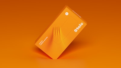 Packaging for Stoic steps well outside its comfort zone, with bold and unexpected packaging that reflects the strength of its rubber gloves.
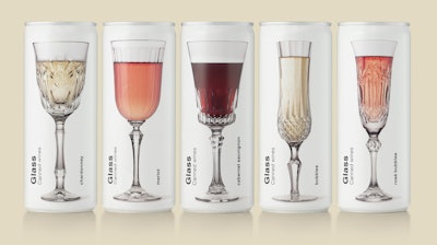 The packaging for Glass Canned Wines plays on the surprise of discovering a product that is not usually found in this type of container.
2. Color as the key visual: Maybe in an attempt to brighten consumers’ lives in what has been a gloomy year for many, there has been a trend for bold color being used as the key visual on packaging—often instead of the product itself or its ingredients. According to Pentawards, some of this year’s entries pushed the use of color to new levels, from using unprecedented amounts of color to highlight flavor and taste, to disrupting the category by helping the product stand out from competitors.
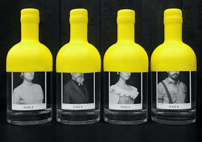
 SAGA Gin uses an iconic, extra-large yellow wax seal to make it more distinctive on-shelf, while creating a unified look across its packaging.
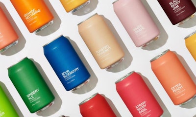 United Sodas of America put color front and center with its “daringly minimalist” packaging.
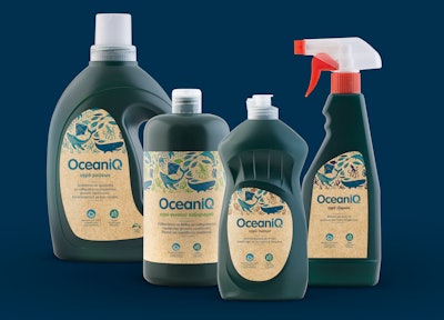 OceanIQ packaging is made from 100% recycled fishnets retrieved from oceans worldwide, with its packaging graphics instantly reflecting its brand purpose.
 | Read this story on Grove Collaborative's new plastic-free, refillable deodorant system. |
4. Highlighting mental health: As the report notes, mental health has always been a sensitive societal issue, with diseases such as depression leading to approximately 700,000 death a year, according to the WHO. And, it says, not surprisingly, countries worldwide have seen a rise in mental health issues since the pandemic. A theme reflected in this year’s entries was around using packaging as a platform to open up conversations around people’s mental wellbeing.
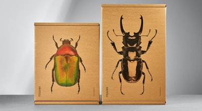 Packaging for Frahm’s men’s jackets reinforces the company’s Tough Beautiful mantra, reflecting its support for mental health issues.
5. Diversity and inclusivity: Another trend was packaging highlighting the diversity of individuals across the planet—whether that be based on sexuality, disability, ethnicity, gender, or age.
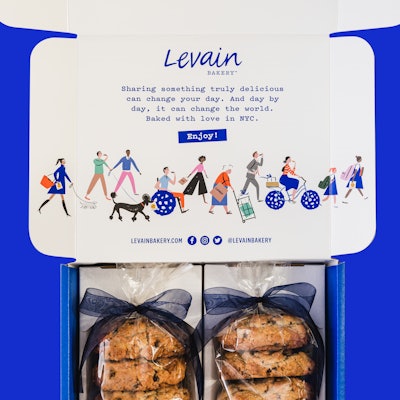 Levain Bakery’s e-comm packaging features a “cookie lover’s parade” illustration that includes a variety of characters of different ages, abilities, ethnicities, and genders.
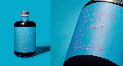 Coffee brand Only for Your Eyes, which raises awareness of the blind, developed a label for its bottle that is printed exclusively in Braille.
 | Watch this video how Unilever's Degree package prototype embodies inclusiveness. |
6. Protest and propaganda: Notes the report, “Packaging, like any form of art or design, can be a great outlet for communicating societal issues and cultural events, or becoming a symbol of a movement.”
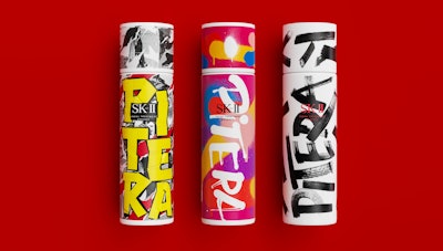 Limited-edition packaging from skincare brand SK-II Pitera is an example of how brands are using the visual language of protest and propaganda to draw in younger consumers.
7. Optimizing packaging for e-commerce. During the 2020 pandemic, the reliance on online shopping grew by as much as 77% and is still growing strong, notes the report. It adds that there are three things to consider with online packaging: “One, that it looks good online, two, that it can be easily delivered to a person’s home without getting damaged, and three, the sustainability impact of the additional packaging that would normally not exist if purchasing in-store.”
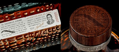 Packaging for Moët Hennessy’s Eminente Reserve rum was designed to meet the needs of e-commerce distribution.
 | Watch this video on five e-commerce packaging design trends headed to your doorstep. |
8. Packaging as a canvas: According to the Pentawards team, over the years, it’s seen many examples where illustrations have been developed as part of a brand story and used across a range of packaging. “But something we noticed this year was packaging being used for the actual canvas for the art itself, rather than a vessel you simply stick art onto,” it says.
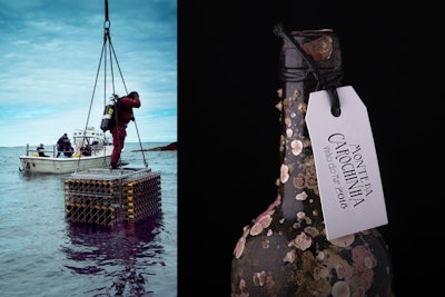 Submerged under water for a number of months, bottles for Vinho do Mar and Black Sea aged wines use packaging as a canvas to let nature make its mark.
9. The rise of wraparound illustrations: An extension of the “packaging as a canvas trend,” the Pentawards team also spotted a number of brands using graphics that travel across packs to create larger, composite visuals when placed side by side. “While this has been a technique designers have used in the past, it now seems to be reaching a new level of popularity,” the report notes.
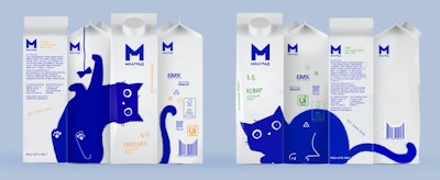 The blue cat on Milgrad’s dairy drink packaging delightfully wraps around the packaging designs and across the range.
10. Packaging as transformative storytelling: As the report notes, creating a connection with consumers is a crucial part of packaging design, and in many cases this year, the Pentawards judges saw packaging designs that transcended the product itself to become their own storytelling device.
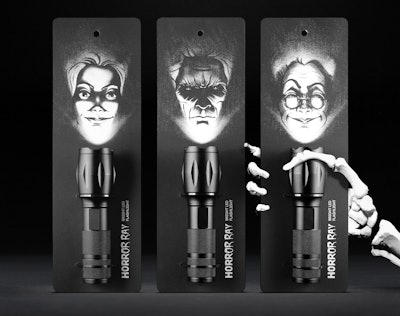 The package design for the Horror Ray flashlight, a product designed for children attending summer camp, is loaded with evocative storytelling.
Pentawards is accepting entries for its 2022 packaging design awards competition until Feb.14, 2022. Learn more at The Pentawards Competition website.


