Beverage brands are introducing innovative packaging formats including transparent cans that showcase product contents, oversized promotional canisters that function as coolers, and collectible co-branded multipacks designed to enhance consumer engagement and differentiate products in the market.
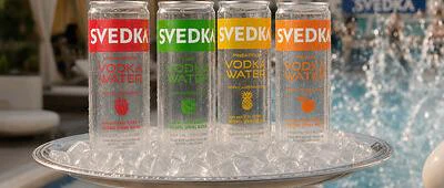
- SVEDKA introduced the world's first fully transparent canned vodka water in four flavors, allowing consumers to see the product contents directly in clear aluminum cans
- Molson Coors developed the CoooorsLight Tallerboy, a reusable promotional canister designed to hold and chill three standard Coors Light cans simultaneously
- Jones Soda partnered with Crayola for a limited-edition six-pack multipack featuring color-coded bottles and collectible packaging as part of their 30th anniversary celebration
- These innovations focus on visual transparency, functional design, and consumer engagement to differentiate products while maintaining familiar can formats
- All three packaging innovations are designed for retail distribution and seasonal or year-round availability across the United States
These innovations highlight new and different innovations that are hitting the market.
Learn more about ThePackHub's Innovation Zone here.
SVEDKA Vodka's transparent canned vodka water packaging
SVEDKA Vodka, based in Louisville, Kentucky, USA, has introduced a new ready-to-drink packaging format featuring what it describes as the world's first fully transparent canned vodka water. The packaging innovation centers on the use of a completely clear can, allowing consumers to see the contents directly rather than relying on traditional opaque aluminum beverage cans. The transparent can is designed to showcase the product's composition, which includes vodka, purified water and fruit flavoring, while reinforcing visual clarity as a key packaging feature. The range is available in four flavors—Strawberry, Peach, Lime and Pineapple—and each 12-ounce (355 ml) can contains 90 calories with zero sugar, zero carbohydrates and no carbonation. The packaging has been developed for both individual consumption and multipack retail formats, with products available in 12-ounce (355 ml) single cans and 8-pack configurations. By replacing the conventional opaque appearance associated with canned alcoholic beverages, the design provides immediate product visibility, allowing consumers to inspect the liquid before purchase or consumption. This transparent format differentiates the packaging from standard metal beverage cans while maintaining the portability and convenience associated with canned ready-to-drink products. The innovation focuses on combining visual transparency with a lightweight, portable container suitable for retail distribution and outdoor consumption. The company positions the clear can as a packaging feature intended to communicate simplicity and product visibility rather than relying solely on printed graphics. The introduction demonstrates an alternative approach to packaging design within the ready-to-drink alcoholic beverage sector, where packaging materials and appearance are increasingly being used to differentiate products while maintaining familiar can formats. The product is scheduled for nationwide distribution across the United States and will remain available throughout the year.
 The innovation focuses on structural design and consumer engagement rather than changes to the primary beverage packaging itself.ThePackHub
Molson Coors Beverage Company introduces oversized beverage canister to extend promotional packaging
Molson Coors Beverage Company, headquartered in Golden, Colorado, United States, has introduced the CoooorsLight Tallerboy, a limited-edition promotional packaging format developed for its Coors Light brand. Rather than functioning as a conventional beverage container, the Tallerboy is an oversized reusable canister designed to hold and chill three standard Coors Light cans simultaneously. The packaging innovation extends the familiar tallboy can format into a larger cylindrical container intended for temporary storage and cooling during consumer use. The design retains the visual appearance of a beverage can, including the elongated "CoooorsLight" branding, while increasing its dimensions to accommodate multiple cans within a single outer package. The canister has been developed as part of a seasonal promotional campaign and demonstrates how packaging can be adapted to create an interactive consumer experience while maintaining strong brand recognition. By replicating the proportions and graphics of a conventional drinks can at a larger scale, the design creates a distinctive packaging format that serves both as a branded promotional item and a functional beverage cooler. The reusable construction allows consumers to use the canister beyond its initial purchase, supporting repeated use during social occasions. The innovation focuses on structural design and consumer engagement rather than changes to the primary beverage packaging itself. The Tallerboy illustrates how secondary promotional packaging can be engineered to provide additional functionality while reinforcing brand identity through familiar pack geometry, graphics and scale. The six-pack carton contains six bottles, each linked to a specific Crayola color through coordinated graphics and color-coded flavor identificationThePackHub
Jones Soda collaborates with Crayola for back-to-school limited-edition multipack
Jones Soda, based in Seattle, Washington, USA, has collaborated with Crayola, headquartered in Easton, Pennsylvania, USA, to introduce a limited-edition six-pack featuring refreshed packaging as part of Jones Soda’s 30th anniversary. The packaging innovation centers on a co-branded multipack designed to coincide with the back-to-school season, combining distinctive visual branding from both companies to create a collectible retail format. The six-pack carton contains six bottles, each linked to a specific Crayola color through coordinated graphics and color-coded flavor identification. The featured flavors include Fruit Punch Soda inspired by Razzmatazz, Orange & Cream Soda inspired by Sunset Orange, Pineapple Cream Soda inspired by Dandelion, Green Apple Soda inspired by Granny Smith Apple, Berry Lemonade Soda inspired by Robin’s Egg Blue, and Fufu Berry Soda inspired by Razzle Dazzle Rose. Beyond the bottles themselves, the retail version includes a specially designed collectible six-pack box intended to enhance shelf presence and encourage purchase as a keepsake. The direct-to-consumer version extends the packaging experience by including the same collectible box together with four coloring pages and an eight-pack of crayons, integrating additional printed materials into the overall pack presentation.
Learn more about ThePackHub's Innovation Zone here.