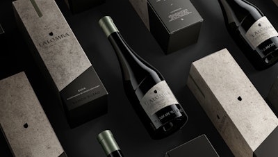
Part of Zamora International group, Lalomba is a new premium wine brand located in the Rioja Baja region of Spain. In an extraordinary landscape between the valley and the mountains, the vineyards culminate at 720 meters. Its name derives from the Spanish “La Loma,” or the slope, strongly linking the brand to its terroir and natural elements.
See: Wine is ‘Untouched by Light
After visiting the new winery and vineyards, boutique design agency Appartement 103 was commissioned to develop the new brand identity and packaging designs based on the brand’s foundations. Says Appartement 103 Creative Director Julien Zylbermann, “We discovered a world full of elegance and allure, which we translated through a brand platform that would provide consumers and visitors with a remarkable and fulfilling experience. An invitation to reconnect oneself to finally finding beauty, inspiration, and grace. A new way to approach life, to see its environment, inviting consumers to reconnect themselves to elementary sensation.”
See: Peel-back Labels Differentiate Each Wine in a Line
From this vision, the creative team developed a new bottle structure, labels, and secondary and tertiary packaging, highlighting the brand platform. The bottle features a dynamic diagonal line that Appartement 103 says reflects a sense of escapism and vision. It also directly reflects the slopes that offer so much to the end product—the wines themselves. The use of concrete textures refers to the wine tanks that are used, conveying a deep natural feeling and minerality to the presentation. Finally, says the agency, the touch of metallic desaturated tones of colors gives a sense of refinement and premium attitude.