Years ago, fledgling cannabis brands could be forgiven any slow progress in brand evolution, conservative takes at branding via packaging, and lack of a consistent, universal message. After all, consider the sheer number of hoops that package designers needed to jump through (and still do), and the disparate nature of those legal hoops from state to state. Also, it wasn’t so long ago that there were comparatively few pack formats that could do all the required heavy lifting of child resistance (CR), explicit THC and CBD content designations, ergonomics for older or disabled users, and track and trace coding to fit disparate, fragmented markets. And that’s not to mention the more typical food-grade barrier layer and puncture resistance functional needs that any type of gummy or chocolate bar packaging might require.
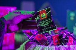
But the industry continues to mature as packaging suppliers become more diverse and sophisticated, and new states decriminalize or legalize to open up previously untapped markets. As a result, an arms race is breaking out over pieces of a growing pie, and brand evolution is accelerating at a breakneck pace. This makes cannabis, particularly as it applies to food and beverage, a fun market to watch.  Some states prohibit depictions of real food on cannabis packs. So for this gummy pouch, color and design have to communicate flavor.
Early packages a reaction to uncertainty about product
Given the explicitly outlaw character of pre-legalization or pre-decriminalization cannabis products—the often-cited image is that of the Graffix brand of smoking pipes, with menacing skull in court jester hat—it’s no wonder that the early legal, edible cannabis brands wanted to distance themselves from the outlaw motif. Many gravitated to a much less stimulating visual appeal. Soft, natural tones and gentle, cursive fonts were meant to elicit calm and confidence in the legality and safety of edible cannabis products contained in the pack.
But this justifiable, even smart brand positioning created a glut of similarly branded edible gummies and chocolates that now meet consumers at dispensaries. And it’s hard to differentiate between beige and taupe.
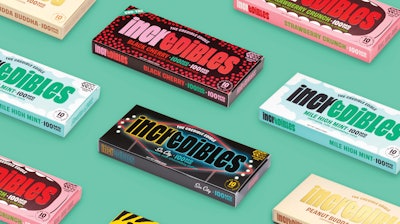
As a case in contrast, take a glance at the grocery store candy bar selection while waiting for a checkout register. There, you’ll find that candy isn’t so buttoned up. Successful brands use colors that pop, make fun of themselves, and love their logos and mascots. Essentially, most big brands making traditional candy bars and gummies can be said to be ‘loud’ brands, and that extends to packaging. One premium cannabis brand owner is taking a cue from its non-cannabis counterparts and differentiating itself from its more serious-minded competitors on the shelf. In doing so, is driving further evolution in a nascent but quickly maturing market.
Taking a cue from “big confectionary”
Green Thumb Industries Inc. is a new breed of cannabis brand owner (read more about its Clio-Award winning Dogwalkers brand packaging) that applies the big brand owner mentality to its stable of cannabis products.
One of its brands, incredibles, which Green Thumb purchased from Colorado’s Medically Correct (MC) brand in 2019, is undergoing a massive rebranding to catch cannabis confectionary products up with major store-brand counterparts. The two primary product ranges of gummies and chocolate bars were first up, and all other incredibles product ranges are soon to follow suit.
Jessica Benchetrit, Brand Director incredibles, at Green Thumb Industries. worked closely with design and innovation consultancy IA Collaborative on the project, seeking to make a colorful visual splash among otherwise calm or unobtrusive pack designs on a shelf or in a display case.
“Color plays a critical role within the context of this redesign,” says Benchetrit. “From a functional standpoint, our bold color pallet allows us to differentiate ourselves on shelf, break through visual clutter, and importantly, communicate flavor. Whether it’s the juicy red backdrop of our Strawberry gummies, or the warm glow of the Summer Peach sunset, color has a powerful ability to drive appetite appeal and we really lean into it, all while adhering to cannabis packaging regulations. In combination with the graphical elements and on-pack messaging, color brings the brand’s persona to life, one that we modeled after the pioneering spirit of the brand’s founders.”
Interested in cannabis packaging? Join us for “The Most Engaging Virtual Event for the Entire Industry” at PACK EXPO Connects, November 9-13. Live demos of equipment and products, live chat with product experts, expedited product search, and more. Attendee registration is now open. Visit packexpoconnects.com to register and plan your experience.
Why now for this kind of departure? Because the market is changing. Earlier use of subdued colors and messaging often played a role in calming nerves of folks who never had tried the product before. Instead of bright colors that could convey anxiety or bold fonts meant to be declarative, reassuring pack designs established an in-control mood as starting point to consuming the product.
But in the intervening years between the onset decriminalization and now, cannabis candies have become more mainstream. For incredibles, that allowed designers to employ more mainstream CPG packaging design fundamentals, like strong wordmarks or the use of color to communicate flavor. This realization opened up new blueprints for cannabis confectionary brands to follow, ones that largely focus on fun, laughter, and clever word play. As a decade-old cannabis company—a lifetime in this business—its sheer longevity wins sufficient trust points with most consumers, freeing the brand to lighten up the mood elsewhere.
“For our incredibles redesign we use common frameworks and design language employed by any other consumer packaged goods company looking to break through at shelf and connect with our target consumer,” Benchetrit says. “It all comes down to trust and we tell that story with details throughout the design. For example, we tied our tagline 'the credible edible' to our word mark and highlighted the year that the brand was established since very few in the space can say that they have been operational for more than a decade. The back of pack begins to tell the brand story and highlights our points of differentiation. But packaging is one of several communication mediums. Others include retail and point-of-purchase, field activation, and in certain states, digital and out-of-home. We know that, in isolation, packaging can only communicate so much so and when we think about messaging, we are always thinking through the lens of how these mediums work together.”
The new design
There are a few carryovers from the previous pack design, but just as many departures or upgrades. Color differentiation in the brand mark, i.e. incredibles, is a continuing design feature that helps emphasize the word play captured in the name. But the redesign included an update of the logo typeface to a style that felt to the design team to be established as a decade-old company in a young market, yet modern and able to withstand the test of time.
The brand has always used the “e” with a bite mark in the logo, but Benchetrit moved it so that it was on the first “e” in the word “incredibles” instead of the second. This plays off “edibles” as part of the name. She and her team took the extra care to tilt the “e” to reflect the relaxed, laid-back feeling she hopes is associated with the product.
“We prioritized the brand within the messaging hierarchy to help aid in brand recall. We know that people are often exposed to our brand through friends and sharing occasions. When that happens, we want consumers to remember that they had an incredibles product, not a watermelon gummy or any other generic edible," Benchetrit says. “Also, the goal is to ensure that we remain top of mind when consumers are in the purchasing mindset so that they bypass other menu options and (ideally) ask for us by name.”
See it Live at PACK EXPO Connects Nov. 9-13: Secure Remote Access for Packaging Machinery, by KEB America, Inc. Preview the Showroom Here.
For the chocolate bar products, the paperboard pack structure and material remain unchanged, only the aesthetic changed. The chocolate sits in a PP tray, and the tray is then sealed with film for freshness. The decision to use this sealing step related to maintaining the product integrity and freshness for an improved consumer experience. A child-resistant (CR) mechanism is built into the tray that holds the chocolate inside the carton. The tray has two wings that must be squeezed while the tray is simultaneously pulled out of the carton, requiring an adult’s hand size and dexterity.
Gummies, on the other hand, shifted to full color pouches, and moved away from the PP dram to improve branding and product portability. All gummies now use digitally printed high barrier metalized PET film pouches from converter and printer ePac Flexible Packaging, using HP Indigo 20000 digital presses. The zipper function at the top of the gummy bag is CR-certified and the top of the bags are heat sealed closed after filling to maintain freshness.
Varying display possibilities
By running with big confectionery’s playbook for package design, Green Thumb and Benchetrit are using traditional CPG packaging and branding practices that haven’t been used frequently for cannabis. And from a visual perspective, they’ve achieved just that. The chocolate bars’ cartons feature embossing and spot gloss UV on the packs to make them stand out among a variety of competitors on the shelf.
But the reality is that at many dispensaries or cannabis retail shops, products aren’t displayed like they would be in a grocery store aisle. They are behind lock and key, or may not even be visible at all, depending on the shop owners’ whims, or more likely, local regulation.
Still, consumers still will have an experience and interaction with the packs one way or another, perhaps after the purchase has been made and the product is already in the home. So the incredibles’ redesign was performed as if the products would both be an on-shelf disruptor or at least create a memorable experience back at home, regardless of each disparate dispensary’s treatment. This dynamic brings up a larger point: In the absence of cohesive federal legislation on edible cannabis packaging, Green Thumb has to design its packaging for flexibility and for the future.
“We are building our brands with the future in mind, and the for the experience we want our consumers to enjoy when they reach their homes with our products in hand,” Benchetrit says. “Our goal was to ensure that no matter where the packaging gets displayed, it gets noticed and the embossing and spot gloss elements are additional ways to achieve that. The cannabis industry, and the way consumers shop in general, is evolving rapidly, and we created a design that was flexible enough to win not only today but in the future.”  Several of incredibles chocolate bar SKUs use visual cues on the packs that are specific to each state, and often they use a clever “we’re in-on-the-joke”-motif designed to localize the otherwise national brand.
Hyper-local packs for a national brand
Several of incredibles chocolate bar SKUs use visual cues on the packs that are specific to each state, and often they use a clever “we’re in-on-the-joke”-motif designed to localize the otherwise national—well, as national as cannabis can be—brand.
“Each state gets its own bar and these bars are not available anywhere outside of its intended market,” Benchetrit says. “The custom designs give a nod to the local nuances that resonate with people from those communities. We know that people outside of Chicago may not understand the dibs reference [after snow storms, people shovel their own street parking spots, then claim the spot with a lawn chair], or the “Politics Not Included” language on the end of the box, and that’s okay. The state-specific designs and supporting creative should feel like an inside joke between the brand and those who live in those markets.”
Beyond the play to local consumers, each state has its own unique regulations that need their own attention. For instance, in Colorado brands are allowed to show food on cannabis packages. However, most states in Green Thumb’s footprint prohibit showing food on-pack, which was certainly a design challenge.
“But we really rose to the occasion and were able to communicate flavor with color and shape language to drive home appetite appeal,” Benchetrit adds. “By designing against the most stringent regulations, the brand is better positioned to enter new states quickly as we continue to expand distribution across the country.”
See it Live at PACK EXPO Connects Nov. 9-13: KOCH Digital Solutions, by KOCH Packaging Systems, Inc. Preview the Showroom Here.
Colorado patrons, where MC produces the incredibles brand, will continue to see the incumbent packaging for the time being. The older packaging includes images of food, which uniquely is allowed Colorado. MC will exhaust inventory of the incumbent packs to avoid/manage any write-offs before making the switch to the new, standard packaging.
Aligning for the future
Before the redesign, the chocolate bars already had catchy, memorable names, including the Monkey Bar, Strawberry Crunch, and Mile High Mint. But the gummies flavors were more straight forward, simply stating each variety as peach, watermelon, or green apple, etc. To extend the quippy nicknames across the brand, and included gummies, the redesign included adapting the gummy flavors to drive cohesion, brand personality, and appetite appeal across the portfolio. For example, what were once “watermelon” and “peach” are now “Watermelon Smash” and “Summer Peach.”
Brand alignment down to the naming convention in what we already described as a fragmented market might seem unnecessary. But Green Thumb in general, and incredibles as a subset of it, have taken a serious, brand owner’s approach to a burgeoning market. Where efficiencies like economy of scale can be achieved, or clearer, better-defined names and identifiers can be used, the company is taking that step. If the U.S. ends up taking a more federal attitude toward cannabis, the infrastructure will be in place for a single brand identity in all markets. Even absent of that federal legislation, a singular brand identity has benefits in recognizability, storytelling, trust, and the real gold standard for any brand, loyalty. -PW