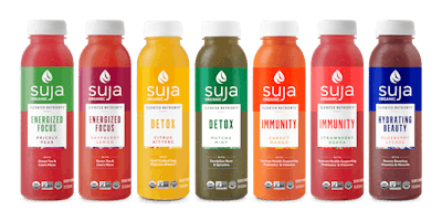
Developed in collaboration with Whole Foods, Suja Organics' new Elevated Nutrients line launched exclusively on the retailer’s store shelves nationwide in March of this year. The line of seven chef-crafted juices were designed to be packed with key vitamins, minerals, and premium functional ingredients offering benefits to beauty, immunity, energy, and detoxification, according to the company. While the PET bottle and closures remain the same, the labels present a bold new look.
“We wanted to create a clean, premium design that was consistent across all segments, would deliver packaging that reflected the care and process we put into our products, and make it easier for our consumers to shop across flavors and quickly identify their favorite,” says Greg Rose, CMO, Suja Organic.
Suja uses a variety of labels depending on the product lines, including pressure sensitive, shrink sleeve, and roll-fed labels. Some product lines feature gloss labels while, but the newest line, Elevated Nutrients, features spot matte. In general, labels produced for Suja use nine to ten color stations—Pantone 1, Pantone 2, C, M, Y, K, Black, White, Gloss— with a tenth station used for labels that incorporate spot matte. Labels are printed on flexographic print plates.
The company turned to design and creative agency Moxie Sozo, Boulder, Colo., to roll out the new brand-wide package design.
“We aimed to simplify content, better establish category and product systems/hierarchy, justify premium price point, and incorporate brand strategies and personality,” says Derek Springston, Chief Creative Officer, Moxie Sozo. “We started looking at their "word-cloud” [on the legacy pack design]. This had been a staple for the brand, but created clutter on pack and confusion on shelf. In came our “window.” A design element that highlights only the most important ingredients and simplifies the hierarchy to brand, SKU, ingredients. It also reiterates our transparent ideals; you can see right to the liquid.
“Next, we needed a way to speak to personality and quality ingredients, but not fall into the trap of being literal,” continues Springston. “Seeing realistic fruits and veggies spoke more to smoothies than cold-pressed juice. Our new "art-strip" showcases a pop of color and an abstraction of the combination of ingredients within each SKU. It doesn't overpower the package and adds a hint of who Suja is as a brand.”
“Our updated packaging marries the bold colors of our old bottles with a sleek, easy-to-read label,” adds Rose. “We spent countless hours speaking with our fans directly to learn more about what they loved most about the brand and are so proud to unveil our bold new design.”
The 2-oz shot line retail for $2.99, the single-serve 12-oz juice line retails at $3.99, and the 46-oz multi-serves retail at $9.99.