Each year, companies in the color business announce their predictions on those colors that most exemplify, or capture, current societal trends and therefore will capture the consumer’s eye as well. These predictions are based on a careful examination of a range of influences. In his article, “Color Matters,” featured in Packaging World magazine, Howard Wright of Equator Design named a number of these and explored how color trends can be used in packaging design.
According to Pantone, in selecting its annual Color of the Year, its Color Institute combs the world looking for new color influences. This can include the entertainment industry and films in production, traveling art collections and new artists, fashion, all areas of design, and popular travel destinations, as well as new lifestyles, playstyles, and socio-economic conditions. Influences may also stem from new technologies, materials, textures, and effects that impact color, relevant social media platforms and even upcoming sporting events that capture worldwide attention.
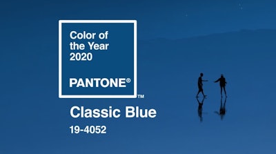
For 2020, Pantone has selected a color it describes as a timeless and enduring blue hue: PANTONE 19-4052 Classic Blue. Says Pantone, “Suggestive of the sky at dusk, the reassuring qualities of the thought-provoking PANTONE 19-4052 Classic Blue highlight our desire for a dependable and stable foundation on which to build as we cross the threshold into a new era.”
“We are living in a time that requires trust and faith,” says Leatrice Eiseman, Executive Director of the Pantone Color Institute. “It is this kind of constancy and confidence that is expressed by PANTONE 19-4052 Classic Blue, a solid and dependable blue hue we can always rely on. Imbued with a deep resonance, Classic Blue provides an anchoring foundation. A boundless blue evocative of the vast and infinite evening sky, Classic Blue encourages us to look beyond the obvious to expand our thinking; challenging us to think more deeply, increase our perspective, and open the flow of communications.”
Adds Pantone, “Imprinted in our psyches as a restful color, PANTONE 19-4052 Classic Blue brings a sense of peace and tranquility to the human spirit, offering refuge. Aiding concentration and bringing laser-like clarity, PANTONE 19-4052 Classic Blue re-centers our thoughts. A reflective blue tone, Classic Blue fosters resilience.
“As technology continues to race ahead of the human ability to process it all, it is easy to understand why we gravitate to colors that are honest and offer the promise of protection. Non-aggressive and easily relatable, the trusted PANTONE 19-4052 Classic Blue lends itself to relaxed interaction. Associated with the return of another day, this universal favorite is comfortably embraced.”
Authenticity and collaboration drive ColorForward 2021
Technology and its impact on human connections is also a theme that spoke to the color experts at ClariantColorWorks when it put together the 15th edition of its annual color forecasting guide for the plastics industry, ColorForward 2021. Says Clariant, “ColorForward 2021 recognizes that genuine human contact is actually becoming a luxury in the digital era, and that people crave authenticity in a world of deep fakes. On a more positive note, technology is being used to create products that connect with people on an emotional level, while collaboration is seen as critical to realizing positive change.”
 Clariant's ColorForward 2021 color palette exhibits contrast.
“Where greens ruled 2020, warm oranges and yellows seem to be taking over in 2021. Blues and greens remain important, ranging from deep nightly hues to softer aquatic tones. Brights have an artificial feel and are juxtaposed with enchanting darks. The lilacs from the last edition have developed into deeper versions of themselves, adding mystery and depth to an overall lively range.”
In ColorForward 2021, as in previous editions, Clariant has identified four societal trends that can be expected to influence consumers consciously or unconsciously in the next few years. Then, for each trend theme, it presents five colors that people can be expected to respond to.
This year’s trends, described by Clariant, include:
1. Dumb numb: This first trend theme is based on the idea that digital devices (screens) have the effect of numbing people and dumbing them down. Medical research is beginning to show that excessive “screen-time” and easy access to information via the Internet actually make people less intelligent and less creative. As result, people are intentionally trying to find ways to disconnect themselves and their children from digital media, but with limited success. The experience of genuine human contact is actually becoming a luxury.
Four of the five theme colors offer something more or less than pure color. A smoky grey swirl effect called Why-FI? suggests how difficult it can be sometimes to see things clearly, while The golden ticket is a translucent beige with subtle gold flecks to represent the luxury of human engagement. A similar idea lies behind two tactile color samples: No WI-FI is a soft green talc-filled chip that has a soft touch, and Stupidify is bright magenta rendered in a flexible thermoplastic elastomer. The only pure color is Ciaokefai? (Italian slang for “Hey! What’s up?”), a very red orange representing the thrill of real human interaction.
2. C-true: Increasingly, people don’t believe what they are told. This can be infuriating and frustrating, like when deep-fake videos make it difficult or impossible to recognize the truth or when consumers intentionally buy products they know are counterfeit—it seems they don’t really care. Fans feel cheated when they follow influencers only to discover that so much of what they represent is totally artificial. The blockchain, which has found its way into a number of trends in the past, is here too, because it can ensure accuracy and truthfulness. The so-called D-web or decentralized web is another inspiration as society tries to find new, credible sources for truth, openness, and authenticity.
Colors in this trend family range from a warm yellow called El Dorado, after the mythical city of gold, and Pure false, which includes a swirl effect so it looks like marble, even when it is clearly not the real thing. The Mask exposes the fake bravado of “greenwashing” with a bright, obviously-artificial green that references the film starring Jim Carrey and the idea that a mask is a false face. Representing the very opposite of fake is Myrddin, a dark, true blue named for the mythical Welsh prophet driven mad when he was unable to deny the truth. The naked truth is a fleshy, peachy pink that is exactly the same color as the paper on which the trusted and authoritative Financial Times is printed.
3. Sense appeal: As much as the digital world can be beset by confusion between true and untrue, some of the same technology is being used scientifically to differentiate between the two. Brands and designers are using neuroaesthetics in an attempt to connect better with their customers by using eye movement, galvanic skin response, heart rate, and other metrics to analyze, quantify and even predict emotions so they can understand better how consumers are making decisions. While some may view this approach as intrusive, it can also be used to create more individualized products. For instance, Swedish retailer Ikea did an experiment when they put certain limited-edition rugs up for sale. In part to prevent people from buying the highly desirable rugs at low Ikea prices and then reselling them at much higher prices, Ikea invited customers to wear a device that measured their autonomic responses. Then they sold the carpets only to those individuals who had a strong emotional response to a design.
Acknowledging this new science that connects design to emotion, the colors of Sense appeal are both visceral and technological. Motus intelligentia, Latin for “emotional intelligence,” is a pinkish coral rendered in a flexible thermoplastic urethane material. Then, there is Mona-Lise me, which is a deep, translucent purple that plays homage to the enigmatic smile of Leonardo da Vinci’s Mona Lisa. A dark transluscent green called Sweaty art is shot through with a purple pearl effect so either color appears when looked at from different angles. D.A.B.E., which stands for Design Augmented by Emotion, is a warm copper. The very same color can be seen as a random effect in a white chip called Yuan bei, a Chinese term referring to a sense of complete and perfect accomplishment, suggesting that neuroaethetics enables people to get to a nearly perfect design, matched to an individual.
4. Ubuntu: In Zulu, ubuntu means “I am because we are” and reflects the Zulu concept that any person’s life is inextricably linked to other people. So this trend theme is about collaboration and the need we have to work together. We need to look to nature for examples of how working collectively can accomplish great things. Ants and bees, for instance, live in complex collaborative communities, relying on the many for the benefit of the whole. Blockchain comes in here too because it is a way to collaborate and build trust. Open source technology serves the common good. And on the banks of the Red Sea, work is about to begin on Neom, the world’s first truly smart city, conceived to be completely collaborative and sustainable.
A reddish translucent brown with metallic effect called Ant attack was inspired by those cooperative ant colonies, and Waggle dance—honey colored with a dark speckle effect—is named for the complex movements that bees use to alert their hive mates to the presence and location of nectar or pollen. Deep shi(f)t is a fury red that sounds the alarm while embedded blue, green, and pink glitter stand for the complexity of today’s problems. Magurgur, a Sumerian word for a great ship out of a Babylonian legend that predates Noah’s Ark in Hebrew tradition, is represented by a forest green with golden metallic flakes. Molded in flexible thermoplastic urethane, it is intended to represent nature and to reference the idea of saving the human species. Finally, a dark, dark purple has been dubbed Stigmergence. The name is derived from the word “stigmergy” which combines the Greek “stigma” meaning mark or sign and “mergy” meaning work or mechanism. It refers to a mechanism of spontaneous coordination between agents or actions.