The successful integration of structural and graphic branding has
proved to be a great challenge for many consumer packaged goods
companies. “Do we start with the graphics branding and then create a
structure around it, or do we create a structure and then start the
graphics exploration afterward?” This question is commonly asked at the
beginning of the creative process.
The best answer I have found to the question is “neither.” A successful
package must be a seamless combination of structural form and function
and graphic branding working together in support of a common message to
the consumer.
So why is a balance so difficult to achieve?
Possible reasons for much of the difficulty are varied. Structural
designers tend to have industrial design backgrounds and they must be
technically familiar with many complex manufacturing processes in order
to be effective in structural branding. For this reason, in addition to
the marketing team, they often interface with a company’s research and
development team and operations.
On the other hand, graphic designers are often trained specifically in
graphic design. They have little experience in structural manufacturing
processes. They typically work directly with the brand manager and/or
creative services group in communicating the brand attributes in the
two dimensions of print.
If that were not enough of a difference, timelines for structural
changes are typically much longer than for graphic changes, making it
difficult to work on both concurrently. Projects often start with the
“longest lead time” item to be resolved first, leading to a structural
kick-off before the graphics team is even assembled.
To be successful, I have found that a collaborative process involving
both graphic and structural designers (along with marketing, research
and development, and operations) is vital to successful overall package
communication. The following examples illustrate the point.
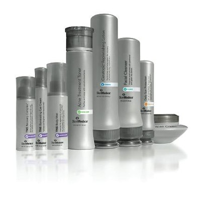
SkinMedica line
SkinMedica had a very effective line of skin care products that was
sold primarily in dermatologists’ offices. Unfortunately, the line was
produced in stock packaging with graphics that did not truly reflect
the quality (and price!) of the products inside. While the
doctor-recommended line of TNS-based medical products continued to sell
individually, consumers did not seem to see a reason to buy the
remaining 21 products in the line. Instead, they chose mass-market
equivalents.
SkinMedica needed a line of products that stood out as unique in
dermatologists’ offices and reflected the medical and scientific
heritage of the line in order to differentiate the products from
mass-market competitors.
In this case, the packaging program had to begin with structural
branding. SkinMedica was previously purchasing more than 40 stock
packaging components. The company needed a plan for organizing the line
into as few components as possible to make practical a switch to custom
packaging. 4sight inc. reduced the line to eight package forms with 18
components. This task required extensive analysis of consumer usage
behavior, ergonomic needs for the packaging, and product delivery
requirements. Only then were initial structural design platforms
created for line differentiation, cost effectiveness, and manufacturing
feasibility.
With the structural platform in place, it was time to create unique
imagery. Since the need to manage capital costs was still critical,
judicious use of custom components was necessary to ensure that a form
language could be created without requiring extensive tooling. This
really had to be done before the graphic branding could be started, but
the graphic team was part of the structural explorations. This assured
that the graphic designers’ vision for the graphics could be
incorporated into the overall product communication.
The visual form language that best communicated the brand was based on
a mix of graduated cylinders representing SkinMedica’s science-based
heritage and simple but elegant cosmetic forms. Next, the graphics team
developed created sophisticated and elegant graphics to complement the
structural branding. These graphics created the line’s premium look.
Plastic resin finishes and colors were revised until the graphic
branding and structures were in complete harmony. Collaboration between
graphic design, structural design, marketing and R&D/operations led
to a great success in the marketplace for SkinMedica.
Blink and it’s done!
When 4sight inc. and the Honeywell Consumer Products Group collaborated
to create a new line of products, it soon became clear that entirely
new package forms would be required. The line of Blink products is
targeted at moms trying to survive the crazy realities of active kids
in their cars leaving things a mess. Since the underlying message is
“These are the products you need to manage the mess in your car, where
you want them and when you want them,” it was necessary for the
products to be available just about anywhere in the car that mom wanted
them. This capability required shapes, hanging devices, etc., that were
very different than traditionally packaged interior car care products.
Structural designers started by creating product concepts that could
meet mom’s needs. Then structural solutions were developed that would
work in many locations throughout the car. The graphic design team
worked closely with the structural team throughout, helping to define
exactly what a line of unique products should look like to the consumer
and what type of personality they should have. HMS Design suggested to
the structural designers that mom wasn’t as worried about
“coordinating” the product colors to her car, but would prefer a
friendly, fun line of products that stood apart from each other based
on their unique functionalities. This insight resulted in a playful
line of multicolored products, with graphic elements working together
with common form languages to present a complementary line of products.
This collaboration of structural and graphic branding has already made
the line successful at retail.
Fido Dido meets 7-Up
When Pepsico asked 4sight to develop unique designs to integrate its
licensed Fido Dido character with its 7-Up line of beverages worldwide,
the project started with the graphics. Graphic designers had created
Fido Dido as a fun-loving character with a unique life style.
Structural designers worked closely with the graphics to capture the
feeling of the character and determine how to convey Fido Dido’s
essence in bottles that would work on the production line. Two paths
were selected: First was the literal interaction of the Fido Dido
character with the bottle and second was an “empty canvas” approach
that provided a “Fido-like” bottle that could be labeled in any way
necessary to keep the character fresh while providing variety for the
consumer.
The Fido interaction bottle combined the graphic imagery of Fido Dido
hugging the bottle with structural changes to the bottle to support the
character.
Understanding the technical parameters around creating pressurized glass bottles was critical to achieving the blend of “Fido fun” and the ability to manufacture the bottles. The graphic and structural teams worked closely together to integrate the ACL printing, glass embossing, and sculpting essential to achieving the final look. The Fido Canvas bottle is intended to provide more options for the graphics team to integrate Fido Dido into the bottle. The bottle form is intended to be an easy grasp bottle in the way that “Fido would have designed it”—fun and cartoon-like in its overall form.
A partial shrink label allows the product to be seen in support of the
“Think Clear” positioning while allowing Fido Dido to
have fun around
the 7-Up logo. This approach also allowed the creation of eight initial
label designs that provide variety for the consumer on shelf.
These examples return us to the question of whether structure or
graphics comes first. While a collaborative approach is always best,
leadership is determined more by project needs than any formal
protocol. If structural functionality or a strong unique profile on the
shelf is required, the structural branding should lead. But the graphic
branding insights are critical to keeping the structure on track. If
strong graphic elements are the foundation for the new packaging, the
structural team should follow the lead of the graphics designers in
order to assure clear brand communication on the shelf.