The new line of Tread Softly wines were created as a ‘next generation wine for the next generation of drinker’ in response to the increasing appetite for light wines with appealingly gentle flavor and minimal environmental impact.
The brand worked in partnership with drinks design specialist Denomination, Sydney, Australia. The design firm’s work illustrates how these factors—light and sustainable—can be communicated effectively while appealing to both traditional audiences and those that new to wine.
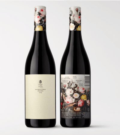
The front label uses a PSL pale grey/green colored stock so the only print is the black lettering. The back label prints CMYK offset. The capsules utilize new CMYK technology, and Fourth Wave applies both labels with an in-line automated labeler.
Family-run winemaker Fourth Wave produces the range–Prosecco, Pinot Grigio, Sauvignon Blanc, rosé, Pinot Noir, and Grenacheu–using sustainable vineyard management and winemaking techniques, as well as lean and green reduced-weight bottles.
“This selection of wines has been developed in response to modern thinking about wellbeing and sustainability, and we wanted that message to be communicated clearly to consumers,” says Nicholas Crampton, Co-owner, Fourth Wave. “We approached Denomination because it has unparalleled experience in the wine sector, and we knew the team would deliver a brave brand and packaging strategy to reflect the ground-breaking nature of Tread Softly.”
The name itself, Tread Softly, evokes a sense of eco-awareness and sustainability, while echoing the lighter styles and refined flavors of the wines.
According to Denomination, the semiotics of the labels needed to support the name, so the chosen graphics are delicate and considered. It’s a daring, restrained approach, but the a design aesthetic has a softness that complements the brand premise and name. Overall, the work celebrates the selection’s pioneering, eco-aware spirit and communicates that the wines are better for the planet and the consumer.”
Using naturally flecked uncoated paper stock, the front label is not only nature-friendly, its artwork is discreet and understated, encouraging you to lean in and take a closer look. However, turn the bottle around and you find dramatic, sensual images of flora and fauna signifying the wines’ sophisticated flavour profiles. These eye-catching images also appear on the capsules to further boost stand-out and allow for a more minimalist approach on the front labels.
“Research shows that consumers all over the world are drinking less, but better quality, and they want products that chime with their eco-aware thinking. The Tread Softly brand totally taps into this, Crampton adds. “Denomination’s label work has an ethereal and beautiful presence on shelf that will ensure that Tread Softly enjoys a long, fruitful future.”