A company that should have failed three times, according to its CEO & Co-Founder David Simnick, Soapbox is now finding its social mission-oriented personal care products flying off store shelves after getting a package redesign that hits the sweet spot between Millennials’ eagerness to embrace socially-conscious products and their desire for affordable luxury.
In 2010, when Simnick created his first batch of soap products in his kitchen, he wasn’t driven by his love—or knowledge—of personal care products, or even of the consumer packaged goods industry in general. He was inspired by the idea of creating a brand that would give back, one-to-one, hygiene products to those in the greatest need.
Before ambitiously launching a brand into a category dominated by such heavy hitters as Procter & Gamble, Unilever, and Colgate-Palmolive, Simnick worked as a subcontractor on water aid projects for the United States Agency for International Development. “While doing that, I saw there was a void in WASH projects,” he says. WASH is an acronym for water, sanitation, and hygiene. “There was a lot of focus on water and a growing focus on sanitation, mostly led by the Bill and Melinda Gates Foundation, but there wasn’t a lot of focus on hygiene. So I called up my best friend and said, ‘Hey, I really want to work on this, and I want you to come help me start a soap company.’”
The company began with incredibly humble origins, Simnick adds, “and a lot of hubris.” He admits, “We didn’t know what we were getting ourselves into.”
In 2012, Simnick and his partner, Soapbox President & COO Dan Doll, quit their day jobs and began working full-time to build the Soapbox business. Since then, Simnick shares, there were three definitive points where the company should have failed—when “the wheels looked like they were about to fall off the cart.” Despite having an affordably-priced, high-quality product, made with “thoughtfully selected,” natural ingredients, and despite the businesses’ worthy mission of donating one bar of soap for each product purchased, Soapbox was often hobbled by poor branding and package design.
But when brand design agency Anthem Worldwide created new packaging for Soapbox’s personal care products, it completely changed the trajectory of the company. One SKU, in fact, saw a jump in sales of 2,000% as a result of the redesign. But most important to Simnick, it fuels Soapbox’s mission. “The whole reason we exist is not just to sell as many products as we can,” he says, “but through each and every one of those purchases, we are able to donate one more bar of soap.”
Finding a new branding direction
Starting with a simple bar soap, the Soapbox brand has now grown to include more than 20 products, including shampoo and conditioner, body wash, bar soap, and liquid hand soap, among others. Whole Foods was the first chain to carry the brand in 2011; today, the products can be found online and in retail stores across the country.
Since its beginning, the brand has been about the mission: “To empower people to change the world through everyday, quality purchases.” For every Soapbox product purchased, one bar of soap is donated, either locally or abroad. As Simnick explains, Soapbox tries to give 50% of the donations to local homeless shelters, food pantries, and other charitable organizations, while 50% is distributed through NGOs around the world. So far, more than 3 million donations have been made worldwide, many of them complemented by hygiene education.
Connecting consumers with the mission, each Soapbox package is printed on the back with a Hope Code™. By going onto the company’s website and typing in the unique code, the consumer can see where “their” bar of soap was donated. The company’s ethos, summed up in its tagline, “SOAP = HOPE,” is certainly inspiring and is one that increasingly socially-conscious Millennials can get behind. But with Soapbox’s original packaging, the social mission was the message, not the product itself.
In 2016, Soapbox began vetting multiple design agencies to help them restage the brand in a way that would resonate more strongly with consumers. Anthem was chosen due to its willingness to “test every single assumption,” Simnick says. “When we interviewed a bunch of other agencies, we felt they came to the meeting with a pre-prescribed solution, that they already believed they knew exactly what our brand should look like.”
The challenge for the redesign, Simnick explains, was how to take such a meaningful mission, with a naturally-positioned product and elevate that, while still being accessible and inviting to the consumer. “We didn’t want to be pretentious, we didn’t want to be stand-offish, but we did want to say, ‘This hand soap you’re seeing right in front of you ranges anywhere from $3.99 to $4.99, and that’s accessible. And, you get an EDTA-, paraben-, phthalate-, and silicon dye-free, vegan-certified, cruelty-free product, yet it also looks like it might be thirty dollars.”
Design with thoughtful luxury in mind
As John-Paul Doyle, Senior Creative Director for Anthem Worldwide NY, explains, Soapbox’s existing packaging at the time of the redesign used very bright and cheerful colors. And, while it did a lot to push the mission forward, it didn’t talk much or very well about the quality of the product inside. “And these products are top-notch,” he says.
Anthem’s process was focused on mining consumers for insights to learn what they expected from a product such as this, where the sweet spot was between driving the product benefits and also telling the story of the mission, and what permission they had visually within a very aggressive, competitive marketplace. This included direct conversations with consumers—the demographic being women, in particular Millennials and mothers of Millennials—about initial concept ideas as well as predesign research on the category, looking at all its codes and cues and extracting and inventing “some raw visual territories” they could then put in front of consumers.
“Through those conversations and through our design process, we were able to find out things about hierarchy, cross category codes, and cues for the brand, things we could tweak depending on whether we were in liquid hand soap or whether we were in body wash or whether we were in shampoo,” Doyle explains. “We were able to test structural stimuli as well a whole range of graphic options afterwards to arrive at a suite of elements that in our minds was really answering all of those core questions from consumers.”
One insight: The liquid hand soap needed to be a “badge” item, or one consumers would be proud to display in their kitchen or bathroom. Whereas items such as shampoos and body washes had a more functional element to them and had to overdeliver on the ingredient and benefit story.
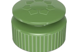
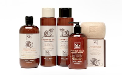
The end result was a line of package structures with an apothecary feel, a style that Doyle explains was beginning to show up with startup brands in the haircare and personal care space and that consumers associate with handmade products—“that are beautiful, that you would want to display in the home.” The hair and body care bottles are amber-colored and use an off-white label, enhancing the craft appearance. The liquid hand-soap bottle uses a transparent label, while the bar soap is in a cream-colored carton.
With the exception of the liquid hand soap, the bottles sport a label decorated with a hand-drawn illustration of the prime ingredient used in the products: coconut. The artwork changes position, as does the pared-down logo, depending on the product. At the bottom of all packaging is the “SOAP = HOPE” tagline.
“It was about trying to find a beautifully crafted illustration style that really spoke to the quality of the ingredients and creating a brand mark that had a lot of stature and that was quite elemental in its look, one that could be beautiful and very powerful, and one that could easily migrate around the pack depending on what category we were in,” Doyle explains.
The mission of the brand is embedded within the design on the back of the label and includes the variable-printed Hope Code and the word “Hope” integrated into the barcode. “It’s just another beautiful little detail that is delightful for consumers to find, especially in a brand that wants to convey the idea of thoughtful luxury,” Doyle explains.
To Doyle, “thoughtful luxury” includes the thoughtful way Soapbox selects its ingredients, the way it creates its products from those ingredients, the way it depicts those ingredients on the packaging, and the way it uses 100% recyclable structures and labels. It also includes the way the Soapbox mission comes to life throughout the world and the health it can lend communities in need.
Baseline jump of 40% to 90%
An interesting twist to the story is that after beginning the project, Soapbox received an acquisition offer in mid-2017. “The reason we turned it down,” says Simnick, “was that simultaneous to having an exit opportunity, we were getting all this amazing feedback in consumer surveys about how the new branding would do compared to our old branding.”
Following the relaunch of the brand in August 207, Soapbox saw a substantial jump in sales, with the average baseline increasing from 40% to 90%. One particular SKU, Simnick shares, even increased more than 2,000%. In some retailers, he adds, the company has actually seen closer to two- to three-times growth in terms of where the baseline was before and where it is now. “That’s just incredibly exciting,” he says. “And that’s without promotion.” With promotions such as temporary price reductions, Soapbox has seen increases anywhere from 200% to 400% above the already-elevated baseline.
“What's so interesting now is that people are usually shocked to find out how affordable our products are,” Simnick says. “With the old design, we’d get a lot of consumer feedback such as, ‘I’m surprised this is as good as it is.’ Whereas now, we’ve gotten so many people writing in saying, ‘I absolutely love the new product. I love what you guys have done with the formulations.’
“I think our consumer is really looking for accessible opulence that has an authentic and original story. The space we’re in is so competitive, you really need to connect with that consumer on an emotional level.”
As Soapbox’s rebranding experience attests, social mission brands need great packaging too. Affirms Doyle, “We knew a virtuous brand like Soapbox is very attractive to consumers, particularly Millennials, who are very conscious of the behavior of the corporations and the brands they subscribe to and want to be associated with. We definitely knew the brand had a very attractive proposition. However, we also knew from talking to consumers and the industry and from doing our research, that’s all well and good, but really at the first moment of truth, that product has to sell itself on its own merits, meaning the quality of its ingredients, the quality of its benefits, and the uniqueness of its proposition versus its many competitors. The mission alone, the virtue alone, wasn’t enough to really draw people in without having that fundamental quality of the product.
“For us, it was about creating a good design that could connect the brand mission and the product, which then would drive the business, which would then then in turn lift the mission, which would then feed back into the virtuous cycle. It was important for our design process to create something that had the right level of premium and the right level of pure communication, and the right level of beauty and the right level of evident quality, to drive an uptick, and a huge uptick, in the brand, that would then feed back into the virtuous cycle.”