What do you do when you have a wildly successful hummus brand—60% of the U.S. market, in fact—with packaging that consumers embrace? While your answer may not be to change it, that’s just what White Plains, NY-based Sabra did with the package design for its 50 SKUs of hummus, guacamole, and Greek yogurt-based tzatzikis.
In 2015, on his first day as CMO for Sabra, Eugenio Perrier sat in on a consumer focus group evaluating new package design concepts. “It was wonderful to hear from consumers,” he says. “And what I learned that day was that our packaging was working quite well. There was no urgent need to change, which meant to me, there was a reason to change, but no reason to rush.
“We see this as a part of a natural evolution of the brand. Thankfully, Sabra’s packaging was still working quite well. But we felt the packaging could work even harder for us.”
Working harder meant a design that could convey the key attributes of the brand, including freshness, transparency, authenticity, and taste appeal, while making the brand’s products more easily navigable on shelf.
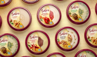
However, those disruptive features that Sabra pioneered with its hummus packaging back in the early 2000s when it launched the brand and that competitors have since duplicated needed to remain, Perrier says. These included the red rim on the lid of the dip container and the transparency of the package, which allows consumers to see the fresh product inside. The rest of the packaging elements were flexible.
Brand design firm Beardwood&Co worked with Sabra’s in-house design team to create a new logo, restyled label design, and on-pack photography. The “Sabra sun,” a well-recognized piece of the brand’s logo, is now illustrated as a chickpea heart, surrounded by five sesame seed rays, representing the two primary ingredients of the dip—chickpeas and sesame paste, or tahini. The five rays also represent the company’s five core ingredients: openness, trust, passion, caring, and daring. The new Sabra wordmark has been customized to keep the “musicality” of the previous version, while prompting a bolder impression.
For the artwork, photography shows sunlit ingredients—chickpeas, tomatoes, cucumber, garlic, and peppers among them—resting on top of a wooden kitchen cutting board, conjuring freshness and real food appeal. “We are in an era of real food. Consumers care more about the quality of the ingredients and the innate healthfulness of what we eat,” says Perrier. “Increasingly, people are prioritizing plant-based nourishment. So, as makers of an original plant-based food, and since all Sabra recipes are created in our kitchen, we wanted this design to evoke that welcoming and culinary atmosphere while streamlining the way we communicate product and flavor varieties.”
Another iconic feature of Sabra’s packaging has been the wave-like die-cut edge of the lid’s pressure-sensitive label, which that covers half of the top of the package. With the redesign, the label has been reoriented from horizontal to vertical, guiding the eyes to the logo at the top, then to the flavor descriptor, then to the photography, and finally to the transparent view of the product. A cleaner label with brighter colors and bolder fonts on the body of the container incorporates color-coded flavor differentiation to improve shoppability.
The new package design landed on store shelves—and consumer’s tables—in February 2018. “We went through a diligent process of listening to consumers and have consistently received very positive feedback on this new design,” says Perrier. “Consumers see it as an improvement in so far as it is a more modern look, has great taste appeal and readability, and conveys freshness. And we’ve enjoyed hearing that consumers appreciate they still can see it is the Sabra they know and love.”