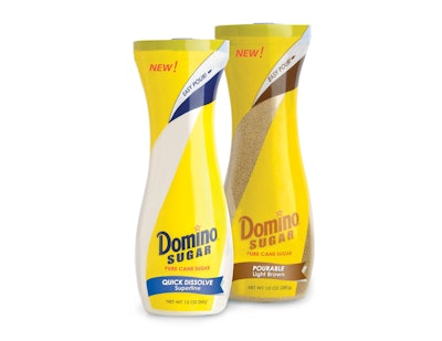
In 2005, Domino Foods, Inc. was the first to innovate in the sugar category, with the launch of an eye-catching, 4-lb grippable, resealable plastic container for granulated sugar that eliminated for consumers the messy process of transferring bulk sugar from a paper bag into a canister. Now, having identified new consumer pain points around smaller-volume sugar packaging, the company has innovated once again, with an elegantly shaped, 12-oz custom bottle with an easy-to-use flip-top dispensing closure that is destined to replace the sugar bowl on consumers’ kitchen tables.
In November, the company—part of ASR Group, the world’s largest refiner of cane sugar—launched its Domino Sugar and C&H Sugar brands in Quick Dissolve Sugar and Pourable Brown Sugar varieties in the new bottle, which Domino says was designed to be “easy to use, highly functional, and elegantly styled to fit in with any kitchen décor.”
“As we continue to focus on the needs of our consumers, we are certain that these well-designed bottles are a convenient and attractive sweetener solution,” says Domino Foods President and CEO Brian O’Malley. “The tall and graceful shape fits securely in the hand, allowing the consumer to easily open and dispense the sugar directly onto their food or into drinks, without needing a spoon. In addition, the patent-pending flip-top lid snaps shut, preserving the freshness of this trusted product.”
Constant innovation
As both the 4-lb canister and the new 12-oz sugar bottle attest, innovation is a core strategy for Iselin, NJ-based Domino. To drive new product ideas, the company operates an innovation center in Boca Raton, FL, that includes a packaging component. “We are constantly screening both packaging and product concepts through our new product development stage-gate process,” says O’Malley. “Through that process, we are looking for products that have the highest commercial appeal and most commercial potential.”
Beginning in 2010, Domino launched a project with design firm 4Sight inc. to leverage its sugar products’ core brand equity and to improve consumer usage with a package redesign. The project focused on the packaging for two value-added products: Domino and C&H Superfine Sugar (now Quick Dissolve), designed to dissolve quickly in hot or cold beverages and marketed in a paperboard carton; and Domino Brownulated Light Brown Sugar (now Pourable Light Brown), in a resealable pouch, formulated to resist clumping and hardening.
Through consumer research, Domino determined the number-one source of dissatisfaction in the sugar category is packaging that leaks or does not reseal. “In addition, we found in the research that there was an opportunity to design specific packages for specific usage occasions,” says O’Malley.
Package development for the new bottle was a two-year process that included consumer input, prototype testing, and quantitative testing of the concept and price points. As part of the process, Domino asked consumers to think about various occasions when they used sugar. These included baking for the holidays, stirring in cold beverages, sprinkling on fruit, etc. They then asked consumers for imagery associated with each occasion. Finally, consumers were asked to think about the ideal packaging for use in these occasions.
“In the case of ‘on-the-table’ usage, the typical sugar bowl is short and squat, with a wide aperture for refilling the bowl from a larger container,” says O’Malley. “Once consumers were freed from the need to refill the package, they came up with all sorts of shapes and packaging configurations.”
This information, combined with Domino’s requirements that the new package had to fit comfortably in the hand, sit on a table, and easily dispense and pour, led to the development by 4Sight of 14 prototypes. Giving 4Sight further freedom to innovate, the new prototypes were not restricted by existing packaging line requirements; the bottle is filled by contract packers.
‘Table-worthy’ design
With its graceful, curving shape and unique custom closure, the final package structure in clear PETE (from a proprietary supplier) is a real first for sugar. “The overall carafe shape was designed to celebrate the fun and great taste of sugar while providing a much better usage experience for consumers,” says 4Sight founder and President Stuart Leslie.
“The elegant shape is intended to elevate the package to ‘table worthy’ status—consumers can feel comfortable leaving it out on tables or counters, leading to easier access when they need it,” Leslie adds. “The shape is also intended to be very easily grasped and allow controlled dispensing with one hand. The flowing lines from the base through the closure in profile, and reinforced with the graphics, hint to the consumer on-shelf the ease of pouring and provide a reminder of the fun of swirling sugar into a beverage.”
The proprietary white polypropylene closure, also designed by 4Sight, is an oval shape that complements the bottle opening, with the pour spout at the top of the oval. A slight, round indent at the opposite end indicates to consumers where to apply pressure to open the closure, the entire top of which flips up for dispensing.
“Functionally, it is a simple, one-handed press-open device that allows easy opening and secure reclosing,” Leslie explains. “Consumer research indicated it was very important that all the sugar drop back into the container and not get stuck in cracks and hinges, so the flow-black platform at the orifice was not only designed to direct the flow to improve control, but also angled just the right amount so that every remaining granule flows back into the container.
“Aesthetically, the closure finishes the flowing lines provided by the carafe shape. The slightly soft, pointed top profile also cues the consumer of the ease of pouring and control in dispensing just the right amount of sugar.”
Finishing off the bottle’s sophisticated appearance is a clear, flexo-printed, full-body shrink-sleeve label, with graphics designed by Encore Marketing. Central to the design is a ribbon-like band of color—yellow for Domino; pink for C&H—beginning at the base and sweeping up and around the hourglass-shaped container. Clear windows on each side of the bottle allow consumers to see the product inside. Brand logos are positioned near the bottom of the bottle, above the variety name.
“The brand logos and packaging colors have been carried into the new package to provide easy recognition for the consumer as they move through the aisle,“ says O’Malley. “One of the things that is important in the package is to be able to see the product itself, which is new for the sugar category. We are bringing a value-added product, and we want the consumer to be able to see that it’s different.
“I am sure that the marriage of these iconic brands with such exceptional products and this premium packaging will have consumers delighted with the new user experience. Our expectations are that the new sugar package will become part of morning breakfast routines and family meals, and be displayed proudly when entertaining, as it is truly a ‘table-worthy’ offering.”
To see a spin + zoom 360° photo, click here.