Shelf Impact!, over the past year, has explored the growing trend of consumer products investing in custom-shaped packages. The idea behind this tactic is to gain shelf presence and create memorable experiences with consumers bombarded with product choices.
The Dial Corp. embodies the custom-shape trend perfectly. Consider this, from Shannon Bowers, senior package design manager for Dial NutriSkin lotions: “It’s becoming more of a consumer expectation to deliver a custom shape and provide a higher benefit. A custom shape is a commitment to your product, and it reflects how we feel about our brand. We couldn’t have achieved the S-curve in our design with a stock closure.”
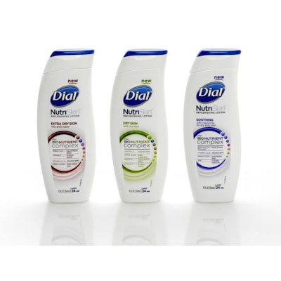
Bowers was referring to the custom-shaped, geometrically pleasing package for Dial NutriSkin, which marks Dial’s entry into the already cluttered $1.6 billion hand and body lotion category. Lotion shelves include heritage brands, strong private-label offerings, and a fair amount of copycat packaging, so differentiation was a key metric in Dial’s search for the right package to introduce the brand, as well as the Dial name, in a new category.
Dial, working with Tirso Olivares Design, opted for a visually distinctive bottle that works seamlessly with a custom flip-top closure.
The package satisfies two marketing objectives for Scottsdale, AZ-based Dial. First, Bowers says, it’s functional, and it also makes the brand believable. Equally important, it makes the brand approachable—crucial for a new product. Adds Nina Daily, brand manager for Dial NutriSkin, “We wanted a unique look but also a functional package that would give the consumer the best experience using this product.”
Dial NutriSkin’s 12-oz squeeze bottle, from Matrix Packaging, features a vertically curved shape and an oval footprint that integrate both the bottle and closure into one gently flowing line from base to cap. The bottle can stand upside-down on the cap as well.
“This package elevates the premium image of the Dial brand above competitors on the shelf,” Olivares observes. It does so, he notes, by visually communicating innovation, modernity, beauty, youth, and body care in support of the brand positioning “Healthier Skin, Healthier You.”
The package’s geometry effectively communicates the value of the nutrients in the product ingredients. At the same time, it enhances the bottle’s functionality. For example, an indented area at the top of the bottle and a ridge built into the mold of the closure, from Seaquist Closures, enable easy opening of the bottle. They also combine to visually resemble the outline of a leaf in support of the brand positioning.
In addition, testing determined that consumers found the S-shape of the slender bottle pleasing to pick up, hold, and squeeze.