onsumers are bombarded with marketing messages, and they want help sorting the need-to-know from the nice-to-know information. What is the product, what does it do, and why should they buy it?
Labels are an excellent but underutilized way to convey essential decision-making information quickly to shoppers. Among those that are doing a particularly good job of supporting brand sales efforts are those that communicate a value-added proposition. Consumers may be more likely to pick up a product when the packaging presents them with an added incentive.
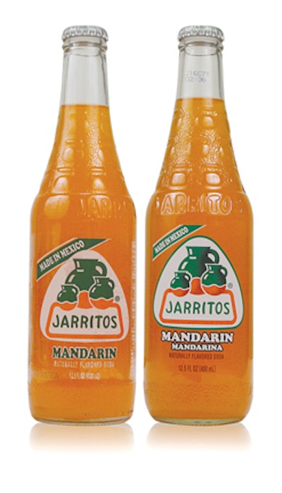
For Jarritos fruit drinks, the additional value comes in the form of the “no-label” look, which enables shoppers to see the vibrant colors of its beverages through a clear bottle, adding “pickup power.” The clear, pressure-sensitive label, combined with a newly designed bottle, enhances perceptions of a premium product.
In the search for the best way to adhere a label to Aquafresh toothbrush packages, GlaxoSmithKline, working with its supplier, achieved the wrinkle-free label it needed. Along the way, it also gained an unexpected benefit that’s new to the category: an on-pack, instant redeemable coupon.
On other packages, the label is attracting niche audiences of passionate consumers and building brand loyalty. One example is Honest Tea’s limited-edition label on its Maqui berry variety in support of breast-cancer awareness. Beyond cause marketing, the label manages to keep communications simple while also calling out the tea’s calorie-free and organic benefits.
The following three examples show how these labeling trends work for specific product categories.
1. Clear label provides ‘grab factor’
Life cycles for package redesigns are getting shorter as marketers are under increased pressure to continually deliver sales results—even when the brand is performing well. So marketers are responding to consumer desires for contemporary packaging that easily distinguishes between product varieties.
That was the case for Novamex, of El Paso, TX. The company’s Jarritos fruit drinks target Mexican immigrants longing for home-country brands. The firm posted more than 20% annual sales growth for the past five years, yet the company was facing mounting pressure from competitors’ nonalcoholic beverage brands. Novamex responded by contemporizing the brand with a new label and bottle and discarding the previous wraparound label, which distracted from the bottle contents.
“Our goal was to upgrade the brand’s image to a cleaner, more up-to-date and premium look that would pop on shelf,” says David Flynn, Novamex marketing director.
A key selling point of the 12 fruit-flavored drinks across the Jarritos line is their vibrant colors, which helps create the taste appeal. Novamex worked with label converter Spear USA, which recommended a clear biaxially-oriented polypropylene face-stock label from Avery Dennison. The face stock was paired with a PET liner and an emulsion acrylic adhesive.
The new labels feature an image of Jarritos, or “little jugs,” referring to the tradition of consuming water and other beverages from clay jugs. The eight-color label is printed UV flexo, with a combination of flexo and rotary screen-printing.
“Compared with the traditional labels used previously, the new Fasson pressure-sensitive film label provided more creative freedom to enhance product image and raise consumer awareness,” notes Dan Muenzer, vice president of marketing at Spear USA.
Novamex paired the clear label with a straight-wall, lighter-weight bottle, and the result is a package that enables shoppers to see the vibrantly colored product at any angle on the shelf.
“This puts us on par with other beverages that have already made the switch to pressure-sensitive labels,” Flynn says.
2. Label solution delivers couponing opportunity
When the package footprint is very small, communication is particularly challenging with consumers. The package offers a confined space for grabbing shoppers’ attention through marketing approaches such as special offers.
Toothbrushes are among products facing that hurdle. The package typically is a tall and very narrow clamshell adhered to an equally proportioned graphics card. Such a package presents marketing difficulties because it has very little flat “billboard” space. GlaxoSmithKline faced this dilemma with packages of its Aquafresh Gel-Flex and Aquafresh Deep-Action toothbrushes. Besides the limited package surface, the labels were wrinkling along the clamshell’s contoured shape during trials, regardless of the label’s shape or size.
Working with WS Packaging Group, GSK opted for a clear over-laminate text sheet with pressure-sensitive wings that attach the label to the back of the package rather than the clamshell.
Besides a wrinkle-free label, the approach also provided a measure of serendipity for GSK. The company was able to include an instant redeemable coupon—a novel marketing approach on toothbrush packages. The coupon remains wrinkle-free, and it separates cleanly from the over-laminate without damaging the barcode, thereby providing GSK with strong promotional and cross-merchandising opportunities.
3. Tea label simplifies multiple messages
Co-branding is one marketing tactic that’s used in calling attention to a brand’s line extension, and it’s also a way to become more intimate with consumers who are passionate about a cause. The challenge on the label is to avoid overwhelming the consumer with information. Honest Tea accomplishes this goal with a limited-edition label that leverages both color and clean design to keep the communication simple but effective.
When designing packaging for its new Passion Fruit Green Tea with Maqui Berry variety, Honest Tea wanted to highlight its relationship with Susan G. Komen for the Cure in support of breast-cancer awareness. Yet Honest Tea also wanted to communicate that the new flavor variety is calorie-free and an organic product, a blend of USDA-certified organic green tea—which it is marketing as the first tea naturally sweetened with organic stevia extract, a leafy plant native to South America that is sweeter than sugar but does not contain any calories.
“After a lot of hard work, we’ve surprised ourselves with how delicious this drink tastes,” says Seth Goldman, Honest Tea president. “The packaging reflects our message perfectly.”
The focal point of the label design, developed by Moxie TM, is the brand’s “T” logo, which serves as a window for the fresh ingredients inside the bottle. The logo nestles next to vibrant photography of the Maqui berry. The words “0 calories” appear in a pink color band next to the logo to highlight the zero-calorie message.
Color is used effectively elsewhere on the logo. A pink ribbon on the logo complements the pink-color twist-off cap to signify breast-cancer awareness. In addition, color bands at the bottom of the label and a silver band on top further differentiate the Maqui berry tea from other flavor varieties in the line.