When Wall Street is pressuring a brand owner to quickly revive a recently purchased stagnant brand, the tendency often is to default to rushing “me-too” packaging into stores. That was anything but the case with Procter & Gamble’s approach for reviving its Herbal Essences brand.
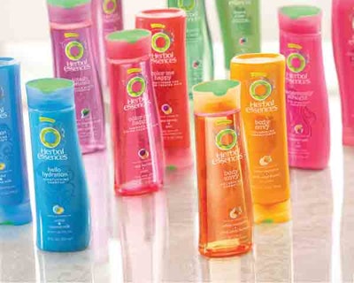
The Cincinnati, OH-based marketing powerhouse has been cultivating a new culture in which the power of design underpins every aspect of the company, including packaging—and the restaging of Herbal Essences shampoo and conditioner demonstrates this thinking. The new packaging fuses both shape and product and bottle color combinations to walk in step with the personality attributes of its core consumers.
Herbal Essences’ new look was achieved in 18 months and exceeded P&G’s expectations by:
• Increasing dollar share of the brand 9% vs. competitors.
• Raising purchase intent by 20%.
• Winning over the brand’s core consumers through packaging.
To achieve these lofty heights and bring Herbal Essences out of its sales slump—the brand had fallen somewhat out of favor with consumers—P&G assigned a cross-functional team to the project. This step sounds a bit cliché, but P&G has emerged as a leading company in infusing design innovation into all aspects of its business strategy. Among other initiatives, departments across P&G are being educated about the value of design.
At the Fuse: Brand Identity and Package Design conference in April in New York, Claudia Kotchka, vice president of design innovation and strategy, explained the directive she has received from the executive suite to “build design into P&G’s DNA.” Kotchka, a 29-year veteran of P&G, cited the Herbal Essences project as an example of the culture change within the company. She explained that “we had to debunk the myth that the only thing that counted was the product in the package. We started with the importance of aesthetics.”
With a cross-functional team assembled, the restaging of Herbal Essences moved forward. Creative team members visited with core Herbal Essences consumers as they shopped and also in their homes. “We wanted to understand her shopping mind-set, her lifestyle,” explained P&G’s Krista Schwartz at The Packaging Summit in May in Rosemont, IL, and who then talked in more detail about the redesign with Packaging World. Schwartz is a global upstream packaging manager who helped guide work on the Herbal Essences project. “We learned that knowing your customer is not enough. You can get a lot of behavioral demographic data about someone, but it doesn’t tell you about their hopes, dreams, and aspirations.”
Out of this learning, P&G formulated a composite of the brand’s core consumer—the “Herbal Girl.” Schwartz describes her as an “adventure-, entertainment-, and experience-seeker,” with personality traits such as “optimistic” and “fun-loving,” and who gravitates to multisensory experiences. She is what P&G describes as the “new organic”—active, glamorous, and exhibiting a bit of attitude.
To make Herbal Essences relevant again to its consumer base, those attributes needed to be reflected through package design.
P&G enlisted the assistance of LPK Design (www.lpkdesign.com) and Ziba Design (www.ziba.com) to build a visual platform and packaging system around the Herbal Girl profile and evolve Herbal Essences into a lifestyle brand. The packaging approach follows a “10-2-1” design matrix—also practiced at Nike—that enables different design elements to increase or decrease in prominence depending on whether shoppers are standing 10 feet, two feet, or one foot in front of the package.
At 10 feet out, Herbal Essences relies on shape as a key visual differentiator—unlike conventional package design for many other brands, which favors color ahead of shape atop the visual hierarchy. Schwartz explains P&G’s perspective: “Shape catches your eye faster and better than color, especially in a category where virtually every color is used.”
The “dancing” shapes of the bottles, from Alpla (www.alpla.com), arrest the eye with a distinctive look in the personal care aisle, says Nathan Hendricks, creative director of LPK’s Beauty Group. P&G uses shape to create fusion. The shampoo and conditioner bottles invert the molds of the same curvaceous shape to visually instruct consumers that these are complementary products.
An unexpected price/value benefit for P&G, Schwartz says, was that consumers perceive the new taller and thinner bottle shapes hold as much as 30% more product than the prior bottles.
P&G takes the extra step of creating startling visual effects across the Herbal Essences family by fusing product and package colors to create “shelf pop” from 10 feet out. P&G worked with Alpla and resin supplier Clariant (www.clariant.com) to create a range of colors by mixing and matching different product formula and bottle colors. For example, the Body Envy variety of shampoo combines a pink bottle and yellow liquid to create an orange appearance on shelf.
A third element comes into play for Herbal Essences 10 feet from the shelf. A holographic logo shimmers on the clear, pressure-sensitive label, supplied by CCL Label (www.ccllabel.com).
Moving in closer to two feet, a metallic “feminine flourish” comes into view around the hologram, Hendricks says. “Witty product names, such as ‘Set Me Up’ and ‘Totally Twisted,’ along with abstract botanical patterns, are important in making the Herbal Girl smile. She wants organic as entertainment, and she can take from these elements what she wants,” Hendricks says.
When shoppers are standing just one foot from the Herbal Essences bottles, the design objective is eye management. The front label makes heavy use of icons to convey details on the product ingredients. The back label’s engagingly witty copy gives the product user another way to interact with the product in the shower. And shoppers notice the color-coordinated dispensing closures from Seaquist Closures (www.seaquistclosures.com).
“With our new packaging, we’re talking to these women in a way that is relevant to them,” Schwartz says. “All of a sudden, they are willing to buy our product.”
At P&G, brands such as Herbal Essences are increasing sales by going beyond pure statistical data and endeavoring to understand what makes each brand’s loyal shoppers tick. Then, with that very intimate knowledge in hand, the company is leveraging design in every aspect of shaping the company as a whole and P&G’s individual brand communications.
“Aesthetics are very important. Start with fusing meaning and pleasure with function,” Kotchka recommends. “Unfortunately, businesses that operate on functionality see aesthetics as fluff.”