United States Beverage believes the answer is yes. The company markets and manages Seagram’s Coolers, a 20-year-old brand owned by Pernod-Ricard USA, Lawrenceburg, IN.
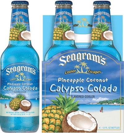
Recent issues of both Packaging World and Shelf Impact! reported that with sales stagnating or declining across Seagram’s family of wine coolers, United States Beverage in 2004 had discarded the brand’s iconic appearance and restaged the brand as Seagram’s Cooler Escapes, with more contemporary graphics that accentuate the fun inherent in consuming the fruity, low-alcohol-content beverage.
Now that the brand’s old packaging has cycled through store shelves, United States Beverage in 2005 got an accurate read on just how much the new packaging has contributed to brand sales. In a word, the answer is significantly. Although the product formulations remain the same, Justin Fisch, senior brand manager at United States Beverage, tells Shelf Impact! that sales of the brand in the new packaging have risen beyond those of both the entire category for all of 2005.
Fisch says the new package’s aspirational message of escapism connects with the brand’s core consumers—middle-income women ages 30-39. “Our consumer loves this whole idea of the package taking them on a vacation, taking them to the beach,” Fisch says. “Some consumers who left the category are coming back.
“We had image problems with the brand based on the old packaging. Consumers told us, ‘It makes us feel a little old.’ And the packaging wasn’t socially acceptable.”
Changes in both structure and graphics give the packaging a contemporary and fun appeal, Fisch explains. The brand scrapped its tear-drop-shaped bottle and replaced it with a bottle whose streamlined shape is common in beer packaging.
Bottle label and carton graphics exude a tropical paradise theme. The labels, from Cameo Crafts, are paper stock offset- and screen-printed using an average of six colors. Metallized paper gives the labels a shimmer on the store shelf. Photographs of fruit on the bottle labels and cartons change to reflect the line’s 10 flavor varieties.
The four-pack, recycled-board carriers, from Smurfit-Stone, are gravure-printed in six clors.
In home trial studies and focus groups, consumers also expressed frustration with the paper label that over-wrapped the cap on the old package. “When they twisted off the cap, some of the paper label on the neck would overhang the bottle opening and get in their mouth when they took a drink,” Fisch says. The redesigned neck label ends just below the twist cap.