Understanding how consumers shop a category can pay off handsomely when that knowledge results in packaging that guides them through multitudes of product choices in a glutted category. Light bulbs, a middle-of-the-store product, can use this technique, and General Electric’s approach could provide a model for success in communicating both form and function in a commodity product.
GE followed this approach in developing a new packaging and branding program for its bulbs. The results:
• Packaging that eliminates consumer confusion at the point-of-sale by displaying lighting products according to how consumers understand them rather than by technology.
• Packaging that identifies a clear best-application message for each style of bulb. With packaging that avoids communicating in technical jargon, GE believes it has created opportunities to steer consumers toward a more expensive product, a process called “up-selling.”
• A merchandising presentation that guides consumers to the right area in GE’s shelf set, where they can then select the appropriate product.
GE spent three years researching consumer sentiment about light bulb packaging and product merchandising. The results guided the development of its new packaging approach, which leverages color and “scale-of-light” boxes as key communicators about each product. Such a protracted venture may seem unusual for a company that’s the sales leader in the $2.7-billion category. But GE noted that like many of its competitors, its sales were flagging, and wanted to understand why.
GE knew from earlier research that “if we can get consumers to pick up our package, there’s a 70% chance they’ll buy it,” says Robert Stuart, general manager of consumer lighting for GE Consumer & Industrial. But a sale in this category doesn’t guarantee a happy customer or a repeat purchase. Among the questions GE wanted answered was whether shoppers were leaving the store with a bulb purchase that satisfied them and if not, what factors led them to select the bulb they did buy.
Multiple layers of research
GE engaged the San Francisco office of branding firm Landor Associates for the initial phase of the research, resulting in more than 25 consumer studies. As part of the process, GE shadowed consumers as they purchased light bulbs in grocery stores, home centers, hardware stores, and mass-merchandise stores.
This research identified several reasons behind consumer frustration when buying light bulbs. Consumers shop for bulbs just four times per year, and poor packaging communications and confusing product arrangements on the shelf heighten their anxiety. They often wind up purchasing the wrong bulb.
One woman summed up the frustration of many shoppers with this statement: “I have a hundred choices in shampoo and I don’t get stressed out about it. But I get stressed out when shopping for light bulbs. What can you do to help me?”
GE let her comment help guide its work in building a new branding and packaging framework.
In another layer of research, GE asked Perception Research Services to examine shelf presence and product label readership patterns in the light bulb category. The objectives were to increase up-sell potential, improve the shopping experience, and retain or enhance strong consumer perception of the GE brand in light bulbs.
One finding was that consumers felt that GE’s product arrangements didn’t seem to naturally flow into each other, according to how different bulbs are used.
Stuart comments, “We were forcing them to walk 30, 40 feet to find different bulbs with the same application.”
In the course of the research, GE determined that an effective graphics program would have to communicate with both genders equally well. While men make the purchase decision 75% of the time in home centers, women make 60% of the purchases in the category as a whole.
Ironically, while consumers professed to know little about light bulbs from a technical standpoint, GE learned that their purchase decision is not terribly measured. The buying decision required just 8 to 10 seconds.
Speed may be the primary driver in light bulb purchases, but GE’s research determined that psychological need is an important factor, too. In focus groups, consumers continually used words such as “brilliant,” “magnificent,” and “changes my world” to describe the desired emotional state they associate with light.
Finally, the focus groups conveyed that as the retail price increases, they expect the package to work harder in explaining the price-value relationship with the product inside.
A communication hierarchy emerges
GE engaged branding firm Source/Inc. to adopt GE’s new packaging and retail system across 1겨 SKUs. New GE package design standards and a packaging style manual also emerged from this collaboration.
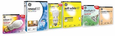
GE opted to develop its packaging design around a linear product scale called “quality of light” in satisfying consumers’ desired emotional state from light.
The scale differentiates products by expressing them as relational sub-brand names. Soft White is GE’s basic, soft-light bulb. Next on the scale is Crystal Clear, radiating “regular, sparkling light.” Still higher on the scale is Reveal, a bulb that shines “enhanced, vivid light.” Reveal bulbs use neodymium, a chemical element that’s baked into the glass to filter out the yellow tint and create a richer light. Edison bulbs sit at the scale’s high end, providing “exceptional, rich bright light.”
The quality-of-light scale appears on each Soft White and Reveal package, reflected as a horizontal series of boxes representing basic to best quality. Each box contains a sub-brand name and text that lists the product’s attributes. Beyond simpler communication, the scale can influence consumers to buy a higher-quality product and increase sales, Stuart says.
“We’re letting consumers know there are better choices out there” beyond basic light bulbs, he explains.
Each sub-brand name carries a number, such as “Edison 50.” This indicates the bulb’s wattage, with the average product life rated on the package. Below the sub-brand name is a descriptive phrase about the bulb, such as “clean, beautiful light” or “bright, crisp light.”
Graphics also play prominently in delivering the usage message on packaging for each sub-brand. The bulb shape and a line drawing of the lighting fixture appropriate for the bulb’s use appear on the front panel, along with a black band with reversed type that identifies the fixture. Consumers can visually match bulbs with their fixtures, Stuart says.
As products move higher up the quality-of-light scale, the package background becomes more color-intense and color-detailed to communicate higher value. Cartons and blister cards are offset printed in up to five colors with a varnish coating.
See sidebar to this article: New packaging shines in final hurdle—consumer testing