Danone Adds Refreshed How2Recycle with Dynamic, Localized Recycle Check
Truth in labelling laws and recycling infrastructure changes prompted GreenBlue's How2Recyle to refresh its iconography for any potential future. An adaptable, interactive datamatrix label based on The Recycling Partnership's Recycle Check is a big shift.
Danone Silk Cartons Feature How2Recycle Plus Label
How2Recycle Plus is available for brand adoption now and will appear on packaging across the U.S. in 2025, starting with Danone. The CPG giant is the first company to adopt the new How2Recycle Plus label on select new Silk brand products by the end of the year, hitting store shelves soon. Both General Mills’ Pillsbury brand and Horizon Organics had piloted earlier iterations of the H2R and The Recycling Partnership’s (TRP) Recycle Check, but Danone’s Silk is the first adopter of the official How2Recycle Plus under the new How2Recycle Forward program.
“Reducing packaging waste and promoting sustainability are at the heart of our packaging innovations,” says Kory Nook, VP of research & innovation packaging at Danone North America. “Our sustainability journey always starts with the consumer at the center. With Recycle Check [and How2Recycle Plus], we aim to simplify recycling and help consumers make informed choices across the U.S. in real-time, that benefit the environment and promote a circular economy.”
Paul Nowak, executive director, GreenBlue, and Katherine Huded, VP of recyclability solutions at TRP, say the Danone rollout has gone well. Potential problems they anticipated didn’t come to pass. Most big brands already have a H2R label, so there was already an assessment done on Silk cartons from How2Recycle that could then be fed through TRP. That part, which you’d think would be the hard part, wasn’t a problem. Timing and printing, however, always are tricky.
“An issue for the brands with labeling is always their inventory levels of existing packaging, and when they print new packaging,” Nowak says. “That doesn’t sound like the most exciting part of this discussion, but if you understand the friction that presents for the brand, considering and how many different plants they’re printing in and distributing out of, it’s problematic.”
Adds Huded, “another challenge with the brands that are eager to get started with this new label is looking across their portfolio and deciding where to start. Like Paul [Nowak] says, you’re looking at timelines and artwork changes, but you’re also looking at the various material types and formats. You’re even looking at consumer demographics for a particular brand’s target audience. Who is this right for? Just picking where to start can be a challenge, and our teams can help folks with that.”
GreenBlue's How2Recycle platform refresh
In a bid to future proof the familiar How2Recycle (H2R) label system that it operates, nonprofit GreenBlue unveiled to its 800-plus members How2Recycle Forward, which includes a family of refreshed label symbols and icons called How2Recycle Pro. Stakeholders say the move updates the How2Recycle labels’ appearance to better communicate clearer disposal instructions that reflect the current recycling landscape. The refresh also strengthens the data that underpins and informs the labels, optimizes the program’s operations, and improves consumer education around recycling and disposal, they say.
How2Recycle Forward’s new designs arrive amid a host of changes to recycling infrastructure and policy, including EPR legislation potentially driving greater investment, improvements in what and how material recovery facilities (MRFs) can sort and recycle, and so-called “truth in labelling” laws. This set of circumstances pushed How2Recycle to pursue an adaptable label program that would replace existing labels to keep up with the pace of change.
The resulting How2Recycle Forward programs contains a suite of redesigns in different flavors, from static to a dynamic version called How2Recycle Plus, to accurately inform consumers of what to do with packaging waste at the point of disposal. The design updates aim to fortify the label system against any potential eventuality, accounting for policy, infrastructure, and consumer behavior variables that remain in flux today.
‘Truth in labeling’ triggers research, research informs refresh
Most immediately pressing among those variables are truth in labeling laws. These emerging regulations seek to prevent consumer deception on packaging and ensure that products are labeled accurately. But adherence to stricter versions of these laws would be a difficult task for brands given the regional, fragmented nature of recycling infrastructure. How2Recycle member companies, mostly composed of brands plus some converters and other supply chain stakeholders, had been worried that truth in labeling laws, especially ones from California, threatened the venerable chasing arrows, standing to chase the chasing arrows off of packaging entirely.
“It would’ve been easy to just say remove the arrows,” says Nowak. “We could keep it simple, skip any research, and save a bunch of money. That doesn’t mean that it would be the right answer. It might’ve been short-sighted.”
Instead, GreenBlue and H2R commissioned consumer research studies meant to take stock of the existing label’s performance.Outgoing How2Recycle Legacy, pictured here, is being replaced with How2Recycle Forward.
“Do we have the brand equity we think we have? We studied that and found out that we do. It’s not just pride in ownership, brand equity exists,” Nowak says. “And second, if you’re going to do a consumer research study, let’s not just look at the chasing arrows and the other iconography. Let’s make sure we’re using language that meets the consumer of today, versus the consumer of 10 years ago, based on the challenges that recycling has recently faced.”
Notably, these studies weren’t conducted in an echo chamber. To agnostically evaluate the iconography, Nowak engaged the Sustainable Packaging Coalition (SPC), a 500-member multi-stakeholder organization that GreenBlue also operates. Member companies’ marketing and consumer research teams were asked to analyze and scrutinize the existing messaging, and if necessary, implement improvements informed by those findings. Brandi Parker of Parker Brands headed up SPC’s efforts within its Design Collaborative, the working group that executed the request.
“Essentially, SPC became the agency, and How2Recyle became the client. And then SPC presented How2Recycle with what they think of as the best-case scenario, and we [GreenBlue, who operates H2R] funded the research through our membership,” Nowak says. “Not only are SPC members talented and willing to give us what we need there from their marketing teams, but it also gives them a place at the table. The new labels are something SPC members are likely going to need adapt to, and implement as these changes unfold, so membership needed to have a voice in the room.”
Under the How2Recycle Forward umbrella, a refreshed symbology and iconography called How2Recycle Pro replaces outgoing icons, now termed How2Recycle Legacy. The Legacy iconography wasn’t entirely static—it had gradually evolved over 12 years, accounting for both material innovation and changing policy. But the messaging hierarchy had remained fixed—until now.
Iconography matters
The research concluded that iconography makes a big impact in recyclability messaging. It exerts an almost magnetic pull on consumers’ eyes. For consumers actively seeking recycling information, familiar icons simplify finding that information in goal-driven (top-down) processing. Even consumers who aren’t seeking recycling information can be made to pay attention to it in a process called first attention, or stimulus-driven (bottom-up) processing. Also, how long a consumer views an icon impacts how much consumers understand and take away from it.
“We were fully ready to say, ‘if the chasing arrows don’t matter, let’s get rid of them.’ Frankly, it would have been an easier path,” Nowak says. “It turns out they do matter. But the research shows they have the most recognition when used to denote a package is recyclable. We were also using a slash through them to indicate a package was non-recyclable. We found that that wasn’t as useful, and a different icon could work better. You’ll see we now use a trash can symbol.”
The research revealed that language matters, too. For instance, indicating that packaging waste simply “is recyclable” is not nearly as powerful as a verb or an action instructing them to “recycle this.”
“That’s why you bring the smart people in, to ask the right questions to inform the design. Our designers even had their favorites, and many times those didn’t prove out in the research. We followed the research,” Nowak says.
“We hope the chasing arrows will persist for [packaging formats] that are still considered widely recyclable, mostly for the 60% and over access threshold,” he adds. “We’re showing Canada and FTC the data first, and then we’re showing different states the data, and we hope they agree with us. But we comply, we don’t lobby. And if our goal is future-proofing How2Recycle, and if [states] suddenly say chasing arrows are illegal, then we have a second version that that relies on another iconography. But I’m hopeful. I think California, specifically, wants to do the right thing. The law wasn’t meant to be punitive. Still, we have a Plan B because we feel that instruction on-pack is more important than a legacy symbol. We’re not dying on the chasing arrows hill.”Consumers preferred designs where all label components were contained within the rounded rectangle.
How2Recycle Pro, with and without arrows
How2Recycle Pro represents a refreshed messaging hierarchy. The outgoing How2Recycle Legacy symbol usage will be sunset as member brands transition into the How2Recycle Pro iconography. The family of redesigns imagines two futures—one where chasing arrows are allowed to persist, and one where they’re regionally outlawed.
With that backdrop in mind, a major refresh goal was to be more inclusive, and to meet the consumer where they are in store aisles and at the point of disposal. To do this, stakeholders say they needed to understand what language, symbols, and layout worked best for consumers. Two major rounds of research were conducted; here were the findings.
First, SPC member Quad conducted quantitative consumer research of more than 800 respondents across the U.S. Establishing a control, the study aimed to see if the current How2Recycle label could meaningfully evolve.
The on-tile symbols were found to have the strongest impact on people’s perception of the label. As materials became less recyclable, participants responded strongly to corresponding changes in symbols. Overall, symbols were the most influential factor, affecting 55% of respondents, compared to the second most influential, the material + noun combination (Glass Jar) at 14%.When asked “Which of these means recyclable to you?” respondents favored the existing chasing arrows symbol (left).
People also preferred symbols that were affirmative. They liked conformational symbols that communicated which stream a material was meant to go into, rather than the negative chasing arrow symbol with a slash through it, indicating ‘no.’ The top two performing sample sets in this round lacked the slashes. These ranked highest out of the control and five variable sample sets.
People tended to respond to language like “Widely Recyclable” or “Not Yet Recyclable,” language that didn’t exist on the legacy labels. They preferred text that gave clear direction, included action words, was precise, and left less room for interpretation. For example, “Do Not Recycle” tested more favorably than “Not Yet Recyclable.”
As Nowak mentioned, researched found brand equity in chasing arrows. Respondents found the existing bold chasing arrows both visually appealing and recognizable—84% of respondents recognized the How2Recycle label, and 91.2% had memory recall of the chasing arrows recycle symbol. The How2Recycle label also encouraged or influenced a purchase decision in 51% of respondents.
Consumers wanted to see references to recycling, no matter the material’s recyclability category. For example, the legacy labels issued for materials that are only recyclable in some communities read “Check Locally,” without the word “Recycling.” Consumers wanted to see some form of the word “Recycle” and preferred verbiage like “Contact Local Recycler.”
Round two of research
In another round of consumer testing, SPC surveyed 1,000 consumers across the U.S. to understand equity in the current How2Recycle label, the symbols that resonate with consumers and comply with legislation, and the verbiage that instills understanding and inspires action.
When several different designs were tested, consumers preferred bold but encapsulated designs, meaning they wanted to see every element of the How2Recycle label as congruent and contained within a rounded rectangle. Respondents preferred this format from an aesthetic perspective, but 75% of respondents agreed that it also captured their attention faster. Most respondents also showed a preference for bold, fully capitalized text within the tile.
People like written instructions. This round of testing substantiated and expanded on that insight, as consumers gravitated toward informative language that clearly, chronologically, told them what to do. For example, consumers preferred “Clean & Recycle” over the current “Recycle if Clean & Dry.” Researchers saw this trend—consumers’ preference for outlining their steps, in order—across several of the directions they tested.
The second round of testing further substantiated consumers’ preference for the chasing arrow. Respondents presented with a series of symbols and the word “RECYCLE” in tiles were asked, “Which of these means recyclable to you?” The winner was the existing chasing arrows symbol. The word “RECYCLE” came in second place, and the symbol that most closely mimicked the chasing arrows in third.How2Recycle Forward includes static How2Recycle Pro (right center icons) and How2Recycle Plus (far right) with Recycle Check.
How2Recycle Plus, powered by Recycle Check
In parallel to Pro, and under the same How2Recycle Forward umbrella, the new How2Recycle Plus tile designs feature data matrix or QR-based connectivity, letting consumers access The Recycling Partnership’s (TRP’s) database-backed Recycle Check platform.
Consumers scan the QR code, enter their zip code or allow location permissions, and receive a clear, yes/no answer on whether the material the label references is accepted for recycling in their community. How2Recycle Plus featuring Recycle Check draws from TRP’s National Recycling Database, which includes acceptance data across more than 9,000 unique community recycling programs, representing 99% of the U.S. population.
Recycle Check launched last year with two early adopters, Horizon Organic cartons and General Mills’ Pillsbury pie tray. Notably, those two pilots were also in collaboration with How2Recycle and Nowak’s team, indicating that a collaboration was likely in the offing early on.
“When we brought Recycle Check into the world, we absolutely had hoped that we could partner with How2Recycle,” adds Huded. Sure enough, “we’ve been working closely with the How2Recycle team and the SPC Label Design Collaborative headed up by Brandi Parker to ask, ‘What do they look like coming together?’
“We know that the industry doesn’t need another label,” she continues. “Eight in 10 Americans know the How2Recycle label. We just need to give them more support and more data with their local information. We’ve been focused on bringing the two together.”
Notably, TRP commissioned some consumer research of its own to validate consumers’ acceptance and usage of the Recycle check program. Early results, they say, are heartening.
“We’ve been seeing 1000s of scans across all 50 states,” Huded says. “We’ve been seeing people entering in their local information, getting those answers, and engaging in survey questions, so we have a captive and engaged audience. We see that people are hungry for their local recycling information.”
More specifically, research revealed that when people know that this QR code has their local recycling information inside of it, they’re 70% more likely to scan it versus just any generic on-pack QR code.
“With a How2Recycle label already inside nearly every home in America, the new label, featuring Recycle Check, delivers real-time information on what is accepted for recycling locally to people across the country,” says Huded. “Reducing confusion on what can be recycled is essential to improving the U.S. recycling rate. Real-time, location-specific education is a critical tool for recovering the 76% of what could be recycled but is instead sent to landfills or incinerators.”Thermoformed PET is known for having an evolving landscape of acceptance by MRFs. Consumers will be able to check locally to receive real-time, accurate information backed by the National Recycling Database.
Collaboration notes
“I keep hearing from our members that we need to move faster. Everyone, not just us, needs to move faster because the challenge of climate change is so real,” Nowak says. “So we shouldn’t duplicate (and charge more money to do) great work that’s already happening. Partner with those people who are already doing it.”
GreenBlue/H2R and TRP did a mapping exercise to determine what core competencies each brought to the table, what each organization did exceptionally well, and where gaps existed that would need addressing.
Nowak offers that none of GreenBlue, SPC, or H2R wanted to be the database managers. That’s just not their lane, and the decade’s worth of groundwork that TRP has done at the municipal level didn’t make sense recreate. From TRP’s perspective, H2R has its own decade of brand equity in a recycling label that it didn’t make sense for them to replicate.
“Could we do it? Could they do it? Both of us could have done it,” Nowak says. “But is going it alone really the mission, or what we need? You have to take your ego out of it and say, ‘let’s get going.’” PW
We’ve done the legwork to identify and vet experienced packaging and processing consultants you can contact directly for your next project. Decades of combined experience in packaging line engineering, machinery selection, package and materials development, and food processing operations.

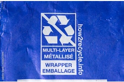
 Outgoing How2Recycle Legacy, pictured here, is being replaced with How2Recycle Forward.