A new company, a new acquisition, and now a new look. It has been quite a start for White Rocket Wine Co., Napa, CA, which officially relaunched Tin Roof Cellars in May 2007, according to vp of marketing Mark Feinberg.
“We wanted a look and feel that was simultaneously retro and modern, that speaks of old-fashioned quality, yet appeals to Millennial-generation consumers who increasingly drive the market for premium and super-premium wines,” says Feinberg, who defines Millennials as consumers aged 21-35.
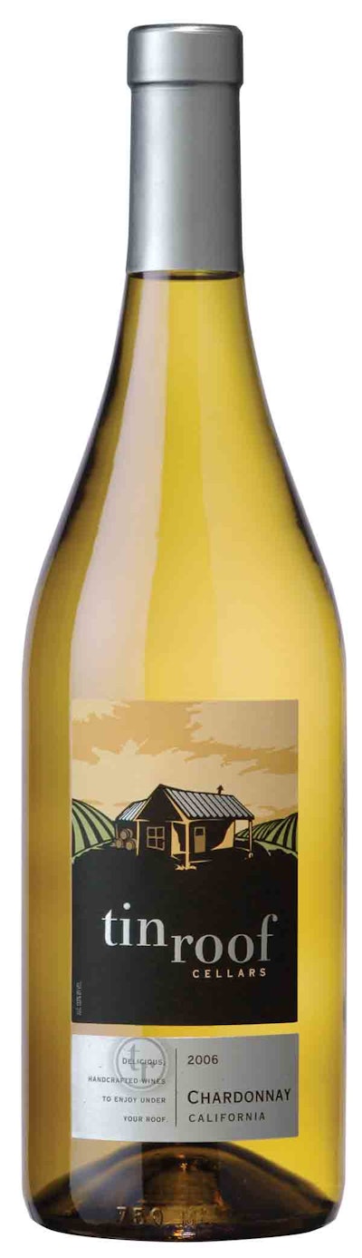
“We totally reinvented the brand,” summarizes Feinberg of the redesign, which includes a new closure type, new bottles, and a new label. Tin Roof produces six varietals in 750-mL bottles.
After determining through consumer feedback that the brand name was strong, White Rocket set out in early 2007 to redo Tin Roof through a major redesign. It turned to HKA Design (www.hkadesign.com) to help with the project.
“We looked initially at 57 different package design concepts and narrowed them down to one,” says Feinberg. Central to the revision was the label.
“Our new label invites consumers to imagine sitting on a porch gazing at vineyards while listening to the patter of rain on a tin roof,” says Feinberg. “It offers escape to a place where you can relax and enjoy delicious, handcrafted wines under your own roof.” The label illustration depicts a tin-roofed winemaking shed in the middle of the vineyard that looks as if it belongs in a John Steinbeck novel.
From ColloType Label (www.collotype.com), the label is converted from a 60# uncoated pressure-sensitive paperstock. A UV-flexo and screen-printed combination deliver more than seven colors, plus embossing and hot-foil stamping. “It’s printed using muted pastels, but for the brand name and roof, we used a shiny silver foil embossing,” Feinberg points out.
The old label offered four-color print including shades of gray and muted reds and purples. In fact, Feinberg characterizes the previous package design as “less than perfect. It was difficult to read the brand name, and there wasn’t a lot of contrast. In addition, the label was not well-defined, so it was a bit confusing to understand really what the brand was all about.” Feinberg estimates the previous design was used for three to four years.
The new Collotype labels are applied to glass bottles from Saint Gobain Containers (www.sgcontainers.com). Tin Roof uses two bottle styles, a burgundy for the chardonnay and a claret bottle for the other five varietals.
A new “roof”
The redesign included changing from a 30 x 60-mm screw cap to a traditional capsule finish using a polylaminate material. The custom, silver-color capsule is provided by Maverick Enterprises (www.maverickcaps.com). Called AT for Almost Tin, the capsule features a three-layer blend body and aluminum top disk.
“There isn’t a single account or consumer in the world that is going to turn down a cork-finished bottle,” says Feinberg, “yet there still is some resistance in the marketplace to screw caps depending on the price point.”
The capsule resulted in an interesting experience for purchasing manager Tom O’Brien, who procured the packaging. The capsule material, although extensively used in the past, is in its natural silver color, which the winery had not used before. When applied on the bottling line during production, it exhibited dramatically more horizontal lines when spun down by the machinery than O’Brien had expected or seen before.
Concerned, he hurriedly contacted Feinberg. “He immediately said, ‘oh good!’,” which was not the response O’Brien was expecting.
“Although subtle, the markings are awesome,” says Feinberg. “It’s one of those things I call an ‘in-the-hand’ detail: you don’t notice it when it’s on the shelf, but then you pick it up and you look at it in your hand, you think it’s pretty cool.
“The silver horizontal lines tie-in with the embossed corrugated tin roof, so there is synergy between the label and capsule design,” says Feinberg, who admits that he could not have asked for a detail like that. The same metallic silver capsule is used on all six products.
Pricing varies by state from $10.99 to $11.99. Feinberg describes the wines as “super-premium, consumer-friendly wines.”
“The market response has been excellent, though the redesigned brand has only been in the market less than three months,” says Feinberg.
A major new customer in the Midwest, Meijer, saw the new design and after trying the wines immediately authorized chain-wide distribution, according to Feinberg.
Tin Roof may extend overseas: Feinberg says the company is presenting the product in the new packaging into the United Kingdom.