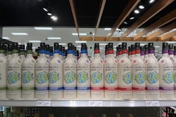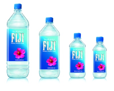
After 10 years on shelf and resounding success in the bottled water category, FIJI Water has updated the label graphics for its iconic square bottle “to personify the natural beauty of the source [of the water] and help tell its journey from cloud to bottle,” explains FIJI Water Vice President of Marketing Clarence Chia.
To tell the story of the water’s path, FIJI has designed six different back-panel bottle labels, each of which highlights one distinct aspect of the story. The labels appear on the brand’s 300- and 500-mL and 1- and 1.5-L sizes, along with a front-panel label that retains and enlarges the previous label design’s pink hibiscus flower illustration.
The new graphics were created in-house and were inspired by the islands of FIJI. “The lightest blue hues mimic the pristine waters of Viti Levu [the largest island in the Republic of Fiji] and the clear rainfall that fills every bottle of FIJI,” says Chia.“The deepening shades of cobalt and sapphire represent the raindrop’s journey from cloud to volcanic rock, where it ends in an ancient artesian aquifer. The signature pink hibiscus flower is greatly amplified, reflecting FIJI Water’s youthful spirit and capturing the essence of ‘untouched’ for premium bottled water consumers.”


