According to IPN USA’s director of manufacturing, Tom Ferguson, the nylon was added to provide the pouch with extra strength, while the aluminum provides both oxygen- and UV-barrier protection.
The size and shape of the pouch were determined by IPN USA, which worked within the dimensional constraints of the dispensing-system compartment, as designed by Esio.
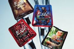
While at present, the concentrates are being sold primarily through dealers of the water-dispensing system, glossy graphics on the pouches and cartons make the Esio-Pak product retail-ready—and then some. “We are living in a ‘High-Definition’ world, so we wanted HD packaging,” says Esio Beverage president Lyle Myers. “We wanted to provide the consumer with a nice package that looks good, whether it’s being used in the home or the office. And we wanted not only the carton to be attractive, but the pouch as well.”
Graphics are designed in-house at Esio Beverage and use bold colors and illustrations to convey the flavor variety against a glossy black background. For example, coffee packs use up-close imagery of richly colored coffee beans, while peach tea pouches provide illustrations of ripe, juicy peaches surrounded by verdant leaves. A line of four electrolyte replacement drinks, co-branded with The Sqwincher Corp., uses the Sqwincher logo and artwork in bright red, green, orange, or purple, depending on flavor.
Pouch stock is gravure-printed in eight colors in India by a strategic partner of IPN India plc.


