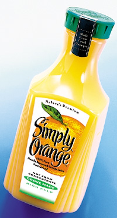
The objective was to create a brand and packaging that is fresh, uncluttered, and direct. The result is a container shape that is completely new in the orange juice category complemented by a clean and simple graphic design. All design elements work together to represent the product as authentic, pure, and fresh. The clear PET bottle is decorated with heat-transfer front and back labels. The front label depicts a juicy, ripe orange. Brand identifying verbiage is illustrated in large, free-form script. The package is topped with a tamper-evident, green-colored closure.
Companies in this article