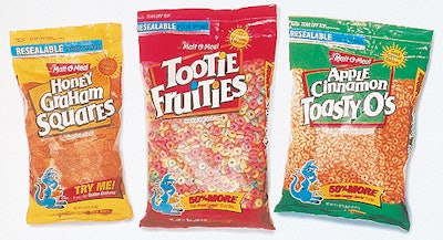
The cereal company requested that the redesigned plastic bag show more of the product than did the previous design. The larger window on the bag allows customers to visually compare Malt-O-Meal cereals to that of the competition. Malt-O-Meal also requested that several elements of the previous package design be integrated into the new design, including the color red and the brand’s trademark characters Cool Blue and Li’l Oaty. Each bag employs multiple colorful banners that highlight the national brand comparison and the Malt-O-Meal brand value message. The banner is repeated on both of the bag’s side panels and on the bottom. Each bag uses a yellow sunburst with copy describing the product’s nutritional value . The resealable bag is equiped with a pourable spout. “Mackey Szar did a wonderful job with the cereal package redesign,” says Sally Literski, marketing director for Malt-O-Meal. “Their design has positively impacted the in-store visibility of our cereal.”