Innovation, high quality, and value: These are some of the attributes driving the rise of private-brand products, whose sales are now outpacing those of major consumer brands. No longer offering just a cheaper alternative to national brands, retailers are now creating products and packaging that build consumer loyalty, drive sales, and in some cases, win industry accolades.
Supermarket portfolio Southeastern Grocers (SEG), based in Jacksonville, FL, and parent company of BI-LO, Fresco y Más, Harveys, and Winn-Dixie stores, offers an expansive range of private-label products. In early 2017, the company announced it would be revamping approximately 3,000 of its own-brand items across all categories at each banner-specific store. The transformation included new product formulations and enhancements, the introduction of three new product tiers, and the redesign of a portion of its packaging.
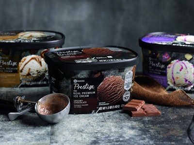
While the formula, or recipe, of its Prestige line of premium ice cream needed no tweaking—it was named Best French Vanilla Ice Cream in the country at the 2016 World Dairy Expo—SEG chose to redesign the line’s carton graphics to elevate and grow the Prestige brand and to establish the look for other Prestige items throughout the store. Prestige is a premium-tier brand made up of affordable, indulgent specialty products.
At the same time, it was looking for a new take on the graphics for its SE Grocers ice cream line. SE Grocers is the supermarket’s core brand and includes products developed with quality that is as good or better than that of established national brands, but at lower prices.
For both projects, SEG worked with Equator Design, a full-service creative consultancy that provided insight on the ice cream category, developed design concepts, created the artwork, shot the food photography, retouched the graphics, and provided film separations to SEG’s package printing suppliers—all from their design studio in Chicago.
Ice cream packaging lacks ‘sense of place’
Equator is a specialist in private-brand strategy and packaging design, having worked with retailers such as Aldi (see "Aldi embarks on Little Journey" and "Private wine brand from Aldi conjures the mysterious"), U.K.’s Co-op (Equator has two offices in the U.K.), and Roundy’s Supermarkets in the U.S., among others.
“Here at Equator, we often get asked what private brands want in terms of pack design, and the answer is simple: A design that lengthens product shelf life and is able to compete with well-known national brands on more than price, while remaining in line with their overarching brand position,” says Michael Duffy, Global Creative Director for Equator. “Building private-brand equity creates consumer loyalty.”
The redesign of SEG’s ice cream brands began with a category audit. Senior Creative and Strategy Director for Equator, Jennifer Gaeto, explains, “Through our research of the category, we saw that ice cream is all about flavor and appetite appeal. How that is communicated on-pack can be expressed in many different ways. Strong navigation is important to ensure there is clarity between flavors as well as product type. Blue, black, and brown colors dominate the brands and freezer case, so we had to find a way to differentiate SEG’s packaging to stand apart. Floating and heroic ice cream scoops are the commonality across many brands; we wanted to bring ours into more of a sense of place to create more of a story.”
The existing graphics for the Prestige line of 25 indulgent varieties—among them Southern Peach, Grandma’s Apple Pie, and Milk Chocolate Praline, to name just a few—were of the floating ice cream school of design. The package was mostly black, with large branding across the top and a floating half-scoop of ice cream with flavor ingredients nestling inside.
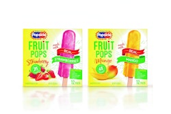
The SE Grocers’ line includes 11 more-traditional flavors, such as strawberry and vanilla. The graphics for its packaging lacked “a sense of place” as well, consisting of a large scoop of ice cream in a white bowl against a white background. On the other side were some flavor cues.
With the redesign, “these two ranges needed to look equally delicious, while separating visually,” says Gaeto. “For the Prestige brand, indulgence drives the flavors, so we wanted to highlight all the flavors and get dramatic texture and lighting to elevate the story. When we got to core, we wanted to keep it light and uplifting in tone. Ice cream is fun and a treat, or it is part of a party or celebration.”
Creating a story though props
With its learnings from the category audit in hand and an understanding of the brand propositions for the Prestige and SE Grocer ice cream brands, Equator then began sharing ideas on a mood board. At its Chicago office, mood boards cover several walls, allowing designers to display photography, preliminary designs or illustrations, color palettes, textures, etc., to set the tone and inspire the concept and design of a new package.
For Prestige, Equator created a board that had dramatically lit elements with darker lighting for a feel that signals the brand’s decadence. Ice cream in a silver scooper is viewed from overhead, with flavor ingredients, such as sliced strawberries, pieces of rich chocolate bar, and slivers of almonds, placed artistically around the scooper on a marbled grey slate table. Says Gaeto, “The overhead angle allows us to tell the flavor story and communicate the premium feel.” Typography for the design is simple to allow the photography to stand out.
In contrast, the core line is playful with a dash of nostalgia. As Gaeto explains, graphics for the core line were inspired by a small ice cream parlor and convey the joy of going out for ice cream, with a soft-pastel color palette, a striped pattern, and whimsical propping. Colorful bowls hold generous scoops of creamy ice cream on a white wood-grain table. Also pictured are ingredients such as a plate of plump red strawberries, silver spoons, ice cream cones, peanuts in the shell and cracked in half and covered with chocolate, and a jar of luscious caramel. Each flavor also has a colorful background that duplicates the color of the bowl. The image is paired with typography that Gaeto describes as “lighthearted and playful.”
Because Equator shoots all the photography for those package designs requiring it in-house, it maintains a significant prop department. The items are stocked by a prop stylist who shops flea markets, antique shops, and online for special and unique surfaces, plates, flatware, and many other items, “to set the perfect tone for a brand,” says Gaeto. “Designers are able to come into the room and be inspired by different surfaces and vessels to create the perfect mood for the product they are designing against.”
Interestingly, many of the props are tiny, as if made for a doll. When photographing products up close, size and scale are important, Gaeto explains. “We are creating scenes that have depth and interest, which need to be believable and hero the food. Depending on the camera angle, you may only see the bottom one-to-three inches of a normal-sized drinking glass, and the width of the base could take up half the image in the background. Instead, we use a much smaller glass to allow the camera to capture it. If we are working with larger-scale elements in the foreground, we are able to use more regular-sized background elements.”
Props chosen for the Prestige line “are antique, as if they have been passed down through generations,” says Gaeto, which brings an elegance to the design. The core line’s props are colorful, with the ice cream bowls giving off a ’50s vintage vibe.
Design comes to life
Equator’s photography studio includes four sets and three full-time photographers, who are assisted by the prop stylist, food stylists, and assistants. Equator also has a full kitchen where food can be prepped for a shoot. Having these capabilities on-site allows the design team and the photographers to collaborate throughout a project.
Photographing ice cream is always a challenge; under the camera lights, it takes less than a minute for the dessert to begin to melt. A common industry practice is to use mashed potatoes to create the illusion of ice cream, but Equator always shoots the real product for which it has created the packaging. “Capturing the perfect scoop takes clear communication between extremely talented food stylists and the photographer,” says Gaeto.
Lighting is first finalized with “stand in” product. The ice cream is styled off-set by the food stylist before it is photographed. “We truly get about a minute to capture the image before the ice cream has to be removed and rechilled,” says Gaeto. “We do multiple shots for surface, hero ice cream, and ingredients that are then composited together by our retouch artists.”
The on-site retouch artist then takes the composite for each of the product varieties and works with it to ensure all of the exposures for the surfaces in the image are consistent throughout the range without impacting the product or the flavor cues. He/she also touches up the images to minimize frost or ripples on the ice cream as needed.
The final stop for the new package design is with the production team, which creates the separations and final trapped file for each individual SKU, based on the printer’s capabilities and the print process to be used. Cartons for the Prestige line and the core line are litho-printed by WestRock and Burd and Fletcher, respectively.
“As part of our process, information for the press profiles, the color of the substrates, and color space were used to build a proofing profile for each printer so everyone understood what the final colors should be,” explains Gaeto.
The Prestige line uses seven ink stations: CMYK, a special dense black, a custom flavor color for each variety, and a metallic ink. Because ice cream needs to go through a metal detector after being packaged to ensure food safety, the Prestige package uses a special ink mixed with plastic particles rather than metallic flakes to create a metallic effect. “Drawdown sample swatches were requested by Equator for approval prior to the print run, so a good match to the Prestige brand color was achieved,” Gaeto says. The core line is printed in CMYK.
The project took about 12 weeks to complete and launched in the spring of 2017. Says Gaeto, the design has been well received by both the client and customers.