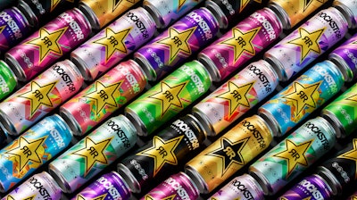
Rockstar Energy kicked off 2024 with a dynamic new look and feel. The brand unveiled the latest visual identity refresh across its full product range, its first in more than four years since its acquisition by PepsiCo in 2020. During the intervening years the brand had transitioned and progressed into a lively, vibrant, and refreshing aesthetic. The latest move is evidence of Rockstar’s progressive approach to continuously evolve the brand to appeal to more diverse and modern energy drink fans.
The refresh is timed with a new strategic evolution towards a future focused on Rockstar’s zero-sugar range. Its also part of its wider “Press Play” platform launched last year, which the company says encourages consumers “to say yes to the things they love to do.”
“The refresh is the visual complement to this, with every touchpoint of the identity oriented towards Rockstar’s evolved brand positioning,” Marie-Therese Cassidy, VP of Design, PepsiCo Europe, says.
The new look retains its iconic star logo but departs from the previous design by introducing a simpler, more universal appeal. The idea is to cater to a broader, more modern audience of energy drink consumers across the portfolio.
“First and foremost, our new visual identity provides greater accessibility and inclusivity by differentiating Rockstar from traditional energy drink norms,” Cassidy says. “Rockstar has a wide variety of flavors, including both full-sugar and no-sugar variants, and we wanted the visual identity to reflect these how these extensive offerings cater to a broader audience.”
While the new design is a departure from its predecessor, some elements were too infused into the brand’s identity to abandon. When asked what was kept, “Definitely the gold star, which is synonymous with the Rockstar brand,” Cassidy says. “We optimized the size and positioning a bit in the refresh, but the shape and color remain the same in the new design.”
The star logo’s placement on the can, however, changed to be more consistent across the flavor range. A single gold star logo is now centered on the can, providing a singular visual gateway into Rockstar's full range of flavors.
“That was a purposeful change,” Cassidy says. “The single standard logo unifies all varieties across the portfolio and advances brand recognition. And the star sits as a beacon in the center of all cans.”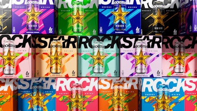 Rockstar also offers a four-pack carton format that reflects the refreshed design.
Also, to describe different flavor categories (i.e. the Juiced or Refresh families), the brand had previously used separate approaches with distinctive wordmarks. That’s no longer the case.
“Our previous approach served us well as we met the rising demand for functional beverages. But Rockstar has a progressive approach to continuously evolve the brand to appeal to more diverse and modern energy drink fans. Our new visual identity prioritizes simplicity and consistency across the portfolio,” Cassidy says.
Text relating flavor and attribute details, such as Sour Apple or Zero Sugar, got a bit smaller in the messaging hierarchy, moving up to the cans’ neck and appearing in smaller font. That means the color and background design has do even more work to visually communicate flavor on the shelf.
“With more background space on the can to play around with, we created a window into the world of flavor and refreshment that lives behind the core star. So, depending on the flavor, you’ll see juicy fruits in the background, or crisp, colorful illustrations, or something simpler in classic Rockstar colors to represent a classic flavor,” Cassidy says.
 | Read more about beverage brands' recent refresh and redesign efforts, including those by Pepsi, Fanta, and Sprite. |
“Another thing we were trying to solve is an improvement to our shelf navigability. With this refresh, our team merged Rockstar's iconic gold star with the updated wordmark. This way, when the can appears on the shelf in retail, both elements are visible to shoppers simultaneously, optimizing brand recognition…. We wanted to instill a more consistent look and feel across … more than 20 flavors. Our text and distinctive assets, like the star and wordmark, have been centralized and made consistent, but we left room for flexibility to express the unique notes of each flavor.”
Rockstar Energy's new visual identity debuted in the U.K., Poland, and Germany in January 2024, with subsequent launches planned throughout the year. The fresh look will extend across all international Rockstar Energy flavors in multi-touchpoint campaigns, and anywhere else you find Rockstar in 2024. As for consumer reaction, early returns have been positive.
“We conducted research and have received a great response so far,” Cassidy says. “Specifically, people like the modern feel of the visual identity and the consistent look and feel across the product line.” PW


