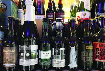
From a packaging perspective, this particular retail category is special. Other brands could go to school here. The micro brand differentiation, creative exploration, and fearless determination to convey an attitude should be the envy of mass brands.
These designs break all “rules” of packaging design. Typographic hierarchy, point size, legibility, and positioning are wildly individualistic. Even within a brand the typefaces may vary drastically. Some logos are legible and bold while others are hidden within the visuals. Imagery from illustrations to graphics dominates the front labels, often overshadowing the brand identity. Cropping, scaling, and positioning of imagery are based on the storytelling strategy of the brand. Color isn’t used to differentiate flavor, connect to any category cues, or attempt to bring brand consistency. It’s simply an outlet for expression. Label dimensions, bottle shapes, neckbands, printing technique, caps, closures, carriers—there is no set standard. There’s something here for everyone.
From single bottles to four- and six-pack carriers, the same creative energy that goes into brewing is applied to on-pack artistry. Some containers are part of a “larger collection” while others are one of a kind. Historical references, stylized images, or expressions echoing some social context—all this we see. But rarely do we see anything “trendy.” All are accessible to an audience that wants to be engaged in an aesthetic experience that is playful, evocative—even thought provoking. These are micro beers with macro attitude.
The style, form, and architecture of micro brew bottle designs convey not just a sense of purpose and personality, but also confidence in aesthetic choices. Appearing to be unconcerned with following the mass beer packaging design strategy of bold, shelf-screaming branding, these are bottles and carriers that communicate on their own terms and according to their own internal truths and manifestos.
As much as I admire all this from an originality perspective, I do wonder if in every case it leads to the sale of more beer. Do we consistently see a framework that clearly articulates the brand’s value to the audience and leads to maximum and long-term sales? The creative strategy behind a craft beer’s packaging design may not have mass appeal in mind, but it should still be driven by business decisions. After all, the ultimate goal is to sell product and sell it fast since micro beers don’t have the longest shelf life. Using vivid packaging design to connect with the consumer is a waste of time if the product goes bad before it’s consumed.
What it comes down to is that a brand experience is different from an art experience. A package design that stands out on the shelf, one that stimulates the senses and speaks to the consumer’s aspirations while overpowering the competition—that should be the goal. An essential ingredient is the use of a few key equity elements, ones that the consumer comes to identify as the brand’s visual point of differentiation. If the consumer cannot visually connect with one or multiple key elements on the packaging design, brand recall is lost. And without brand recall, you can forget about brand loyalty.
I repeat, micros need not follow the formulaic process of the mass brands. But packaging design is a careful balance between risk and opportunity. There is a risk of not getting noticed by not examining design opportunities. While there is not a set of rules to be applied universally to the micros, criteria can be designed specifically for each brand that can optimize shelf impact while also maximizing long-term sales.
“Attitude is everything,” people like to say. But in packaging design, it’s only almost everything.
Marianne Rosner Klimchuk ([email protected]) is Associate Chairperson, Associate Professor, Packaging Design Dept., Fashion Institute of Technology.