See What’s Possible in Packaging & Processing @ PACK EXPO International
See packaging & processing solutions from 2,600 exhibitors and gain insights from 150+ free educational sessions at PACK EXPO International.
REGISTER NOW & SAVE

Create a free Packaging World account to continue reading

A 'fishy' redesign

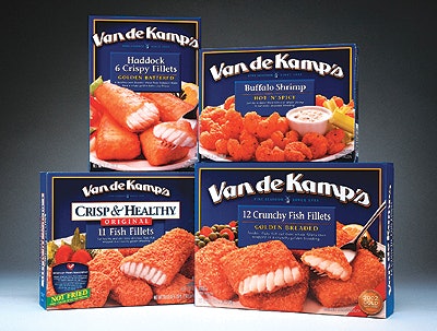
Van De Kamp’s decided to revamp the graphic design for the cartons containing its line of frozen seafood entrées. The company turned to Deutsch Design Works (San Francisco, CA) to help reposition the brand as a main meal for the entire family.

Pw 15429 Van De Kamps

To capitalize on Van De Kamp’s heritage, designers updated its client’s logo and selected richer, deeper colors for an upscale, contemporary look. They incorporated a photo of the product to provide mouthwatering appetite appeal to attract Van De Kamp’s target market (adults). “Deutsch Design works delivered a fresh and tempting new look for Van De Kamp’s that truly sets us apart and establishes the brand as a family meal,” says Eric Grosgogeat, marketing director for Van De Kamp’s. Van De Kamp’s products are available at grocery stores nationwide.

Co-packers: the competitive gap is widening
Brands want more than low bids. See what automation, services, and sustainability mean for CM/CPs in 2026.
Read More
Co-packers: the competitive gap is widening
Is your packaging line built for connected packaging?
RFID, QR codes, and 2D barcodes are reshaping CPG operations. See how leading brands are adapting.
Read More
Is your packaging line built for connected packaging?