Fun and edgy, London-based Rude Health refers to itself as “up for life and bursting with energy.” The food and drinks maker emphasizes ingredients from fields, orchards and vines, noting, “We’re a small and proudly outspoken bunch that isn’t afraid of standing up for real, honest food—the way it should be.”
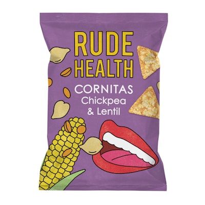
Packaging for the company’s new line of Cornitas snack chips reflects the company’s attitude, with design credited to independent studio Irving & Co., which specializes in packaging design and communication in the food and retail sectors.
Julian Roberts, who was behind the project at Irving & Co, says the design objective was "to build on the “pop art” aesthetic of the Rude Health umbrella rebrand that was unveiled in 2013. “The Tom Wesselmann-inspired lips icon symbolized the sunny, positive disposition of ’60s California—endless blue skies, vibrant color, abundant photorealistic ripe ingredients, and people being ‘in rude health,’” he says. “However, we wanted the Cornitas to be distinct from the core range of Rude Health products—to have a more immediate personality. The work of British pop artist Patrick Caulfield sparked our imagination and led us to the work of the Dutch illustrator Seb Agresti, who we commissioned to help bring to life a bold new design.”


