Executed by London design firm Carter Wong, the rebrand gives the product a more youthful appeal aimed at the 14-25 year old market. The visual changes signal and support a range of innovations in the product and product range that will reposition the brand worldwide.
The new brand design addresses key issues related to the global reach of the brand. It takes into
account language differences, the variable printing capabilities of countries, and, most important,
brand recognition. While not rigidly uniform, the new look signals that wherever you are in the world,
the Cornetto range is part of a single family. The message across the globe is that the new-style
Cornetto provides a full-on journey of tastes and textures from crown to tip.
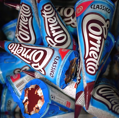
The visual changes begin with a complete re-design of the Cornetto logo. Hand-drawn and
free-flowing letters reference the swirl of the iconic Unilever Heartmarque, also designed by Carter
Wong and recognised the world over. The shaping of the logotype playfully mimics the shape of the
cone, with a large ‘C’ at the top end, tailing off to the ‘tto’ at the tip. This makes the logotype more
playful and less ‘corporate.’ The new logotype ‘owns the cone’ as it would on a chocolate bar, to
become the main graphic element and primary interface with consumers. The easy-to-recognise
graphic nature of the word mark avoids language issues, much like the ubiquitous Coca-Cola logo. The
Unilever Heartmarque appears white on red in a curved ‘swoosh’ on every pack.
New colour coding of the Classic single cone and multi-cone packaging give a visual indication of the
flavours. The packaging colours draw on familiar universal conventions: blue for Classic Vanilla, red for
Strawberry, brown for Chocolate, green for Mint, and so-on. The colours are linked to precise pantone
references to achieve consistency in every market despite local production. Classic multi-packs have
also been given a make-over. Again, these are colour-coded. The cones within the multi-packs are given a completely different graphic design based on lively, modern typography intended to discourage the sale of the cones as individual units. Some regional differences have been introduced, without undermining the
‘family’ look, to reflect local market tastes.
Carter Wong’s Creative Director Phil Carter comments on the brand design programme saying: “Second
only to the Unilever Heartmarque, the Cornetto is probably the most recognisable ice-cream brand
across the world. The commission to redesign and reposition it has been a privilege. Our intimate
knowledge of Unilever’s ice cream business and its global/local position gave us invaluable insights
into how best to progress the Cornetto re-brand and create something memorable.”