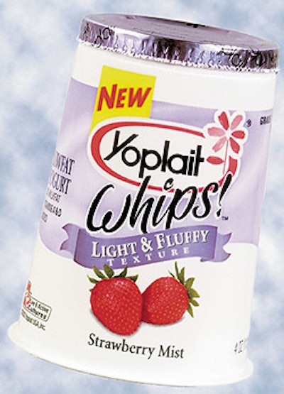
The design helps the new product stand out on store shelves while maintaining the integrity of the Yoplait line, designers say. The design represents the first time General Mills has changed the look of the Yoplait product line since its introduction to the United States in 1977. A lavender background creates the visual differentiation from other Yoplait products. The color was added to convey a light, fresh flavor. Focus testing found the color created the highest appeal to the targeted female demographic. Designers added a swirl to the background that establishes the whipped texture as well as created a custom “airy” typeface for the Whips! product name. Product-identifying characteristics such as the descriptor ribbon and the color-coded background were added to maintain consistency and equity within the Yoplait brand. The new yogurt hit national store shelves earlier this year.